library(babynames)
library(leaflet)
library(mapdeck)
library(shiny)
library(tidyverse)
library(troopdata)
library(usethis)Online Appendix F — Interaction
Under construction
TODO
- Add the plotly section
Prerequisites
- Read Geocomputation with R, Chapter 2 “Geographic data in R”, (Lovelace, Nowosad, and Muenchow 2019)
- This chapter provides an overview of mapping in
R.
- This chapter provides an overview of mapping in
- Read Mastering Shiny, Chapter 1 “Your first Shiny app”, (Wickham 2021b)
- This chapter provides a self-contained example of a Shiny app.
- Read We Still Can’t See American Slavery for What It Was, (Bouie 2022)
- The article discusses slavery in the US, with a focus on data.
Key concepts and skills
- Interactive communication, such as websites, interactive maps, and shiny applications add another dimension to the story we tell. Partly this is just because they allow the user to focus on what they are interested in, but it it also just nice to be able to consider movement.
- A key aspect of communication and presence is having a website and we focus on using a Quarto document to do this.
- Once we have a website, then we can create interactive maps, using
leaflet(Cheng, Karambelkar, and Xie 2021) andmapdeck(Cooley 2020). - And interactive shiny apps allow us to easily add interaction to graphs, using
Shiny(Chang et al. 2021).
Software and packages
babynames(Wickham 2021a)leaflet(Cheng, Karambelkar, and Xie 2021)mapdeck(Cooley 2020)shiny(Chang et al. 2021)tidyverse(Wickham et al. 2019)troopdata(Flynn 2022)usethis(Wickham, Bryan, and Barrett 2022)
F.1 Introduction
Books and papers have been the primary mediums for communication for thousands of years. But with the rise of computers, and especially the internet, in recent decades, these static approaches have been complemented with interactive approaches. Fundamentally, the internet is about making files available others. If we additionally allow them to do something with what we make available, then we need to take a variety of additional aspects into consideration. Interactive communication is also important as models become more complex. For instance, da Silva, Cook, and Lee (2023) develop interactive graphics which they use to better understand their random forest models.
In this chapter we begin by covering how to create and publish a website. This serves as a place to host a portfolio of work. After that we cover adding interaction to maps and graphs, which are two that nicely lend themselves to this.
F.2 Quarto websites
A website is a critical part of communication. For instance, it is a place to make a portfolio of work publicly available. One way to make a website is to use Quarto’s built in websites. Having set-up GitHub in RStudio, it is possible to have a website online in five minutes.
One nice feature of a Quarto website is that it enables us to have a multi-page, rather than single-page, website. As it is fundamentally a Quarto document, it also allows us to use the skills that we developed in Chapter 3.
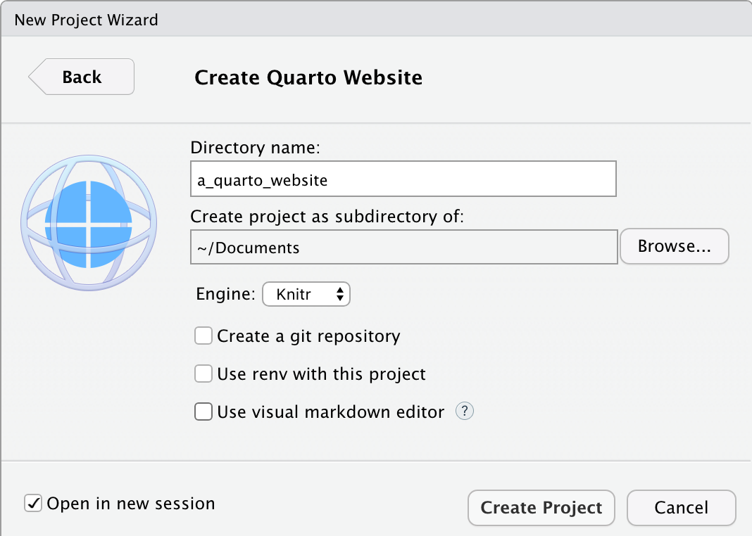
Get started by creating a new project (“File” -> “New project” -> “New Directory” -> “Quarto Website”), give it a name, and select “Open in new session” -> “Create Project” (Figure F.1 (a)).
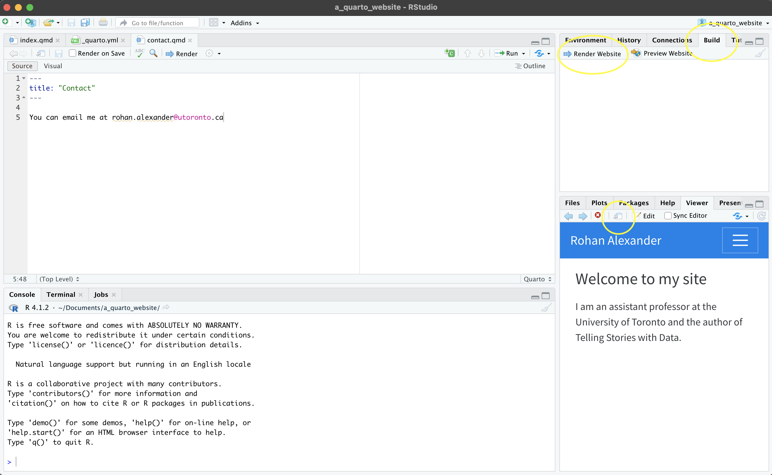
The default basic website can be produced with “Build” -> “Render Website” (Figure F.1 (b)). By default it may show in the “Viewer” pane, but can also be shown in a New Window, by . Again, at this point we may like to change the details to reflect our own. In particular, we may like to change the title of “index.qmd”, and add our own details (Figure F.1 (c)).
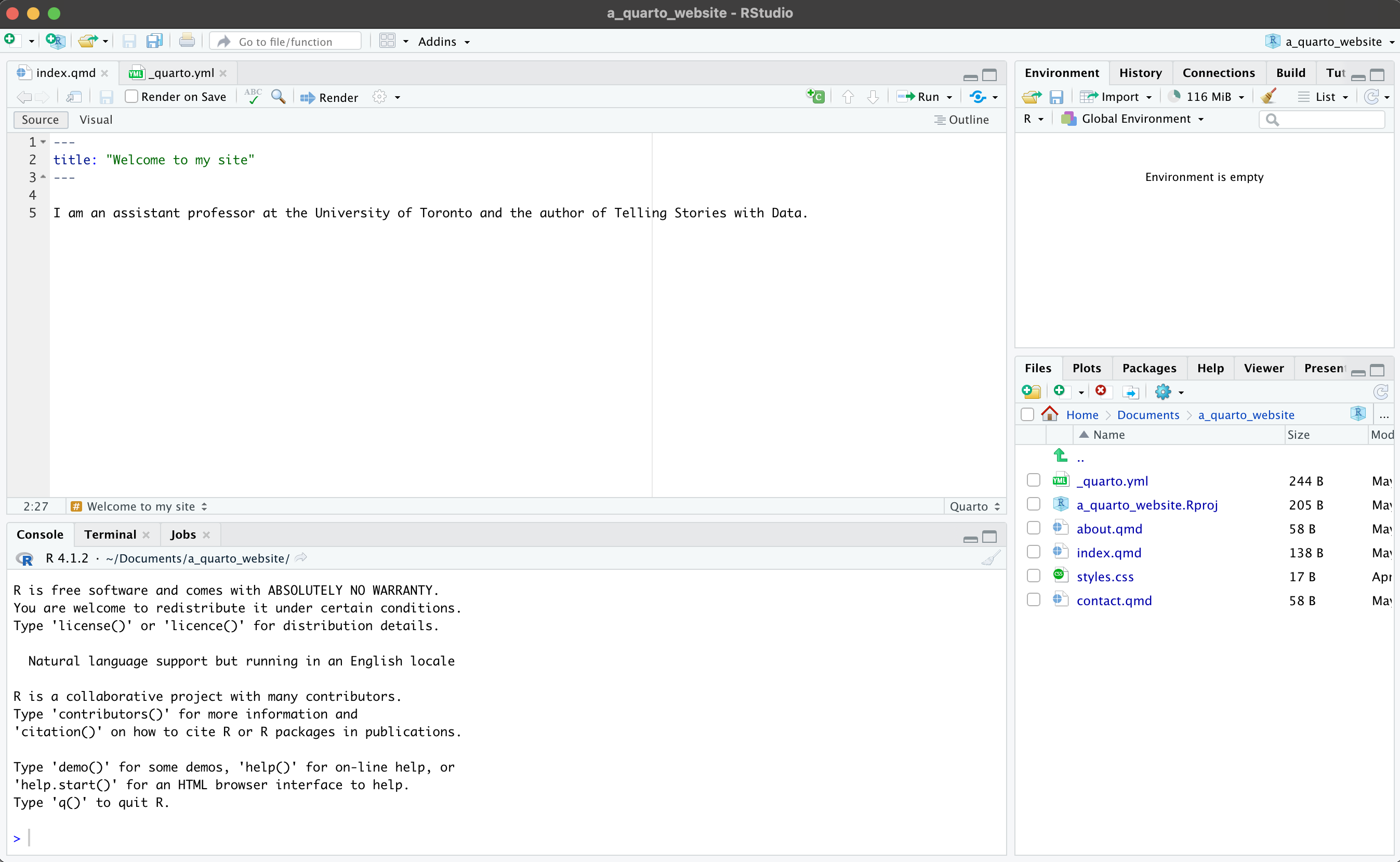
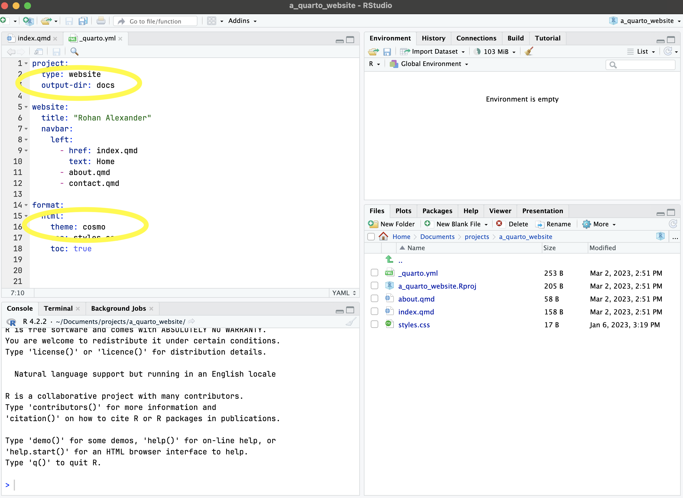
Content that is included in the primary menu is specified in “_quarto.yml”. We could add another page to this, such as “contact.qmd” and to create the content that would be included we may like to duplicate, say, “about.qmd” and then edit that (Figure F.1 (d)). Another aspect that we can change in “_quarto.yml” is the theme. The default is “cosmo”, but there are many other options specified here.
After the details are personalized and we are not unhappy with the website it can be pushed to GitHub and then hosted with GitHub Pages. To take advantage of that we need to first do two things. Firstly, we should slightly modify “_quarto.yml” to specify that we should build to a “docs” folder rather than “_site” (Figure F.1 (d)).
project:
  type: website
  output-dir: docs
The other aspect to know is that when we use this service, by default, GitHub would try to build the site, which we do not want, so we need to first add a hidden file to turn that off, by running this in the console:
file.create(".nojekyll")Then, assuming GitHub was set-up in Chapter 3, we can use usethis to get our newly created project onto GitHub. We use use_git() to initialize a Git repository, and then use_github() pushes it to GitHub.
use_git()
use_github()
The project will then be on GitHub. We can use GitHub pages to host it: “Settings -> Pages” and then change the source to “main” or “master”, depending on your settings, and finally “docs”. After a few minutes to run through various checks, GitHub will let you know the address that you can share to visit your site.
To update the site, work locally. First pull, to ensure that any changes that GitHub made are present locally, then edit the site, re-render it and push it to GitHub in the usual manner. After the checks are completed the live website will update.
F.3 Client-side interactivity
Once we have a hosted website, one nice thing is that we can use it to “ship” some “light” interactivity. We will discuss more onerous approaches, such as a shiny app later, but these require a different skill set to share and deploy. Here we introduce a client-side solution, crosstalk and plotly, which will provide some interactivity, such as a tooltip, with little additional overhead.
F.4 Interactive maps
The nice thing about interactive maps is that we can let our user decide what they are interested in. For instance, in the case of a map, some people will be interested in, say, Toronto, while others will be interested in Chennai or even Auckland. But it would be difficult to present a map that focused on all of those, so an interactive map is a way to allow users to focus on what they want.
That said, we should be cognizant of what we are doing when we build maps, and more broadly, what is being done at scale to enable us to be able to build our own maps. For instance, with regard to Google, McQuire (2019) says:
Google began life in 1998 as a company famously dedicated to organising the vast amounts of data on the Internet. But over the last two decades its ambitions have changed in a crucial way. Extracting data such as words and numbers from the physical world is now merely a stepping-stone towards apprehending and organizing the physical world as data. Perhaps this shift is not surprising at a moment when it has become possible to comprehend human identity as a form of (genetic) ‘code’. However, apprehending and organizing the world as data under current settings is likely to take us well beyond Heidegger’s ‘standing reserve’ in which modern technology enframed ‘nature’ as productive resource. In the 21st century, it is the stuff of human life itself—from genetics to bodily appearances, mobility, gestures, speech, and behaviour—that is being progressively rendered as productive resource that can not only be harvested continuously but subject to modulation over time.
Does this mean that we should not use or build interactive maps? Of course not. But it is important to be aware of the fact that this is a frontier, and the boundaries of appropriate use are still being determined. Indeed, the literal boundaries of the maps themselves are being consistently determined and updated. The move to digital maps, compared with physical printed maps, means that it is possible for different users to be presented with different realities. For instance, “…Google routinely takes sides in border disputes. Take, for instance, the representation of the border between Ukraine and Russia. In Russia, the Crimean Peninsula is represented with a hard-line border as Russian-controlled, whereas Ukrainians and others see a dotted-line border. The strategically important peninsula is claimed by both nations and was violently seized by Russia in 2014, one of many skirmishes over control” (Bensinger 2020).
F.4.1 Leaflet
We can use leaflet (Cheng, Karambelkar, and Xie 2021) to make interactive maps. The essentials are similar to ggmap (Kahle and Wickham 2013), but there are many additional aspects beyond that. We can redo the US military deployments map from Chapter 5 that used troopdata (Flynn 2022). The advantage with an interactive map is that we can plot all the bases and allow the user to focus on which area they want, in comparison with Chapter 5 where we just picked a few particular countries. A great example of why this might be useful is provided by The Economist (2022b) where they are able to show 2022 French Presidential results for the entire country by commune.
In the same way as a graph in ggplot2 begins with ggplot(), a map in leaflet begins with leaflet(). Here we can specify data, and other options such as width and height. After this, we add “layers” in the same way that we added them in ggplot2. The first layer that we add is a tile, using addTiles(). In this case, the default is from OpenStreeMap. After that we add markers with addMarkers() to show the location of each base (Figure F.2).
bases <- get_basedata()

# Some of the bases include unexpected characters which we need to address
Encoding(bases$basename) <- "latin1"

leaflet(data = bases) |>
  addTiles() |> # Add default OpenStreetMap map tiles
  addMarkers(
    lng = bases$lon,
    lat = bases$lat,
    popup = bases$basename,
    label = bases$countryname
)There are two new arguments, compared with ggmap. The first is “popup”, which is the behavior that occurs when the user clicks on the marker. In this case, the name of the base is provided. The second is “label”, which is what happens when the user hovers on the marker. In this case it is the name of the country.
We can try another example, this time of the amount spent building those bases. We will introduce a different type of marker here, which is circles. This will allow us to use different colors for the outcomes of each type. There are four possible outcomes: “More than $100,000,000”, “More than $10,000,000”, “More than $1,000,000”, “$1,000,000 or less” Figure F.3.
build <-
  get_builddata(startyear = 2008, endyear = 2019) |>
  filter(!is.na(lon)) |>
  mutate(
    cost = case_when(
      spend_construction > 100000 ~ "More than $100,000,000",
      spend_construction > 10000 ~ "More than $10,000,000",
      spend_construction > 1000 ~ "More than $1,000,000",
      TRUE ~ "$1,000,000 or less"
    )
  )

pal <-
  colorFactor("Dark2", domain = build$cost |> unique())

leaflet() |>
  addTiles() |> # Add default OpenStreetMap map tiles
  addCircleMarkers(
    data = build,
    lng = build$lon,
    lat = build$lat,
    color = pal(build$cost),
    popup = paste(
      "<b>Location:</b>",
      as.character(build$location),
      "<br>",
      "<b>Amount:</b>",
      as.character(build$spend_construction),
      "<br>"
    )
  ) |>
  addLegend(
    "bottomright",
    pal = pal,
    values = build$cost |> unique(),
    title = "Type",
    opacity = 1
)F.4.2 Mapdeck
mapdeck (Cooley 2020) is based on WebGL. This means the web browser will do a lot of work for us. This enables us to accomplish things with mapdeck that leaflet struggles with, such as larger datasets.
To this point we have used “stamen maps” as our underlying tile, but mapdeck uses Mapbox. This requires registering an account and obtaining a token. This is free and only needs to be done once. Once we have that token we add it to our R environment (the details of this process are covered in Chapter 7) by running edit_r_environ(), which will open a text file, which is where we should add our Mapbox secret token.
MAPBOX_TOKEN <- "PUT_YOUR_MAPBOX_SECRET_HERE"We then save this “.Renviron” file, and restart R (“Session” -> “Restart R”).
Having obtained a token, we can create a plot of our base spend data from earlier (Figure F.4).
mapdeck(style = mapdeck_style("light")) |>
  add_scatterplot(
    data = build,
    lat = "lat",
    lon = "lon",
    layer_id = "scatter_layer",
    radius = 10,
    radius_min_pixels = 5,
    radius_max_pixels = 100,
    tooltip = "location"
)F.5 Shiny
shiny (Chang et al. 2021) is a way of making interactive web applications using R. It is fun, but can be a little fiddly. Here we are going to step through one way to take advantage of shiny, which is to quickly add some interactivity to our graphs. This sounds like a small thing, but a great example of why it is so powerful is provided by The Economist (2022a) where they show how their forecasts of the 2022 French Presidential Election changed over time. We will return to shiny in Chapter 12.
We are going to make an interactive graph based on the “babynames” dataset from babynames (Wickham 2021a). First, we will build a static version (Figure F.5).
top_five_names_by_year <-
  babynames |>
  arrange(desc(n)) |>
  slice_head(n = 5, by = c(year, sex))

top_five_names_by_year |>
  ggplot(aes(x = n, fill = sex)) +
  geom_histogram(position = "dodge") +
  theme_minimal() +
  scale_fill_brewer(palette = "Set1") +
  labs(
    x = "Babies with that name",
    y = "Occurrences",
    fill = "Sex"
  )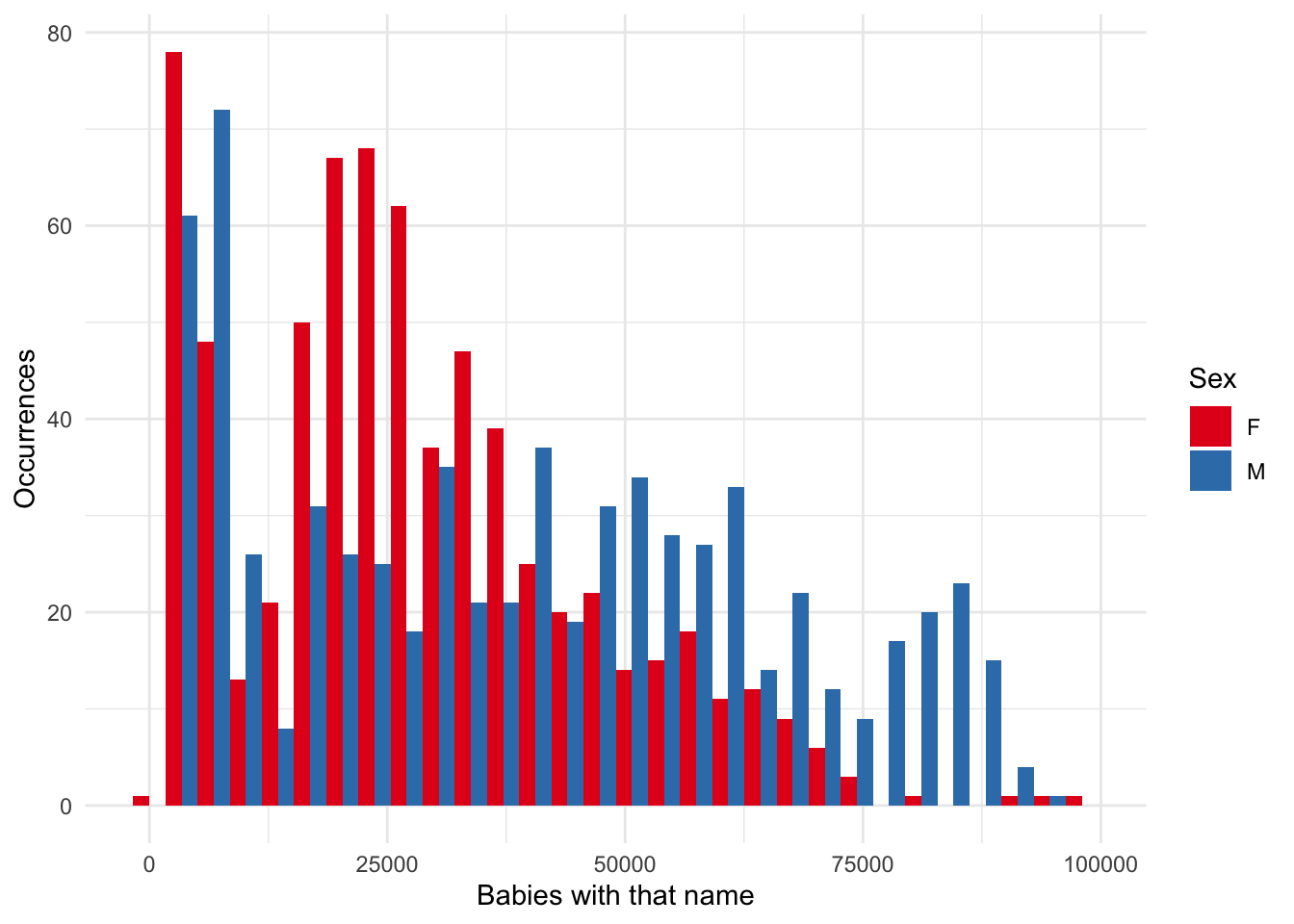
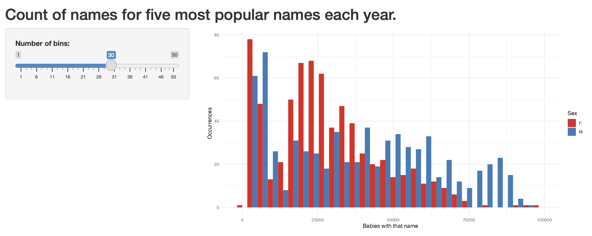
One thing that we might be interested in is how the effect of the “bins” parameter shapes what we see. We might like to use interactivity to explore different values.
To get started, create a new shiny app (“File” -> “New File” -> “Shiny Web App”). Give it a name, such as “not_my_first_shiny” and then leave all the other options as the default. A new file “app.R” will open and we click “Run app” to see what it looks like.
Now replace the content in that file, “app.R”, with the content below, and then again click “Run app”.
library(shiny)

# Define UI for application that draws a histogram
ui <- fluidPage(
  # Application title
  titlePanel("Count of names for five most popular names each year."),

  # Sidebar with a slider input for number of bins
  sidebarLayout(
    sidebarPanel(
      sliderInput(
        inputId = "number_of_bins",
        label = "Number of bins:",
        min = 1,
        max = 50,
        value = 30
      )
    ),

    # Show a plot of the generated distribution
    mainPanel(plotOutput("distPlot"))
  )
)

# Define server logic required to draw a histogram
server <- function(input, output) {
  output$distPlot <- renderPlot({
    # Draw the histogram with the specified number of bins
    top_five_names_by_year |>
      ggplot(aes(x = n, fill = sex)) +
      geom_histogram(position = "dodge", bins = input$number_of_bins) +
      theme_minimal() +
      scale_fill_brewer(palette = "Set1") +
      labs(
        x = "Babies with that name",
        y = "Occurrences",
        fill = "Sex"
      )
  })
}

# Run the application
shinyApp(ui = ui, server = server)
We have just build an interactive graph where the number of bins can be changed. It should look like Figure F.6.
F.6 Exercises
Scales
- (Plan) Consider the following scenario: Everyday a baby wakes at one of: 4am, 5am, or 6am, and wakes up a parent who has a choice of whether to have coffee or tea. Imagine you have daily data for a year about the time the baby wakes up and which drink the parent had. Please sketch what that dataset could look like and then sketch a graph that you could build to show all observations.
- (Simulate) Please further consider the scenario described and simulate the situation where each of the two variables are independent. After that, please simulate another situation where there is some relationship, of your choice, between the time the baby wakes up, and the choice of drink.
- (Acquire) Please describe a possible source of such a dataset.
- (Explore) Please use
shinyto build an interactive version of the graph that you sketched. - (Communicate) Please write two paragraphs about what you did.
Questions
- Based on Lovelace, Nowosad, and Muenchow (2019), please explain in a paragraph or two, what is the difference between vector data and raster data in the context of geographic data?
- Based on Wickham (2021b),
shinyuses:- Object-oriented programming
- Functional programming
- Reactive programming
- In a paragraph or two, why is it important to have a website?
- Which function should we use to stop GitHub itself from trying to build our site instead of just serving it (pick one)?
file.create(".nojekyll")file.remove(".nojekyll")file.create(".jekyll")file.remove(".jekyll")
- Which argument to
addMarkers()is used to specify the behavior that occurs after a marker is clicked (pick one)?layerIdiconpopuplabel
Tutorial
Please obtain data on the ethnic origins and number of Holocaust victims killed at Auschwitz concentration camp. Then use shiny to create an interactive graph and an interactive table. These should show the number of people murdered by nationality/category and should allow the user to specify the groups they are interested in seeing data for. Publish them using the free tier of shinyapps.io.
Then, based on the themes brought up in Bouie (2022), discuss your work in at least two pages. The expectation is that, similar to Healy (2020), you use your work as a foundation to build on and discuss what it means to use data about such a horror.
Use the starter folder, and submit a PDF created using the Quarto doc provided there. Ensure that your essay contains links to both your app and the GitHub repo that contains all code and data. As well as extensive citations to relevant literature that you reflected on.