library(arrow)
library(janitor)
library(lubridate)
library(mice)
library(modelsummary)
library(naniar)
library(opendatatoronto)
library(tidyverse)
library(tinytable)11 Exploratory data analysis
Prerequisites
- Read The Future of Data Analysis, (Tukey 1962)
- John Tukey, the twentieth century statistician, made many contributions to statistics. From this paper focus on Part 1 “General Considerations”, which was ahead of its time about the ways in which we ought to learn something from data.
- Read Best Practices in Data Cleaning, (Osborne 2012)
- Focus on Chapter 6 “Dealing with Missing or Incomplete Data” which is a chapter-length treatment of this issue.
- Read R for Data Science, (Wickham, Çetinkaya-Rundel, and Grolemund [2016] 2023)
- Focus on Chapter 11 “Exploratory data analysis”, which provides a written self-contained EDA worked example.
- Watch Whole game, (Wickham 2018)
- A video providing a self-contained EDA worked example. One nice aspect is that you get to see an expert make mistakes and then fix them.
Key concepts and skills
- Exploratory data analysis is the process of coming to terms with a new dataset by looking at the data, constructing graphs, tables, and models. We want to understand three aspects:
- each individual variable by itself;
- each individual in the context of other, relevant, variables; and
- the data that are not there.
- During EDA we want to come to understand the issues and features of the dataset and how this may affect analysis decisions. We are especially concerned about missing values and outliers.
Software and packages
- Base R (R Core Team 2024)
arrow(Richardson et al. 2023)janitor(Firke 2023)lubridate(Grolemund and Wickham 2011)mice(van Buuren and Groothuis-Oudshoorn 2011)modelsummary(Arel-Bundock 2022)naniar(Tierney et al. 2021)opendatatoronto(Gelfand 2022)tidyverse(Wickham et al. 2019)tinytable(Arel-Bundock 2024)
11.1 Introduction
The future of data analysis can involve great progress, the overcoming of real difficulties, and the provision of a great service to all fields of science and technology. Will it? That remains to us, to our willingness to take up the rocky road of real problems in preference to the smooth road of unreal assumptions, arbitrary criteria, and abstract results without real attachments. Who is for the challenge?
Tukey (1962, 64).
Exploratory data analysis is never finished. It is the active process of exploring and becoming familiar with our data. Like a farmer with their hands in the earth, we need to know every contour and aspect of our data. We need to know how it changes, what it shows, hides, and what are its limits. Exploratory data analysis (EDA) is the unstructured process of doing this.
EDA is a means to an end. While it will inform the entire paper, especially the data section, it is not typically something that ends up in the final paper. The way to proceed is to make a separate Quarto document. Add code and brief notes on-the-go. Do not delete previous code, just add to it. By the end of it we will have created a useful notebook that captures your exploration of the dataset. This is a document that will guide the subsequent analysis and modeling.
EDA draws on a variety of skills and there are a lot of options when conducting EDA (Staniak and Biecek 2019). Every tool should be considered. Look at the data and scroll through it. Make tables, plots, summary statistics, even some models. The key is to iterate, move quickly rather than perfectly, and come to a thorough understanding of the data. Interestingly, coming to thoroughly understand the data that we have often helps us understand what we do not have.
We are interested in the following process:
- Understand the distribution and properties of individual variables.
- Understand relationships between variables.
- Understand what is not there.
There is no one correct process or set of steps that are required to undertake and complete EDA. Instead, the relevant steps and tools depend on the data and question of interest. As such, in this chapter we will illustrate approaches to EDA through various examples of EDA including US state populations, subway delays in Toronto, and Airbnb listings in London. We also build on Chapter 6 and return to missing data.
11.2 1975 United States population and income data
As a first example we consider US state populations as of 1975. This dataset is built into R with state.x77. Here is what the dataset looks like:
us_populations <-
  state.x77 |>
  as_tibble() |>
  clean_names() |>
  mutate(state = rownames(state.x77)) |>
  select(state, population, income)

us_populations
# A tibble: 50 × 3
state population income
<chr> <dbl> <dbl>
1 Alabama 3615 3624
2 Alaska 365 6315
3 Arizona 2212 4530
4 Arkansas 2110 3378
5 California 21198 5114
6 Colorado 2541 4884
7 Connecticut 3100 5348
8 Delaware 579 4809
9 Florida 8277 4815
10 Georgia 4931 4091
# ℹ 40 more rowsWe want to get a quick sense of the data. The first step is to have a look at the top and bottom of it with head() and tail(), then a random selection, and finally to focus on the variables and their class with glimpse(). The random selection is an important aspect, and when you use head() you should also quickly consider a random selection.
us_populations |>
  head()
# A tibble: 6 × 3
state population income
<chr> <dbl> <dbl>
1 Alabama 3615 3624
2 Alaska 365 6315
3 Arizona 2212 4530
4 Arkansas 2110 3378
5 California 21198 5114
6 Colorado 2541 4884us_populations |>
tail()# A tibble: 6 × 3
state population income
<chr> <dbl> <dbl>
1 Vermont 472 3907
2 Virginia 4981 4701
3 Washington 3559 4864
4 West Virginia 1799 3617
5 Wisconsin 4589 4468
6 Wyoming 376 4566us_populations |>
slice_sample(n = 6)# A tibble: 6 × 3
state population income
<chr> <dbl> <dbl>
1 Michigan 9111 4751
2 Missouri 4767 4254
3 Louisiana 3806 3545
4 Colorado 2541 4884
5 Virginia 4981 4701
6 Washington 3559 4864us_populations |>
glimpse()Rows: 50
Columns: 3
$ state <chr> "Alabama", "Alaska", "Arizona", "Arkansas", "California", "…
$ population <dbl> 3615, 365, 2212, 2110, 21198, 2541, 3100, 579, 8277, 4931, …
$ income <dbl> 3624, 6315, 4530, 3378, 5114, 4884, 5348, 4809, 4815, 4091,…We are then interested in understanding key summary statistics, such as the minimum, median, and maximum values for numeric variables with summary() from base R and the number of observations.
us_populations |>
  summary()
state population income
Length:50 Min. : 365 Min. :3098
Class :character 1st Qu.: 1080 1st Qu.:3993
Mode :character Median : 2838 Median :4519
Mean : 4246 Mean :4436
3rd Qu.: 4968 3rd Qu.:4814
Max. :21198 Max. :6315 Finally, it is especially important to understand the behavior of these key summary statistics at the limits. In particular, one approach is to randomly remove some observations and compare what happens to them. For instance, we can randomly create five datasets that differ on the basis of which observations were removed. We can then compare the summary statistics. If any of them are especially different, then we would want to look at the observations that were removed as they may contain observations with high influence.
sample_means <- tibble(seed = c(), mean = c(), states_ignored = c())

for (i in c(1:5)) {
  set.seed(i)
  dont_get <- c(sample(x = state.name, size = 5))
  sample_means <-
    sample_means |>
    rbind(tibble(
      seed = i,
      mean =
        us_populations |>
          filter(!state %in% dont_get) |>
          summarise(mean = mean(population)) |>
          pull(),
      states_ignored = str_c(dont_get, collapse = ", ")
    ))
}

sample_means |>
  tt() |>
  style_tt(j = 1:3, align = "lrr") |>
  format_tt(digits = 0, num_mark_big = ",", num_fmt = "decimal") |>
setNames(c("Seed", "Mean", "Ignored states"))| Seed | Mean | Ignored states |
|---|---|---|
| 1 | 4,469 | Arkansas, Rhode Island, Alabama, North Dakota, Minnesota |
| 2 | 4,027 | Massachusetts, Iowa, Colorado, West Virginia, New York |
| 3 | 4,086 | California, Idaho, Rhode Island, Oklahoma, South Carolina |
| 4 | 4,391 | Hawaii, Arizona, Connecticut, Utah, New Jersey |
| 5 | 4,340 | Alaska, Texas, Iowa, Hawaii, South Dakota |
In the case of the populations of US states, we know that larger states, such as California and New York, will have an out sized effect on our estimate of the mean. Table 11.1 supports that, as we can see that when we use seeds 2 and 3, there is a lower mean.
11.3 Missing data
We have discussed missing data a lot throughout this book, especially in Chapter 6. Here we return to it because understanding missing data tends to be a substantial focus of EDA. When we find missing data—and there are always missing data of some sort or another—we want to establish what type of missingness we are dealing with. Focusing on known-missing observations, that is where there are observations that we can see are missing in the dataset, based on Gelman, Hill, and Vehtari (2020, 323) we consider three main categories of missing data:
- Missing Completely At Random;
- Missing at Random; and
- Missing Not At Random.
When data are Missing Completely At Random (MCAR), observations are missing from the dataset independent of any other variables—whether in the dataset or not. As discussed in Chapter 6, when data are MCAR there are fewer concerns about summary statistics and inference, but data are rarely MCAR. Even if they were it would be difficult to be convinced of this. Nonetheless we can simulate an example. For instance we can remove the population data for three randomly selected states.
set.seed(853)

remove_random_states <-
  sample(x = state.name, size = 3, replace = FALSE)

us_states_MCAR <-
  us_populations |>
  mutate(
    population =
      if_else(state %in% remove_random_states, NA_real_, population)
  )

summary(us_states_MCAR)
state population income
Length:50 Min. : 365 Min. :3098
Class :character 1st Qu.: 1174 1st Qu.:3993
Mode :character Median : 2861 Median :4519
Mean : 4308 Mean :4436
3rd Qu.: 4956 3rd Qu.:4814
Max. :21198 Max. :6315
NA's :3 When observations are Missing at Random (MAR) they are missing from the dataset in a way that is related to other variables in the dataset. For instance, it may be that we are interested in understanding the effect of income and gender on political participation, and so we gather information on these three variables. But perhaps for some reason males are less likely to respond to a question about income.
In the case of the US states dataset, we can simulate a MAR dataset by making the three US states with the highest population not have an observation for income.
highest_income_states <-
  us_populations |>
  slice_max(income, n = 3) |>
  pull(state)

us_states_MAR <-
  us_populations |>
  mutate(population =
           if_else(state %in% highest_income_states, NA_real_, population)
         )

summary(us_states_MAR)
state population income
Length:50 Min. : 376 Min. :3098
Class :character 1st Qu.: 1101 1st Qu.:3993
Mode :character Median : 2816 Median :4519
Mean : 4356 Mean :4436
3rd Qu.: 5147 3rd Qu.:4814
Max. :21198 Max. :6315
NA's :3 Finally when observations are Missing Not At Random (MNAR) they are missing from the dataset in a way that is related to either unobserved variables, or the missing variable itself. For instance, it may be that respondents with a higher income, or that respondents with higher education (a variable that we did not collect), are less likely to fill in their income.
In the case of the US states dataset, we can simulate a MNAR dataset by making the three US states with the highest population not have an observation for population.
highest_population_states <-
  us_populations |>
  slice_max(population, n = 3) |>
  pull(state)

us_states_MNAR <-
  us_populations |>
  mutate(population =
           if_else(state %in% highest_population_states,
                   NA_real_,
                   population))

us_states_MNAR
# A tibble: 50 × 3
state population income
<chr> <dbl> <dbl>
1 Alabama 3615 3624
2 Alaska 365 6315
3 Arizona 2212 4530
4 Arkansas 2110 3378
5 California NA 5114
6 Colorado 2541 4884
7 Connecticut 3100 5348
8 Delaware 579 4809
9 Florida 8277 4815
10 Georgia 4931 4091
# ℹ 40 more rowsThe best approach will be bespoke to the circumstances, but in general we want to use simulation to better understand the implications of our choices. From a data side we can choose to remove observations that are missing or input a value. (There are also options on the model side, but those are beyond the scope of this book.) These approaches have their place, but need to be used with humility and well communicated. The use of simulation is critical.
We can return to our US states dataset, generate some missing data, and consider a few common approaches for dealing with missing data, and compare the implied values for each state, and the overall US mean population. We consider the following options:
- Drop observations with missing data.
- Impute the mean of observations without missing data.
- Use multiple imputation.
To drop the observations with missing data, we can use mean(). By default it will exclude observations with missing values in its calculation. To impute the mean, we construct a second dataset with the observations with missing data removed. We then compute the mean of the population column, and impute that into the missing values in the original dataset. Multiple imputation involves creating many potential datasets, conducting inference, and then bringing them together potentially though averaging (Gelman and Hill 2007, 542). We can implement multiple imputation with mice() from mice.
multiple_imputation <-
  mice(
    us_states_MCAR,
    print = FALSE
  )

mice_estimates <-
  complete(multiple_imputation) |>
as_tibble()| Observation | Drop missing | Input mean | Multiple imputation | Actual |
|---|---|---|---|---|
| Florida | 4,308 | 11,197 | 8,277 | |
| Montana | 4,308 | 4,589 | 746 | |
| New Hampshire | 4,308 | 813 | 812 | |
| Overall | 4,308 | 4,308 | 4,382 | 4,246 |
Table 11.2 makes it clear that none of these approaches should be naively imposed. For instance, Florida’s population should be 8,277. Imputing the mean across all the states would result in an estimate of 4,308, and multiple imputation results in an estimate of 11,197, the former is too low and the latter is too high. If imputation is the answer, it may be better to look for a different question. It is worth pointing out that it was developed for specific circumstances of limiting public disclosure of private information (Horton and Lipsitz 2001).
Nothing can make up for missing data (Manski 2022). The conditions under which it makes sense to impute the mean or the prediction based on multiple imputation are not common, and even more rare is our ability to verify them. What to do depends on the circumstances and purpose of the analysis. Simulating the removal of observations that we have and then implementing various options can help us better understand the trade-offs we face. Whatever choice is made—and there is rarely a clear-cut solution—try to document and communicate what was done, and explore the effect of different choices on subsequent estimates. We recommend proceeding by simulating different scenarios that remove some of the data that we have, and evaluating how the approaches differ.
Finally, more prosaically, but just as importantly, sometimes missing data is encoded in the variable with particular values. For instance, while R has the option of “NA”, sometimes numerical data is entered as “-99” or alternatively as a very large integer such as “9999999”, if it is missing. In the case of the Nationscape survey dataset introduced in Chapter 8, there are three types of known missing data:
- “888”: “Asked in this wave, but not asked of this respondent”
- “999”: “Not sure, don’t know”
- “.”: Respondent skipped
It is always worth looking explicitly for values that seem like they do not belong and investigating them. Graphs and tables are especially useful for this purpose.
11.4 TTC subway delays
As a second, and more involved, example of EDA we use opendatatoronto, introduced in Chapter 2, and the tidyverse to obtain and explore data about the Toronto subway system. We want to get a sense of the delays that have occurred.
To begin, we download the data on Toronto Transit Commission (TTC) subway delays in 2021. The data are available as an Excel file with a separate sheet for each month. We are interested in 2021 so we filter to just that year then download it using get_resource() from opendatatoronto and bring the months together with bind_rows().
all_2021_ttc_data <-
  list_package_resources("996cfe8d-fb35-40ce-b569-698d51fc683b") |>
  filter(name == "ttc-subway-delay-data-2021") |>
  get_resource() |>
  bind_rows() |>
  clean_names()

write_csv(all_2021_ttc_data, "all_2021_ttc_data.csv")

all_2021_ttc_data
# A tibble: 16,370 × 10
date time day station code min_delay min_gap bound line
<dttm> <time> <chr> <chr> <chr> <dbl> <dbl> <chr> <chr>
1 2021-01-01 00:00:00 00:33 Friday BLOOR … MUPAA 0 0 N YU
2 2021-01-01 00:00:00 00:39 Friday SHERBO… EUCO 5 9 E BD
3 2021-01-01 00:00:00 01:07 Friday KENNED… EUCD 5 9 E BD
4 2021-01-01 00:00:00 01:41 Friday ST CLA… MUIS 0 0 <NA> YU
5 2021-01-01 00:00:00 02:04 Friday SHEPPA… MUIS 0 0 <NA> YU
6 2021-01-01 00:00:00 02:35 Friday KENNED… MUIS 0 0 <NA> BD
7 2021-01-01 00:00:00 02:39 Friday VAUGHA… MUIS 0 0 <NA> YU
8 2021-01-01 00:00:00 06:00 Friday TORONT… MUO 0 0 <NA> YU
9 2021-01-01 00:00:00 06:00 Friday TORONT… MUO 0 0 <NA> SHP
10 2021-01-01 00:00:00 06:00 Friday TORONT… MRO 0 0 <NA> SRT
# ℹ 16,360 more rows
# ℹ 1 more variable: vehicle <dbl>The dataset has a variety of columns, and we can find out more about each of them by downloading the codebook. The reason for each delay is coded, and so we can also download the explanations. One variable of interest appears is “min_delay”, which gives the extent of the delay in minutes.
# Data codebook
delay_codebook <-
  list_package_resources(
    "996cfe8d-fb35-40ce-b569-698d51fc683b"
  ) |>
  filter(name == "ttc-subway-delay-data-readme") |>
  get_resource() |>
  clean_names()

write_csv(delay_codebook, "delay_codebook.csv")

# Explanation for delay codes
delay_codes <-
  list_package_resources(
    "996cfe8d-fb35-40ce-b569-698d51fc683b"
  ) |>
  filter(name == "ttc-subway-delay-codes") |>
  get_resource() |>
  clean_names()

write_csv(delay_codes, "delay_codes.csv")
There is no one way to explore a dataset while conducting EDA, but we are usually especially interested in:
- What should the variables look like? For instance, what is their class, what are the values, and what does the distribution of these look like?
- What aspects are surprising, both in terms of data that are there that we do not expect, such as outliers, but also in terms of data that we may expect but do not have, such as missing data.
- Developing a goal for our analysis. For instance, in this case, it might be understanding the factors such as stations and the time of day that are associated with delays. While we would not answer these questions formally here, we might explore what an answer could look like.
It is important to document all aspects as we go through and note anything surprising. We are looking to create a record of the steps and assumptions that we made as we were going because these will be important when we come to modeling. In the natural sciences, a research notebook of this type can even be a legal document (Ryan 2015).
11.4.1 Distribution and properties of individual variables
We should check that the variables are what they say they are. If they are not, then we need to work out what to do. For instance, should we change them, or possibly even remove them? It is also important to ensure that the class of the variables is as we expect. For instance, variables that should be a factor are a factor and those that should be a character are a character. And that we do not accidentally have, say, factors as numbers, or vice versa. One way to do this is to use unique(), and another is to use table(). There is no universal answer to which variables should be of certain classes, because the answer depends on the context.
unique(all_2021_ttc_data$day)[1] "Friday" "Saturday" "Sunday" "Monday" "Tuesday" "Wednesday"
[7] "Thursday" unique(all_2021_ttc_data$line) [1] "YU" "BD" "SHP"
[4] "SRT" "YU/BD" NA
[7] "YONGE/UNIVERSITY/BLOOR" "YU / BD" "YUS"
[10] "999" "SHEP" "36 FINCH WEST"
[13] "YUS & BD" "YU & BD LINES" "35 JANE"
[16] "52" "41 KEELE" "YUS/BD" table(all_2021_ttc_data$day)
   Friday    Monday  Saturday    Sunday  Thursday   Tuesday Wednesday
2600 2434 2073 1942 2425 2481 2415 table(all_2021_ttc_data$line)
               35 JANE          36 FINCH WEST               41 KEELE
                     1                      1                      1
                    52                    999                     BD
                     1                      1                   5734
                  SHEP                    SHP                    SRT
                     1                    657                    656
YONGE/UNIVERSITY/BLOOR                     YU                YU / BD
                     1                   8880                     17
         YU & BD LINES                  YU/BD                    YUS
                     1                    346                     18
              YUS & BD                 YUS/BD
                     1                      1
We have likely issues in terms of the subway lines. Some of them have a clear fix, but not all. One option would be to drop them, but we would need to think about whether these errors might be correlated with something that is of interest. If they were then we may be dropping important information. There is usually no one right answer, because it will usually depend on what we are using the data for. We would note the issue, as we continued with EDA and then decide later about what to do. For now, we will remove all the lines that are not the ones that we know to be correct based on the codebook.
delay_codebook |>
  filter(field_name == "Line")
# A tibble: 1 × 3
field_name description example
<chr> <chr> <chr>
1 Line TTC subway line i.e. YU, BD, SHP, and SRT YU all_2021_ttc_data_filtered_lines <-
all_2021_ttc_data |>
filter(line %in% c("YU", "BD", "SHP", "SRT"))Entire careers are spent understanding missing data, and the presence, or lack, of missing values can haunt an analysis. To get started we could look at known-unknowns, which are the NAs for each variable. For instance, we could create counts by variable.
In this case we have many missing values in “bound” and two in “line”. For these known-unknowns, as discussed in Chapter 6, we are interested in whether they are missing at random. We want to, ideally, show that data happened to just drop out. But this is unlikely, and so we are usually trying to look at what is systematic about how the data are missing.
Sometimes data happen to be duplicated. If we did not notice this, then our analysis would be wrong in ways that we would not be able to consistently expect. There are a variety of ways to look for duplicated rows, but get_dupes() from janitor is especially useful.
get_dupes(all_2021_ttc_data_filtered_lines)# A tibble: 36 × 11
date time day station code min_delay min_gap bound line
<dttm> <time> <chr> <chr> <chr> <dbl> <dbl> <chr> <chr>
1 2021-09-13 00:00:00 06:00 Monday TORONT… MRO 0 0 <NA> SRT
2 2021-09-13 00:00:00 06:00 Monday TORONT… MRO 0 0 <NA> SRT
3 2021-09-13 00:00:00 06:00 Monday TORONT… MRO 0 0 <NA> SRT
4 2021-09-13 00:00:00 06:00 Monday TORONT… MUO 0 0 <NA> SHP
5 2021-09-13 00:00:00 06:00 Monday TORONT… MUO 0 0 <NA> SHP
6 2021-09-13 00:00:00 06:00 Monday TORONT… MUO 0 0 <NA> SHP
7 2021-03-31 00:00:00 05:45 Wedne… DUNDAS… MUNCA 0 0 <NA> BD
8 2021-03-31 00:00:00 05:45 Wedne… DUNDAS… MUNCA 0 0 <NA> BD
9 2021-06-08 00:00:00 14:40 Tuesd… VAUGHA… MUNOA 3 6 S YU
10 2021-06-08 00:00:00 14:40 Tuesd… VAUGHA… MUNOA 3 6 S YU
# ℹ 26 more rows
# ℹ 2 more variables: vehicle <dbl>, dupe_count <int>This dataset has many duplicates. We are interested in whether there is something systematic going on. Remembering that during EDA we are trying to quickly come to terms with a dataset, one way forward is to flag this as an issue to come back to and explore later, and to just remove duplicates for now using distinct().
all_2021_ttc_data_no_dupes <-
  all_2021_ttc_data_filtered_lines |>
  distinct()
The station names have many errors.
all_2021_ttc_data_no_dupes |>
  count(station) |>
  filter(str_detect(station, "WEST"))
# A tibble: 17 × 2
station n
<chr> <int>
1 DUNDAS WEST STATION 198
2 EGLINTON WEST STATION 142
3 FINCH WEST STATION 126
4 FINCH WEST TO LAWRENCE 3
5 FINCH WEST TO WILSON 1
6 LAWRENCE WEST CENTRE 1
7 LAWRENCE WEST STATION 127
8 LAWRENCE WEST TO EGLIN 1
9 SHEPPARD WEST - WILSON 1
10 SHEPPARD WEST STATION 210
11 SHEPPARD WEST TO LAWRE 3
12 SHEPPARD WEST TO ST CL 2
13 SHEPPARD WEST TO WILSO 7
14 ST CLAIR WEST STATION 205
15 ST CLAIR WEST TO ST AN 1
16 ST. CLAIR WEST TO KING 1
17 ST.CLAIR WEST TO ST.A 1We could try to quickly bring a little order to the chaos by just taking just the first word or first few words, accounting for names like “ST. CLAIR” and “ST. PATRICK” by checking if the name starts with “ST”, as well as distinguishing between stations like “DUNDAS” and “DUNDAS WEST” by checking if the name contains “WEST”. Again, we are just trying to get a sense of the data, not necessarily make binding decisions here. We use word() from stringr to extract specific words from the station names.
all_2021_ttc_data_no_dupes <-
  all_2021_ttc_data_no_dupes |>
  mutate(
    station_clean =
      case_when(
        str_starts(station, "ST") &
          str_detect(station, "WEST") ~ word(station, 1, 3),
        str_starts(station, "ST") ~ word(station, 1, 2),
        str_detect(station, "WEST") ~ word(station, 1, 2),
        TRUE ~ word(station, 1)
      )
  )

all_2021_ttc_data_no_dupes
# A tibble: 15,908 × 11
date time day station code min_delay min_gap bound line
<dttm> <time> <chr> <chr> <chr> <dbl> <dbl> <chr> <chr>
1 2021-01-01 00:00:00 00:33 Friday BLOOR … MUPAA 0 0 N YU
2 2021-01-01 00:00:00 00:39 Friday SHERBO… EUCO 5 9 E BD
3 2021-01-01 00:00:00 01:07 Friday KENNED… EUCD 5 9 E BD
4 2021-01-01 00:00:00 01:41 Friday ST CLA… MUIS 0 0 <NA> YU
5 2021-01-01 00:00:00 02:04 Friday SHEPPA… MUIS 0 0 <NA> YU
6 2021-01-01 00:00:00 02:35 Friday KENNED… MUIS 0 0 <NA> BD
7 2021-01-01 00:00:00 02:39 Friday VAUGHA… MUIS 0 0 <NA> YU
8 2021-01-01 00:00:00 06:00 Friday TORONT… MUO 0 0 <NA> YU
9 2021-01-01 00:00:00 06:00 Friday TORONT… MUO 0 0 <NA> SHP
10 2021-01-01 00:00:00 06:00 Friday TORONT… MRO 0 0 <NA> SRT
# ℹ 15,898 more rows
# ℹ 2 more variables: vehicle <dbl>, station_clean <chr>We need to see the data in its original state to understand it, and we often use bar charts, scatterplots, line plots, and histograms for this. During EDA we are not so concerned with whether the graph looks nice, but are instead trying to acquire a sense of the data as quickly as possible. We can start by looking at the distribution of “min_delay”, which is one outcome of interest.
all_2021_ttc_data_no_dupes |>
  ggplot(aes(x = min_delay)) +
  geom_histogram(bins = 30)

all_2021_ttc_data_no_dupes |>
  ggplot(aes(x = min_delay)) +
  geom_histogram(bins = 30) +
  scale_x_log10()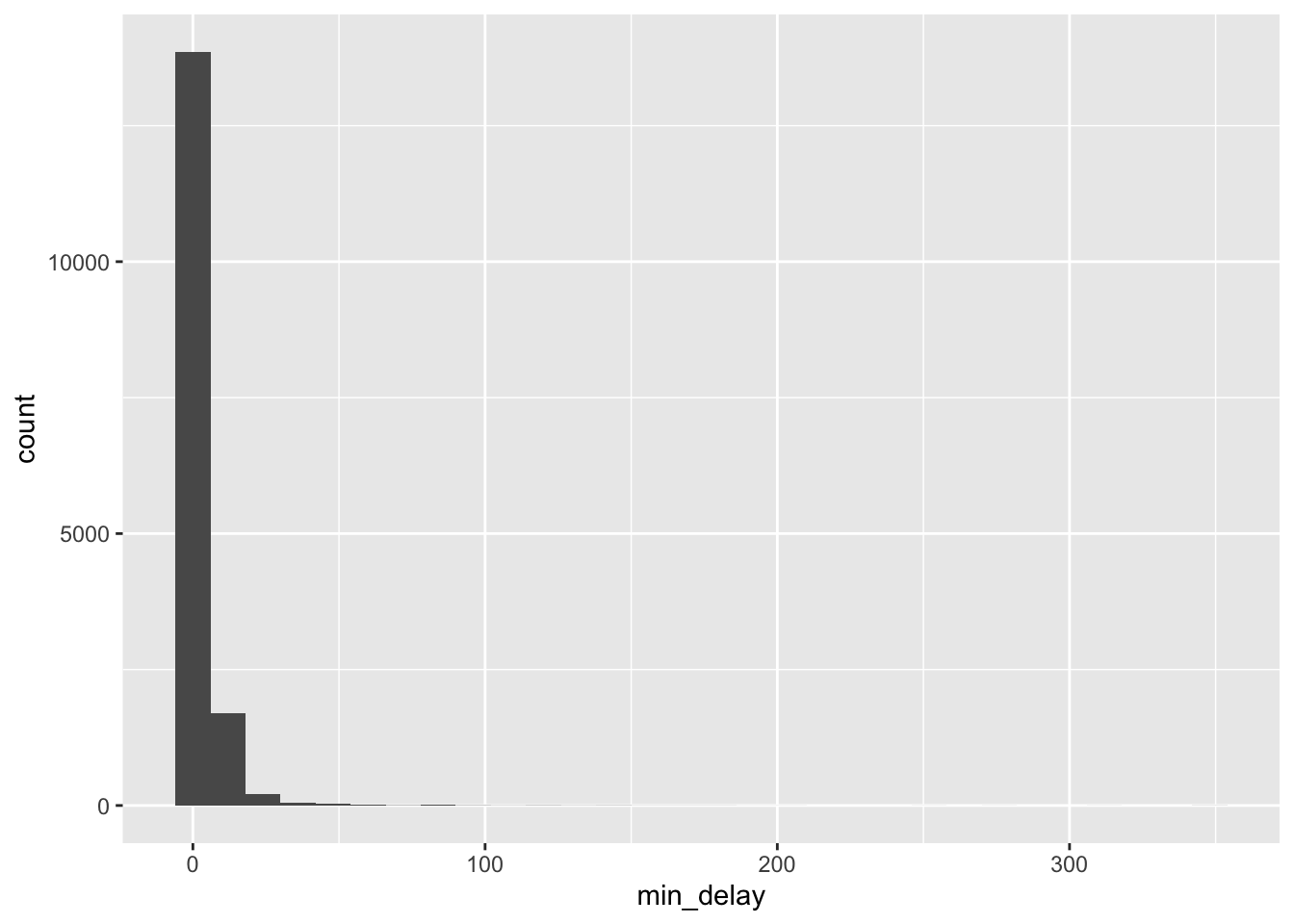
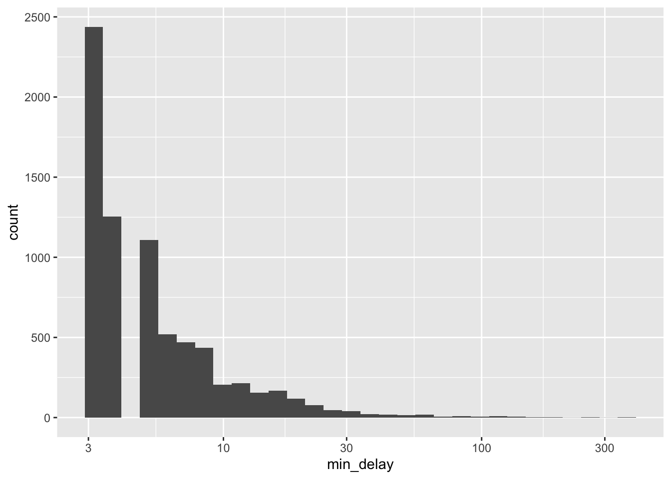
The largely empty graph in Figure 11.1 (a) suggests the presence of outliers. There are a variety of ways to try to understand what could be going on, but one quick way to proceed is to use logarithms, remembering that we would expect values of zero to drop away (Figure 11.1 (b)).
This initial exploration suggests there are a small number of large delays that we might like to explore further. We will join this dataset with “delay_codes” to understand what is going on.
fix_organization_of_codes <-
  rbind(
    delay_codes |>
      select(sub_rmenu_code, code_description_3) |>
      mutate(type = "sub") |>
      rename(
        code = sub_rmenu_code,
        code_desc = code_description_3
      ),
    delay_codes |>
      select(srt_rmenu_code, code_description_7) |>
      mutate(type = "srt") |>
      rename(
        code = srt_rmenu_code,
        code_desc = code_description_7
      )
  )

all_2021_ttc_data_no_dupes_with_explanation <-
  all_2021_ttc_data_no_dupes |>
  mutate(type = if_else(line == "SRT", "srt", "sub")) |>
  left_join(
    fix_organization_of_codes,
    by = c("type", "code")
  )

all_2021_ttc_data_no_dupes_with_explanation |>
  select(station_clean, code, min_delay, code_desc) |>
  arrange(-min_delay)
# A tibble: 15,908 × 4
station_clean code min_delay code_desc
<chr> <chr> <dbl> <chr>
1 MUSEUM PUTTP 348 Traction Power Rail Related
2 EGLINTON PUSTC 343 Signals - Track Circuit Problems
3 WOODBINE MUO 312 Miscellaneous Other
4 MCCOWAN PRSL 275 Loop Related Failures
5 SHEPPARD WEST PUTWZ 255 Work Zone Problems - Track
6 ISLINGTON MUPR1 207 Priority One - Train in Contact With Person
7 SHEPPARD WEST MUPR1 191 Priority One - Train in Contact With Person
8 ROYAL SUAP 182 Assault / Patron Involved
9 ROYAL MUPR1 180 Priority One - Train in Contact With Person
10 SHEPPARD MUPR1 171 Priority One - Train in Contact With Person
# ℹ 15,898 more rowsFrom this we can see that the 348 minute delay was due to “Traction Power Rail Related”, the 343 minute delay was due to “Signals - Track Circuit Problems”, and so on.
Another thing that we are looking for is various groupings of the data, especially where sub-groups may end up with only a small number of observations in them. This is because our analysis could be especially influenced by them. One quick way to do this is to group the data by a variable that is of interest, for instance, “line”, using color.
all_2021_ttc_data_no_dupes_with_explanation |>
  ggplot() +
  geom_histogram(
    aes(
      x = min_delay,
      y = ..density..,
      fill = line
    ),
    position = "dodge",
    bins = 10
  ) +
  scale_x_log10()

all_2021_ttc_data_no_dupes_with_explanation |>
  ggplot() +
  geom_histogram(
    aes(x = min_delay, fill = line),
    position = "dodge",
    bins = 10
  ) +
  scale_x_log10()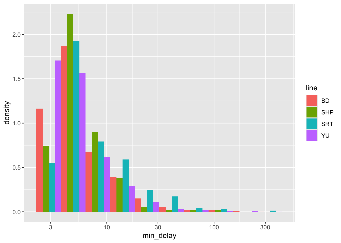
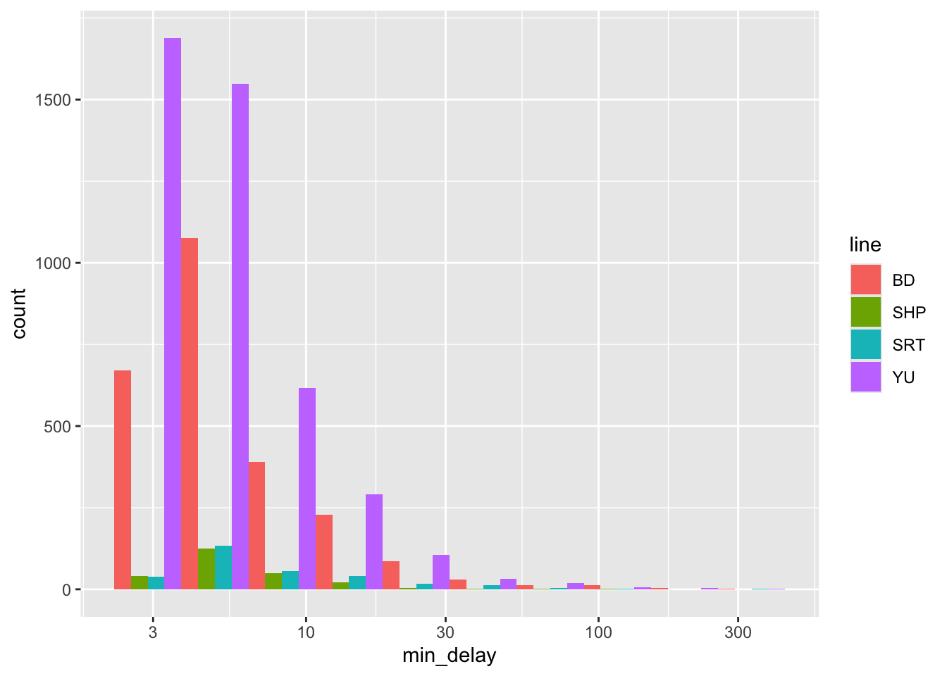
Figure 11.2 (a) uses density so that we can look at the distributions more comparably, but we should also be aware of differences in frequency (Figure 11.2 (b)). In this case, we see that “SHP” and “SRT” have much smaller counts.
To group by another variable, we can add facets (Figure 11.3).
all_2021_ttc_data_no_dupes_with_explanation |>
  ggplot() +
  geom_histogram(
    aes(x = min_delay, fill = line),
    position = "dodge",
    bins = 10
  ) +
  scale_x_log10() +
  facet_wrap(vars(day)) +
  theme(legend.position = "bottom")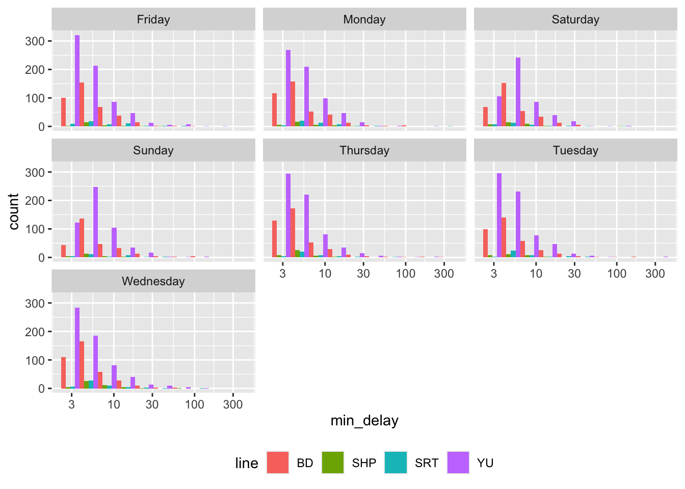
We can also plot the top five stations by mean delay, faceted by line (Figure 11.4). This raises something that we would need to follow up on, which is what is “ZONE” in “YU”?
all_2021_ttc_data_no_dupes_with_explanation |>
  summarise(mean_delay = mean(min_delay), n_obs = n(),
            .by = c(line, station_clean)) |>
  filter(n_obs > 1) |>
  arrange(line, -mean_delay) |>
  slice(1:5, .by = line) |>
  ggplot(aes(station_clean, mean_delay)) +
  geom_col() +
  coord_flip() +
  facet_wrap(vars(line), scales = "free_y")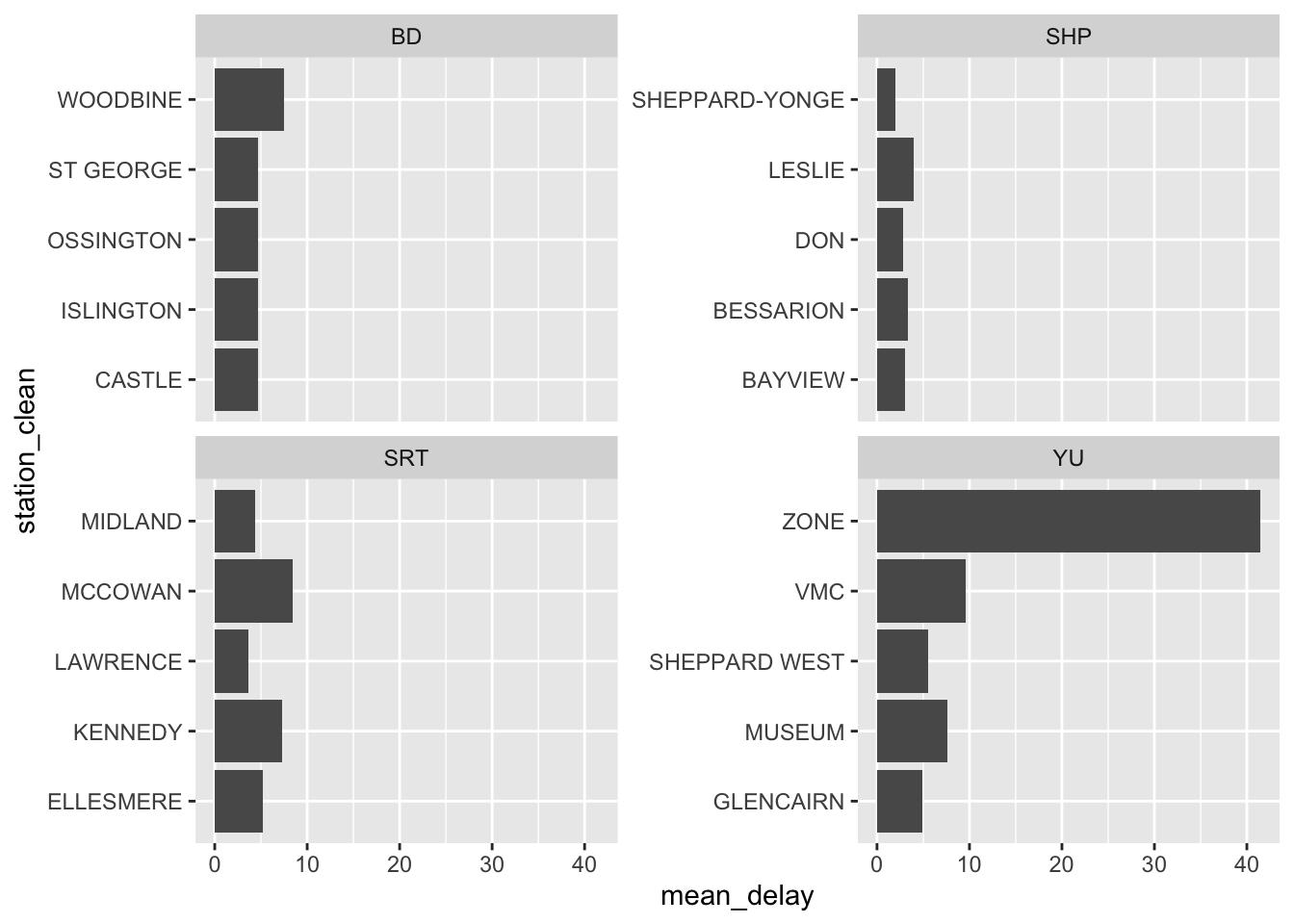
As discussed in Chapter 9, dates are often difficult to work with because they are so prone to having issues. For this reason, it is especially important to consider them during EDA. Let us create a graph by week, to see if there is any seasonality over the course of a year. When using dates, lubridate is especially useful. For instance, we can look at the average delay, of those that were delayed, by week, using week() to construct the weeks (Figure 11.5).
all_2021_ttc_data_no_dupes_with_explanation |>
  filter(min_delay > 0) |>
  mutate(week = week(date)) |>
  summarise(mean_delay = mean(min_delay),
            .by = c(week, line)) |>
  ggplot(aes(week, mean_delay, color = line)) +
  geom_point() +
  geom_smooth() +
  facet_wrap(vars(line), scales = "free_y")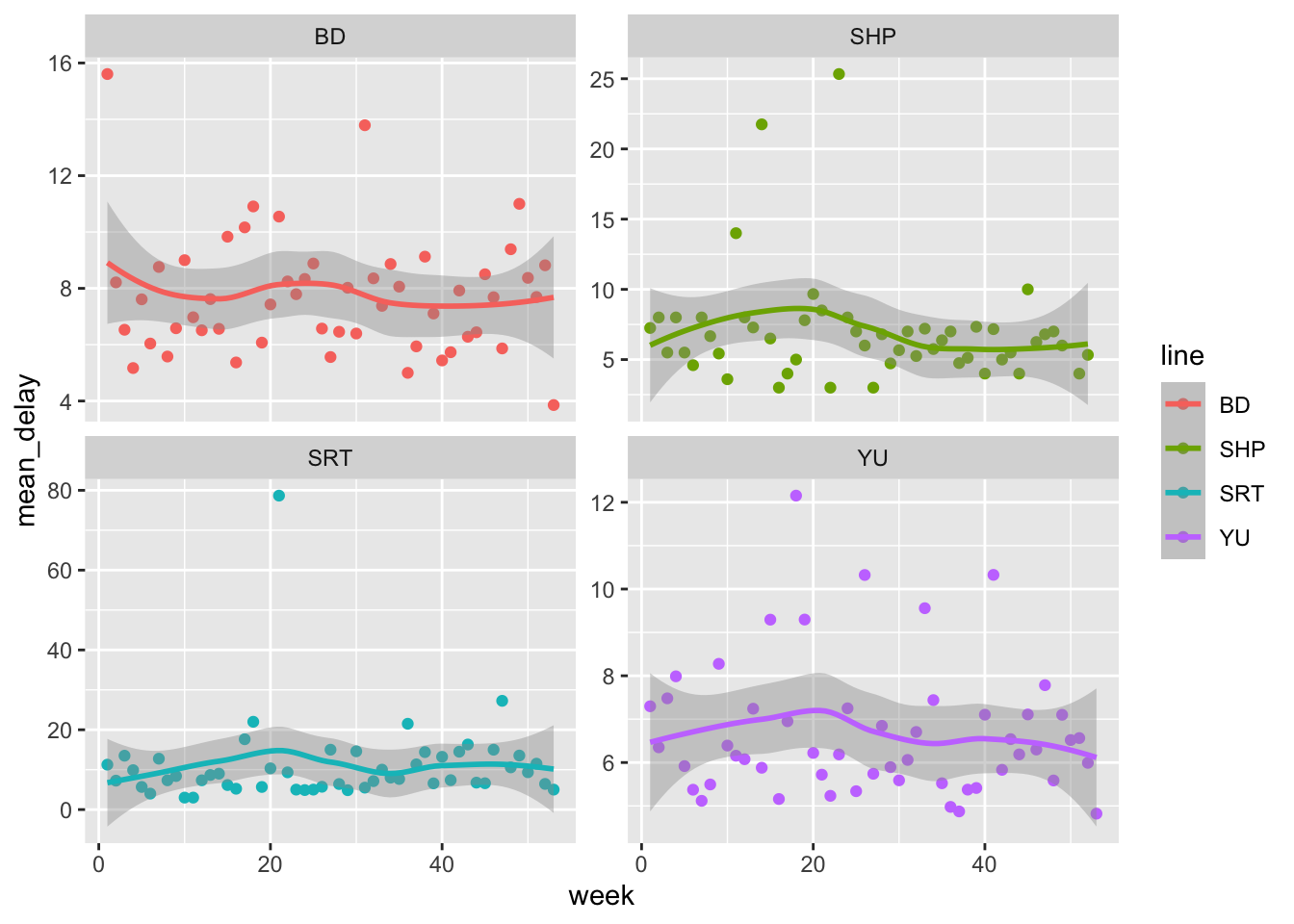
Now let us look at the proportion of delays that were greater than ten minutes (Figure 11.6).
all_2021_ttc_data_no_dupes_with_explanation |>
  mutate(week = week(date)) |>
  summarise(prop_delay = sum(min_delay > 10) / n(),
            .by = c(week, line)) |>
  ggplot(aes(week, prop_delay, color = line)) +
  geom_point() +
  geom_smooth() +
  facet_wrap(vars(line), scales = "free_y")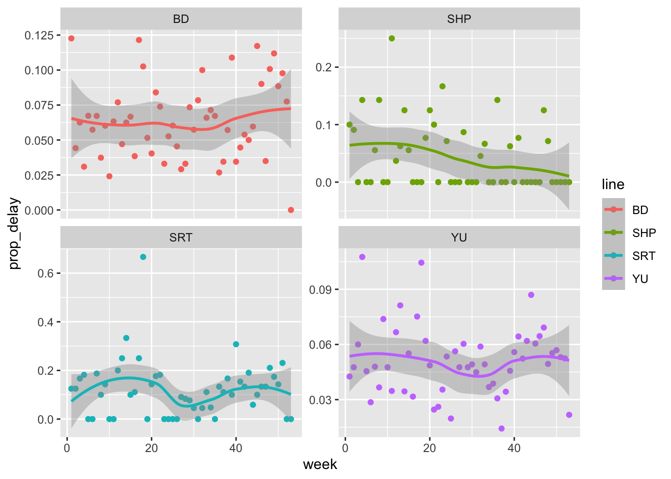
These figures, tables, and analysis may not have a place in a final paper. Instead, they allow us to become comfortable with the data. We note aspects about each that stand out, as well as the warnings and any implications or aspects to return to.
11.4.2 Relationships between variables
We are also interested in looking at the relationship between two variables. We will draw heavily on graphs for this. Appropriate types, for different circumstances, were discussed in Chapter 5. Scatter plots are especially useful for continuous variables, and are a good precursor to modeling. For instance, we may be interested in the relationship between the delay and the gap, which is the number of minutes between trains (Figure 11.7).
all_2021_ttc_data_no_dupes_with_explanation |>
  ggplot(aes(x = min_delay, y = min_gap, alpha = 0.1)) +
  geom_point() +
  scale_x_log10() +
  scale_y_log10()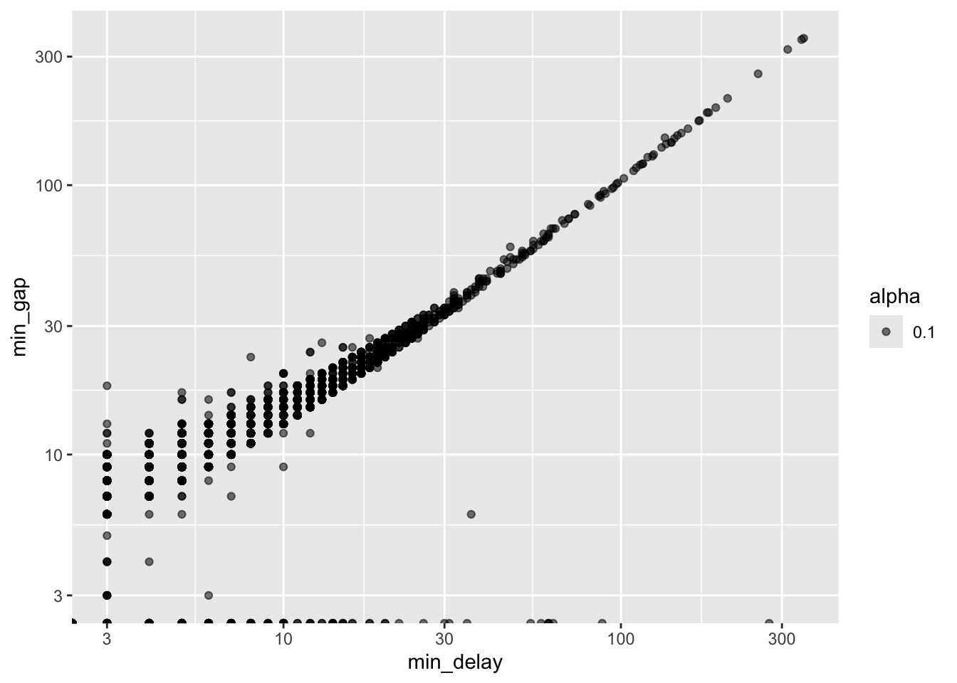
The relationship between categorical variables takes more work, but we could also, for instance, look at the top five reasons for delay by station. We may be interested in whether they differ, and how any difference could be modelled (Figure 11.8).
all_2021_ttc_data_no_dupes_with_explanation |>
  summarise(mean_delay = mean(min_delay),
            .by = c(line, code_desc)) |>
  arrange(-mean_delay) |>
  slice(1:5) |>
  ggplot(aes(x = code_desc, y = mean_delay)) +
  geom_col() +
  facet_wrap(vars(line), scales = "free_y", nrow = 4) +
  coord_flip()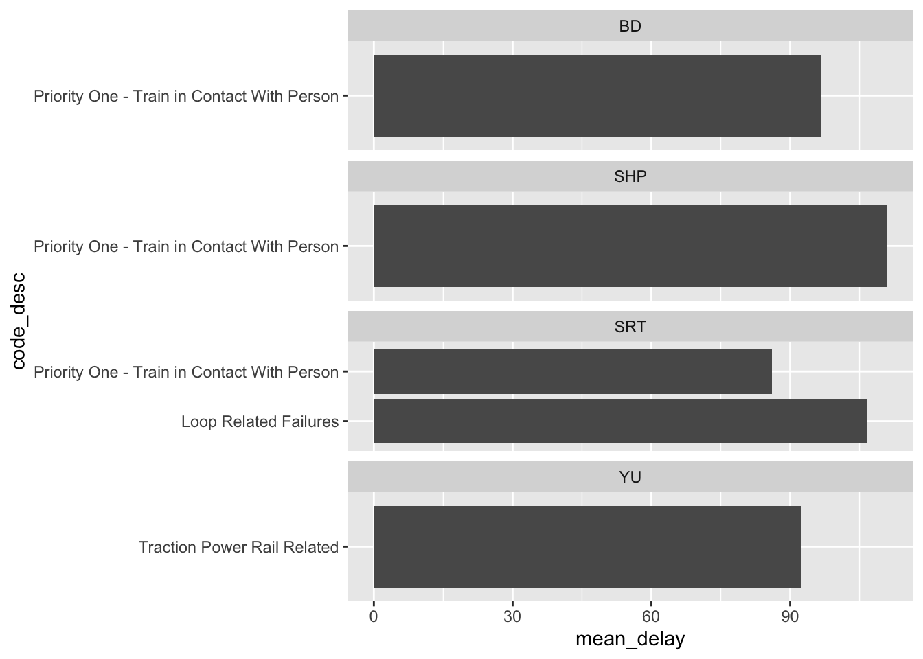
11.5 Airbnb listings in London, England
In this case study we look at Airbnb listings in London, England, as at 14 March 2023. The dataset is from Inside Airbnb (Cox 2021) and we will read it from their website, and then save a local copy. We can give read_csv() a link to where the dataset is and it will download it. This helps with reproducibility because the source is clear. But as that link could change at any time, longer-term reproducibility, as well as wanting to minimize the effect on the Inside Airbnb servers, suggests that we should also save a local copy of the data and then use that.
To get the dataset that we need, go to Inside Airbnb \(\rightarrow\) “Data” \(\rightarrow\) “Get the Data”, then scroll down to London. We are interested in the “listings dataset”, and we right click to get the URL that we need (Figure 11.9). Inside Airbnb update the data that they make available, and so the particular dataset that is available will change over time.
As the original dataset is not ours, we should not make that public without first getting written permission. For instance, we may want to add it to our inputs folder, but use a “.gitignore” entry, covered in Chapter 3, to ensure that we do not push it to GitHub. The “guess_max” option in read_csv() helps us avoid having to specify the column types. Usually read_csv() takes a best guess at the column types based on the first few rows. But sometimes those first ones are misleading and so “guess_max” forces it to look at a larger number of rows to try to work out what is going on. Paste the URL that we copied from Inside Airbnb into the URL part. And once it is downloaded, save a local copy.
url <-
  paste0(
    "http://data.insideairbnb.com/united-kingdom/england/",
    "london/2023-03-14/data/listings.csv.gz"
  )

airbnb_data <-
  read_csv(
    file = url,
    guess_max = 20000
  )

write_csv(airbnb_data, "airbnb_data.csv")

airbnb_data
We should refer to this local copy of our data when we run our scripts to explore the data, rather than asking the Inside Airbnb servers for the data each time. It might be worth even commenting out this call to their servers to ensure that we do not accidentally stress their service.
Again, add this filename—“airbnb_data.csv”—to the “.gitignore” file so that it is not pushed to GitHub. The size of the dataset will create complications that we would like to avoid.
While we need to archive this CSV because that is the original, unedited data, at more than 100MB it is a little unwieldy. For exploratory purposes we will create a parquet file with selected variables (we do this in an iterative way, using names(airbnb_data) to work out the variable names).
airbnb_data_selected <-
  airbnb_data |>
  select(
    host_id,
    host_response_time,
    host_is_superhost,
    host_total_listings_count,
    neighbourhood_cleansed,
    bathrooms,
    bedrooms,
    price,
    number_of_reviews,
    review_scores_rating,
    review_scores_accuracy,
    review_scores_value
  )

write_parquet(
  x = airbnb_data_selected,
  sink =
    "2023-03-14-london-airbnblistings-select_variables.parquet"
  )

rm(airbnb_data)
11.5.1 Distribution and properties of individual variables
First we might be interested in price. It is a character at the moment and so we need to convert it to a numeric. This is a common problem and we need to be a little careful that it does not all just convert to NAs. If we just force the price variable to be a numeric then it will go to NA because there are a lot of characters where it is unclear what the numeric equivalent is, such as “$”. We need to remove those characters first.
airbnb_data_selected$price |>
  head()
[1] "$100.00" "$65.00" "$132.00" "$100.00" "$120.00" "$43.00" airbnb_data_selected$price |>
str_split("") |>
unlist() |>
unique() [1] "$" "1" "0" "." "6" "5" "3" "2" "4" "9" "8" "7" ","airbnb_data_selected |>
select(price) |>
filter(str_detect(price, ","))# A tibble: 1,629 × 1
price
<chr>
1 $3,070.00
2 $1,570.00
3 $1,480.00
4 $1,000.00
5 $1,100.00
6 $1,433.00
7 $1,800.00
8 $1,000.00
9 $1,000.00
10 $1,000.00
# ℹ 1,619 more rowsairbnb_data_selected <-
airbnb_data_selected |>
mutate(
price = str_remove_all(price, "[\\$,]"),
price = as.integer(price)
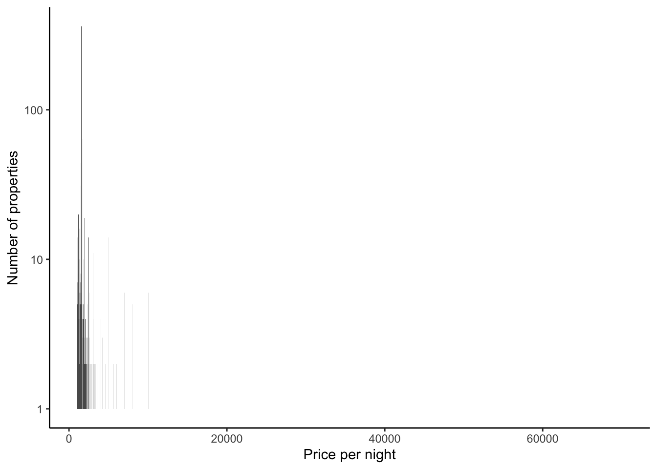
)Now we can look at the distribution of prices (Figure 11.10 (a)). There are outliers, so again we might like to consider it on the log scale (Figure 11.10 (b)).
airbnb_data_selected |>
  ggplot(aes(x = price)) +
  geom_histogram(binwidth = 10) +
  theme_classic() +
  labs(
    x = "Price per night",
    y = "Number of properties"
  )

airbnb_data_selected |>
  filter(price > 1000) |>
  ggplot(aes(x = price)) +
  geom_histogram(binwidth = 10) +
  theme_classic() +
  labs(
    x = "Price per night",
    y = "Number of properties"
  ) +
  scale_y_log10()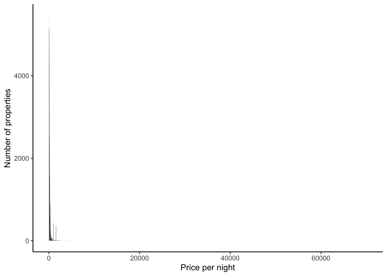
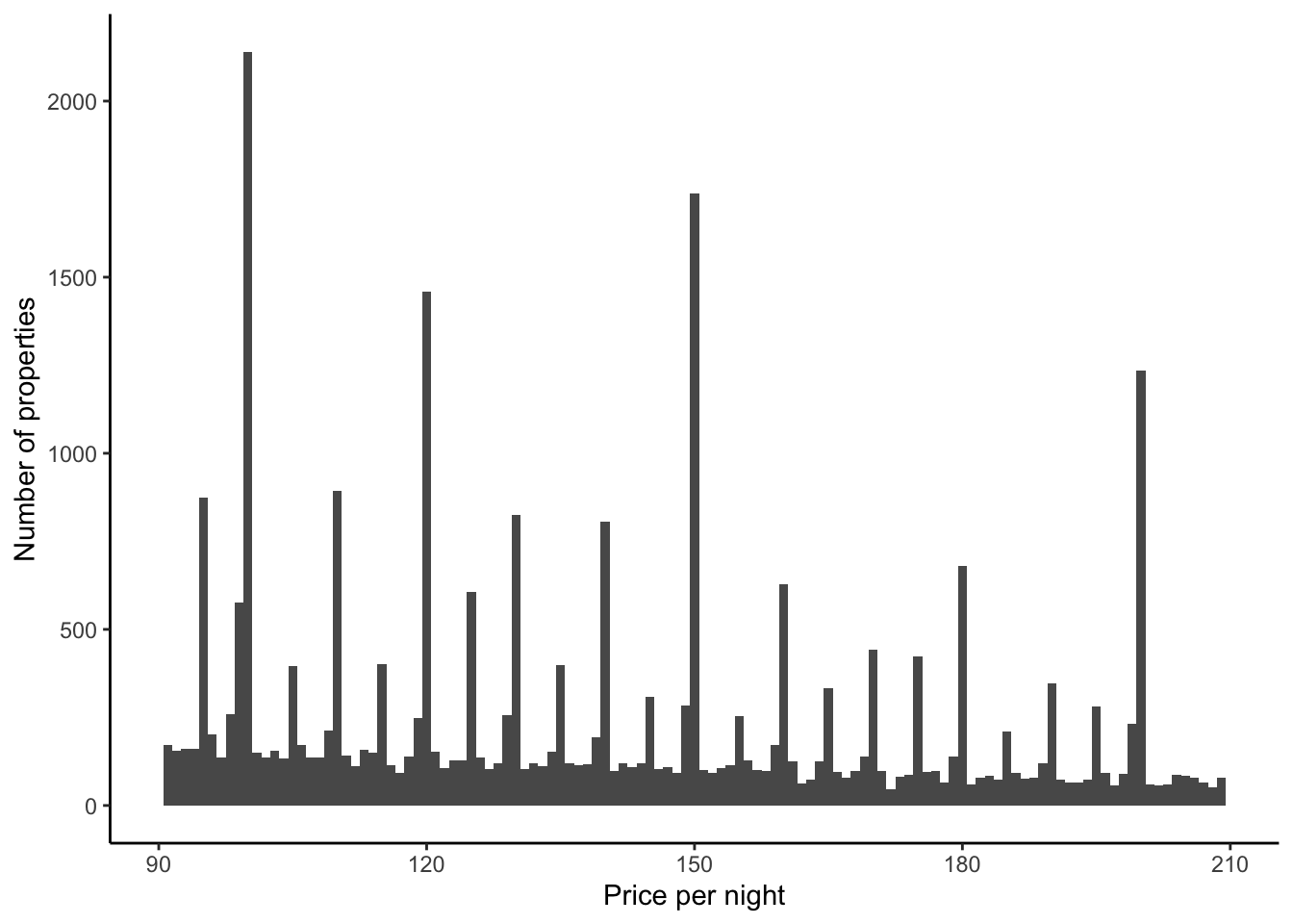
Turning to Figure 11.11, if we focus on prices that are less than $1,000, then we see that most properties have a nightly price less than $250 (Figure 11.11 (a)). In the same way that we saw some bunching in ages in Chapter 9, it looks like there is some bunching of prices here. It might be that this is happening around numbers ending in zero or nine. Let us just zoom in on prices between $90 and $210, out of interest, but change the bins to be smaller (Figure 11.11 (b)).
airbnb_data_selected |>
  filter(price < 1000) |>
  ggplot(aes(x = price)) +
  geom_histogram(binwidth = 10) +
  theme_classic() +
  labs(
    x = "Price per night",
    y = "Number of properties"
  )

airbnb_data_selected |>
  filter(price > 90) |>
  filter(price < 210) |>
  ggplot(aes(x = price)) +
  geom_histogram(binwidth = 1) +
  theme_classic() +
  labs(
    x = "Price per night",
    y = "Number of properties"
  )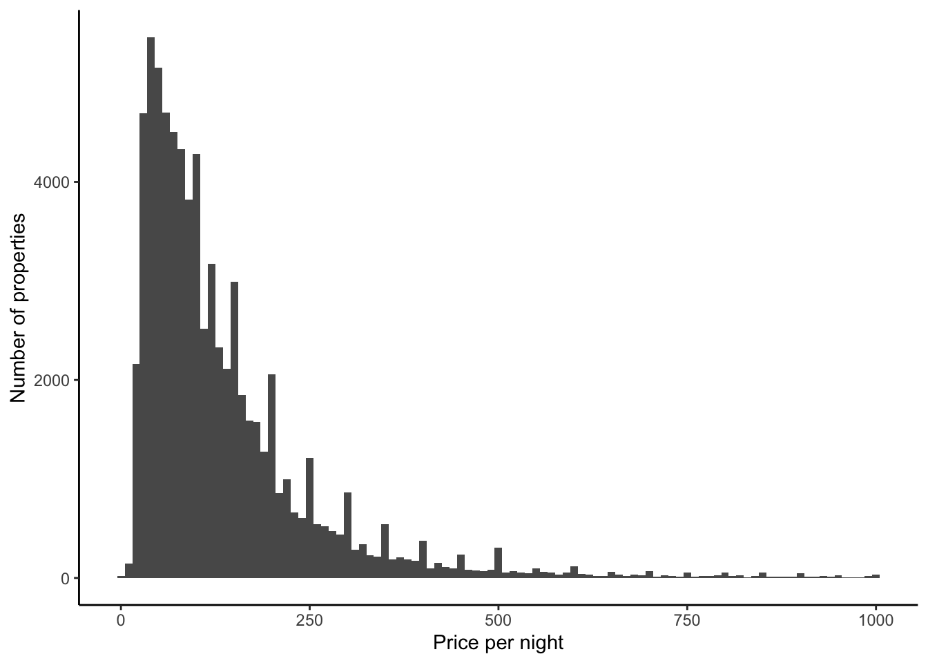
For now, we will just remove all prices that are more than $999.
airbnb_data_less_1000 <-
  airbnb_data_selected |>
  filter(price < 1000)
Superhosts are especially experienced Airbnb hosts, and we might be interested to learn more about them. For instance, a host either is or is not a superhost, and so we would not expect any NAs. But we can see that there are NAs. It might be that the host removed a listing or similar, but this is something that we would need to look further into.
airbnb_data_less_1000 |>
  filter(is.na(host_is_superhost))
# A tibble: 13 × 12
host_id host_response_time host_is_superhost host_total_listings_count
<dbl> <chr> <lgl> <dbl>
1 317054510 within an hour NA 5
2 316090383 within an hour NA 6
3 315016947 within an hour NA 2
4 374424554 within an hour NA 2
5 97896300 N/A NA 10
6 316083765 within an hour NA 7
7 310628674 N/A NA 5
8 179762278 N/A NA 10
9 315037299 N/A NA 1
10 316090018 within an hour NA 6
11 375515965 within an hour NA 2
12 341372520 N/A NA 7
13 180634347 within an hour NA 5
# ℹ 8 more variables: neighbourhood_cleansed <chr>, bathrooms <lgl>,
# bedrooms <dbl>, price <int>, number_of_reviews <dbl>,
# review_scores_rating <dbl>, review_scores_accuracy <dbl>,
# review_scores_value <dbl>We will also want to create a binary variable from this. It is true/false at the moment, which is fine for the modeling, but there are a handful of situations where it will be easier if we have a 0/1. And for now we will just remove anyone with a NA for whether they are a superhost.
airbnb_data_no_superhost_nas <-
airbnb_data_less_1000 |>
filter(!is.na(host_is_superhost)) |>
mutate(
host_is_superhost_binary =
as.numeric(host_is_superhost)
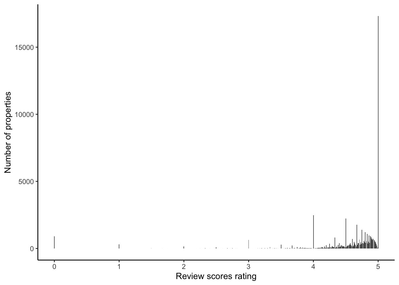
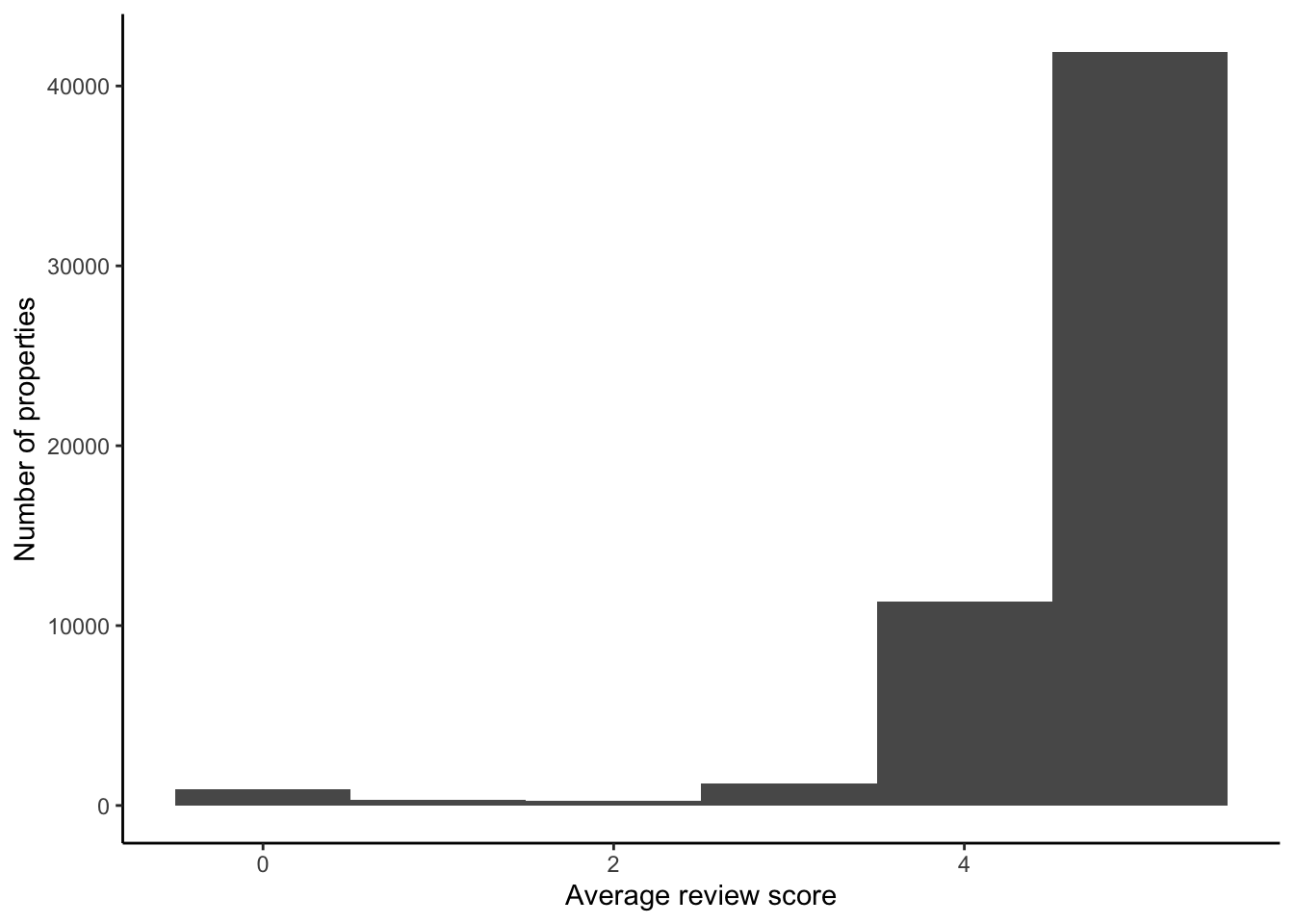
)On Airbnb, guests can give one to five star ratings across a variety of different aspects, including cleanliness, accuracy, value, and others. But when we look at the reviews in our dataset, it is clear that it is effectively a binary, and almost entirely the case that either the rating is five stars or not (Figure 11.12).
airbnb_data_no_superhost_nas |>
  ggplot(aes(x = review_scores_rating)) +
  geom_bar() +
  theme_classic() +
  labs(
    x = "Review scores rating",
    y = "Number of properties"
  )
We would like to deal with the NAs in “review_scores_rating”, but this is more complicated as there are a lot of them. It may be that this is just because they do not have any reviews.
airbnb_data_no_superhost_nas |>
  filter(is.na(review_scores_rating)) |>
  nrow()
[1] 17681airbnb_data_no_superhost_nas |>
filter(is.na(review_scores_rating)) |>
select(number_of_reviews) |>
table()number_of_reviews
0
17681 These properties do not have a review rating yet because they do not have enough reviews. It is a large proportion of the total, at almost a fifth of them so we might like to look at this in more detail using counts. We are interested to see whether there is something systematic happening with these properties. For instance, if the NAs were being driven by, say, some requirement of a minimum number of reviews, then we would expect they would all be missing.
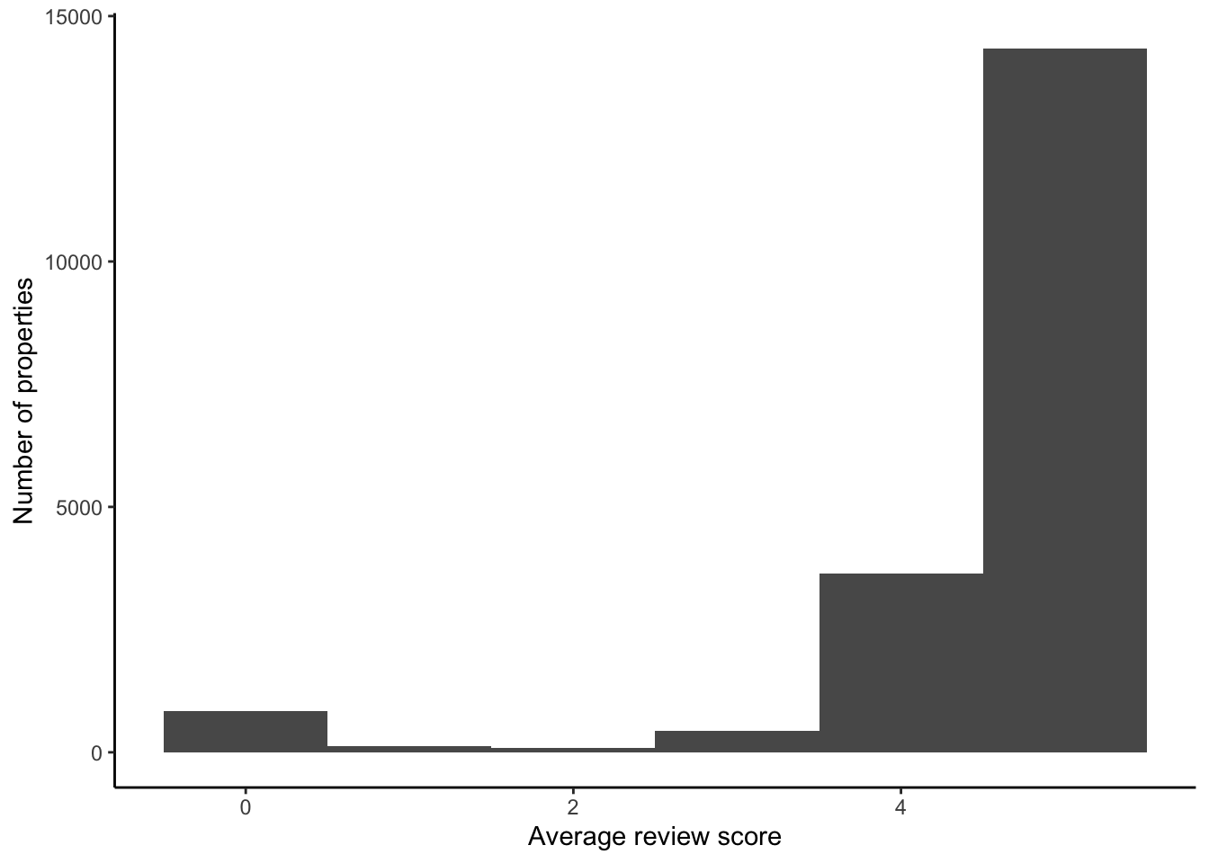
One approach would be to just focus on those that are not missing and the main review score (Figure 11.13).
airbnb_data_no_superhost_nas |>
  filter(!is.na(review_scores_rating)) |>
  ggplot(aes(x = review_scores_rating)) +
  geom_histogram(binwidth = 1) +
  theme_classic() +
  labs(
    x = "Average review score",
    y = "Number of properties"
  )
For now, we will remove anyone with an NA in their main review score, even though this will remove roughly 20 per cent of observations. If we ended up using this dataset for actual analysis, then we would want to justify this decision in an appendix or similar.
airbnb_data_has_reviews <-
  airbnb_data_no_superhost_nas |>
  filter(!is.na(review_scores_rating))
Another important factor is how quickly a host responds to an inquiry. Airbnb allows hosts up to 24 hours to respond, but encourages responses within an hour.
airbnb_data_has_reviews |>
  count(host_response_time)
# A tibble: 5 × 2
host_response_time n
<chr> <int>
1 N/A 19479
2 a few days or more 712
3 within a day 4512
4 within a few hours 6894
5 within an hour 24321It is unclear how a host could have a response time of NA. It may be this is related to some other variable. Interestingly it seems like what looks like “NAs” in “host_response_time” variable are not coded as proper NAs, but are instead being treated as another category. We will recode them to be actual NAs and change the variable to be a factor.
airbnb_data_has_reviews <-
  airbnb_data_has_reviews |>
  mutate(
    host_response_time = if_else(
      host_response_time == "N/A",
      NA_character_,
      host_response_time
    ),
    host_response_time = factor(host_response_time)
  )
There is an issue with NAs as there are a lot of them. For instance, we might be interested to see if there is a relationship with the review score (Figure 11.14). There are a lot that have an overall review of 100.
airbnb_data_has_reviews |>
  filter(is.na(host_response_time)) |>
  ggplot(aes(x = review_scores_rating)) +
  geom_histogram(binwidth = 1) +
  theme_classic() +
  labs(
    x = "Average review score",
    y = "Number of properties"
  )
Usually missing values are dropped by ggplot2. We can use geom_miss_point() from naniar to include them in the graph (Figure 11.15).
airbnb_data_has_reviews |>
  ggplot(aes(
    x = host_response_time,
    y = review_scores_accuracy
  )) +
  geom_miss_point() +
  labs(
    x = "Host response time",
    y = "Review score accuracy",
    color = "Is missing?"
  ) +
  theme(axis.text.x = element_text(angle = 90, vjust = 0.5, hjust=1))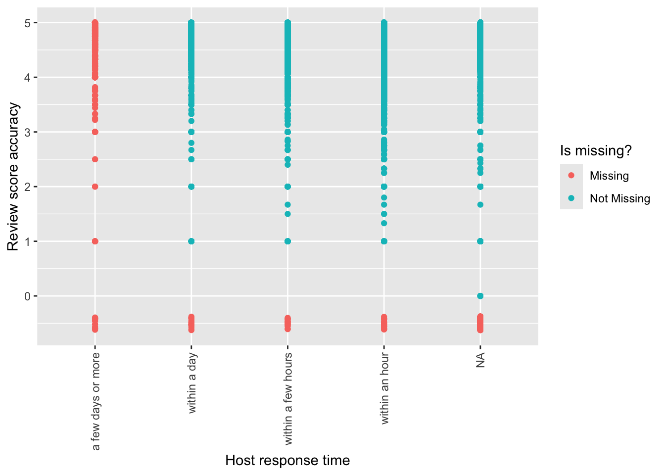
For now, we will remove anyone with a NA in their response time. This will again remove roughly another 20 per cent of the observations.
airbnb_data_selected <-
  airbnb_data_has_reviews |>
  filter(!is.na(host_response_time))
We might be interested in how many properties a host has on Airbnb (Figure 11.16).
airbnb_data_selected |>
  ggplot(aes(x = host_total_listings_count)) +
  geom_histogram() +
  scale_x_log10() +
  labs(
    x = "Total number of listings, by host",
    y = "Number of hosts"
  )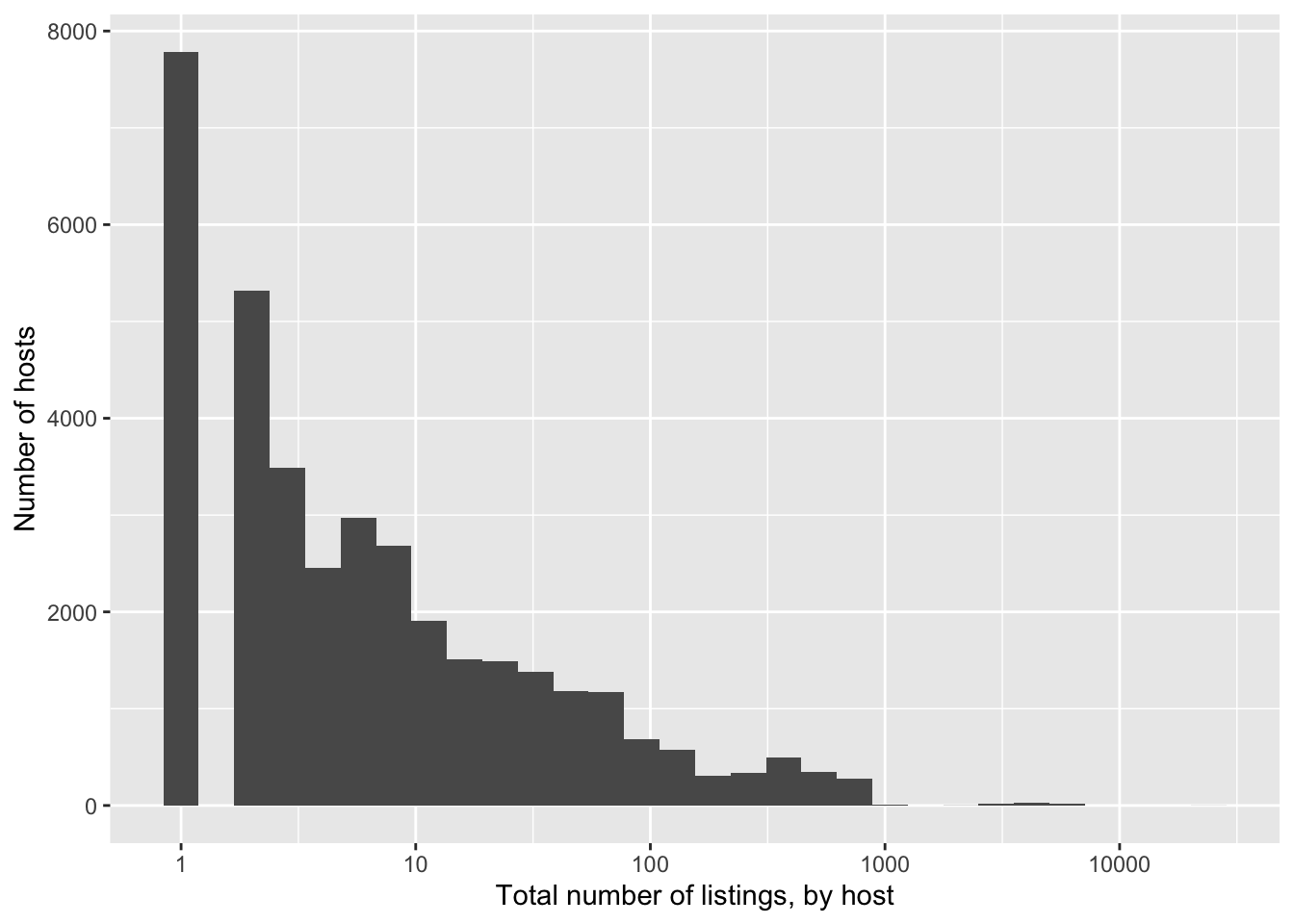
Based on Figure 11.16 we can see there are a large number who have somewhere in the 2-500 properties range, with the usual long tail. The number with that many listings is unexpected and worth following up on. And there are a bunch with NA that we will need to deal with.
airbnb_data_selected |>
  filter(host_total_listings_count >= 500) |>
  head()
# A tibble: 6 × 13
host_id host_response_time host_is_superhost host_total_listings_count
<dbl> <fct> <lgl> <dbl>
1 439074505 within an hour FALSE 3627
2 156158778 within an hour FALSE 558
3 156158778 within an hour FALSE 558
4 156158778 within an hour FALSE 558
5 156158778 within an hour FALSE 558
6 156158778 within an hour FALSE 558
# ℹ 9 more variables: neighbourhood_cleansed <chr>, bathrooms <lgl>,
# bedrooms <dbl>, price <int>, number_of_reviews <dbl>,
# review_scores_rating <dbl>, review_scores_accuracy <dbl>,
# review_scores_value <dbl>, host_is_superhost_binary <dbl>There is nothing that immediately jumps out as odd about the people with more than ten listings, but at the same time it is still not clear. For now, we will move on and focus on only those with one property for simplicity.
airbnb_data_selected <-
  airbnb_data_selected |>
  add_count(host_id) |>
  filter(n == 1) |>
  select(-n)
11.5.2 Relationships between variables
We might like to make some graphs to see if there are any relationships between variables that become clear. Some aspects that come to mind are looking at prices and comparing with reviews, superhosts, number of properties, and neighborhood.
We can look at the relationship between price and reviews, and whether they are a super-host, for properties with more than one review (Figure 11.17).
airbnb_data_selected |>
  filter(number_of_reviews > 1) |>
  ggplot(aes(x = price, y = review_scores_rating,
             color = host_is_superhost)) +
  geom_point(size = 1, alpha = 0.1) +
  theme_classic() +
  labs(
    x = "Price per night",
    y = "Average review score",
    color = "Superhost"
  ) +
  scale_color_brewer(palette = "Set1")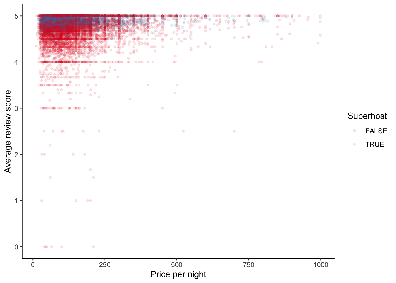
One of the aspects that may make someone a superhost is how quickly they respond to inquiries. One could imagine that being a superhost involves quickly saying yes or no to inquiries. Let us look at the data. First, we want to look at the possible values of superhost by their response times.
airbnb_data_selected |>
  count(host_is_superhost) |>
  mutate(
    proportion = n / sum(n),
    proportion = round(proportion, digits = 2)
  )
# A tibble: 2 × 3
host_is_superhost n proportion
<lgl> <int> <dbl>
1 FALSE 10480 0.74
2 TRUE 3672 0.26Fortunately, it looks like when we removed the reviews rows we removed any NAs from whether they were a superhost, but if we go back and look into that we may need to check again. We could build a table that looks at a hosts response time by whether they are a superhost using tabyl() from janitor. It is clear that if a host does not respond within an hour then it is unlikely that they are a superhost.
airbnb_data_selected |>
  tabyl(host_response_time, host_is_superhost) |>
  adorn_percentages("col") |>
  adorn_pct_formatting(digits = 0) |>
  adorn_ns() |>
  adorn_title()
host_is_superhost
host_response_time FALSE TRUE
a few days or more 5% (489) 0% (8)
within a day 22% (2,322) 11% (399)
within a few hours 23% (2,440) 25% (928)
within an hour 50% (5,229) 64% (2,337)Finally, we could look at neighborhood. The data provider has attempted to clean the neighborhood variable for us, so we will use that variable for now. Although if we ended up using this variable for our actual analysis we would want to examine how it was constructed.
airbnb_data_selected |>
  tabyl(neighbourhood_cleansed) |>
  adorn_pct_formatting() |>
  arrange(-n) |>
  filter(n > 100) |>
  adorn_totals("row") |>
  head()
neighbourhood_cleansed n percent
Hackney 1172 8.3%
Westminster 965 6.8%
Tower Hamlets 956 6.8%
Southwark 939 6.6%
Lambeth 914 6.5%
Wandsworth 824 5.8%We will quickly run a model on our dataset. We will cover modeling in more detail in Chapter 12, but we can use models during EDA to help get a better sense of relationships that may exist between multiple variables in a dataset. For instance, we may like to see whether we can forecast whether someone is a superhost, and the factors that go into explaining that. As the outcome is binary, this is a good opportunity to use logistic regression. We expect that superhost status will be associated with faster responses and better reviews. Specifically, the model that we estimate is:
\[\mbox{Prob(Is superhost} = 1) = \mbox{logit}^{-1}\left( \beta_0 + \beta_1 \mbox{Response time} + \beta_2 \mbox{Reviews} + \epsilon\right)\]
We estimate the model using glm.
logistic_reg_superhost_response_review <-
  glm(
    host_is_superhost ~
      host_response_time +
      review_scores_rating,
    data = airbnb_data_selected,
    family = binomial
  )
After installing and loading modelsummary we can have a quick look at the results using modelsummary() (Table 11.3).
modelsummary(logistic_reg_superhost_response_review)| (1) | |
|---|---|
| (Intercept) | -16.369 |
| (0.673) | |
| host_response_timewithin a day | 2.230 |
| (0.361) | |
| host_response_timewithin a few hours | 3.035 |
| (0.359) | |
| host_response_timewithin an hour | 3.279 |
| (0.358) | |
| review_scores_rating | 2.545 |
| (0.116) | |
| Num.Obs. | 14152 |
| AIC | 14948.4 |
| BIC | 14986.2 |
| Log.Lik. | -7469.197 |
| F | 197.407 |
| RMSE | 0.42 |
We see that each of the levels is positively associated with the probability of being a superhost. However, having a host that responds within an hour is associated with individuals that are superhosts in our dataset.
We will save this analysis dataset.
write_parquet(
  x = airbnb_data_selected,
  sink = "2023-05-05-london-airbnblistings-analysis_dataset.parquet"
  )
11.6 Concluding remarks
In this chapter we have considered exploratory data analysis (EDA), which is the active process of getting to know a dataset. We focused on missing data, the distributions of variables, and the relationships between variables. And we extensively used graphs and tables to do this.
The approaches to EDA will vary depending on context, and the issues and features that are encountered in the dataset. It will also depend on your skills, for instance it is common to consider regression models, and dimensionality reduction approaches.
11.7 Exercises
Practice
- (Plan) Consider the following scenario: We have some data on age from a social media company that has about 80 per cent of the US population on the platform. Please sketch what that dataset could look like and then sketch a graph that you could build to show all observations.
- (Simulate) Please further consider the scenario described and simulate the situation. Use parquet due to size. Please include ten tests based on the simulated data. Submit a link to a GitHub Gist that contains your code.
- (Acquire) Please describe a possible source of such a dataset.
- (Explore) Please use
ggplot2to build the graph that you sketched. Submit a link to a GitHub Gist that contains your code. - (Communicate) Please write one page about what you did, and be careful to discuss some of the threats to the estimate that you make based on the sample.
Quiz
- Summarize Tukey (1962) in a few paragraphs and then relate it to data science.
- In your own words what is exploratory data analysis (please write at least three paragraphs, and include citations and examples)?
- Suppose you have a dataset called “my_data”, which has two columns: “first_col” and “second_col”. Please write some R code that would generate a graph (the type of graph does not matter). Submit a link to a GitHub Gist that contains your code.
- Consider a dataset that has 500 observations and three variables, so there are 1,500 cells. If 100 of the rows are missing a cell for at least one of the columns, then would you: a) remove the whole row from your dataset, b) try to run your analysis on the data as is, or c) some other procedure? What if your dataset had 10,000 rows instead, but the same number of missing rows? Discuss, with examples and citations, in at least three paragraphs.
- Please discuss three ways of identifying unusual values, writing at least one paragraph for each.
- What is the difference between a categorical and continuous variable?
- What is the difference between a factor and an integer variable?
- How can we think about who is systematically excluded from a dataset?
- Using
opendatatoronto, download the data on mayoral campaign contributions for 2014. (Note: the 2014 file you will get fromget_resource()contains many sheets, so just keep the sheet that relates to the mayor election).- Clean up the data format (fixing the parsing issue and standardizing the column names using
janitor). - Summarize the variables in the dataset. Are there missing values, and if so, should we be worried about them? Is every variable in the format it should be? If not, create new variable(s) that are in the right format.
- Visually explore the distribution of values of the contributions. What contributions are notable outliers? Do they share similar characteristic(s)? It may be useful to plot the distribution of contributions without these outliers to get a better sense of most of the data.
- List the top five candidates in each of these categories: 1) total contributions; 2) mean contribution; and 3) number of contributions.
- Repeat that process, but without contributions from the candidates themselves.
- How many contributors gave money to more than one candidate?
- Clean up the data format (fixing the parsing issue and standardizing the column names using
- List three geoms that produce graphs that have bars in
ggplot(). - Consider a dataset with 10,000 observations and 27 variables. For each observation, there is at least one missing variable. Please discuss, in a paragraph or two, the steps that you would take to understand what is going on.
- Known missing data are those that leave holes in your dataset. But what about data that were never collected? Please look at McClelland (2019) and Luscombe and McClelland (2020). Look into how they gathered their dataset and what it took to put this together. What is in the dataset and why? What is missing and why? How could this affect the results? How might similar biases enter into other datasets that you have used or read about?
Class activities
- Fix the following file names.
example_project/
├── .gitignore
├── Example project.Rproj
├── scripts
│   ├── simulate data.R
│   ├── DownloadData.R
│   ├── data-cleaning.R
│ ├── test(new)data.R- Consider Anscombe’s Quartet, introduced in Chapter 5. We will randomly remove certain observations. Please pretend you are given the dataset with missing data. Pick one of the approaches to dealing with missing data from Chapter 6 and Chapter 11, then write code to implement your choice. Compare:
- the results with the actual observations;
- the summary statistics with the actual summary statistics; and
- build a graph that shows the missing and actual data on the one graph.
set.seed(853)

tidy_anscombe <-
  anscombe |>
  pivot_longer(everything(),
               names_to = c(".value", "set"),
               names_pattern = "(.)(.)")

tidy_anscombe_MCAR <-
  tidy_anscombe |>
  mutate(row_number = row_number()) |>
  mutate(
    x = if_else(row_number %in% sample(
      x = 1:nrow(tidy_anscombe), size = 10
    ), NA_real_, x),
    y = if_else(row_number %in% sample(
      x = 1:nrow(tidy_anscombe), size = 10
    ), NA_real_, y)
  ) |>
  select(-row_number)

tidy_anscombe_MCAR
# A tibble: 44 × 3
set x y
<chr> <dbl> <dbl>
1 1 10 8.04
2 2 10 9.14
3 3 NA NA
4 4 8 NA
5 1 8 6.95
6 2 8 8.14
7 3 8 6.77
8 4 8 5.76
9 1 NA 7.58
10 2 13 8.74
# ℹ 34 more rows# ADD CODE HERE- Redo the exercise, but with the following dataset. What is the main difference in this case?
tidy_anscombe_MNAR <-
  tidy_anscombe |>
  arrange(desc(x)) |>
  mutate(
    ordered_x_rows = 1:nrow(tidy_anscombe),
    x = if_else(ordered_x_rows %in% 1:10, NA_real_, x)
  ) |>
  select(-ordered_x_rows) |>
  arrange(desc(y)) |>
  mutate(
    ordered_y_rows = 1:nrow(tidy_anscombe),
    y = if_else(ordered_y_rows %in% 1:10, NA_real_, y)
  ) |>
  arrange(set) |>
  select(-ordered_y_rows)

tidy_anscombe_MNAR
# A tibble: 44 × 3
set x y
<chr> <dbl> <dbl>
1 1 NA NA
2 1 NA NA
3 1 9 NA
4 1 11 8.33
5 1 10 8.04
6 1 NA 7.58
7 1 6 7.24
8 1 8 6.95
9 1 5 5.68
10 1 7 4.82
# ℹ 34 more rows# ADD CODE HERE- Using pair programming (being sure to switch every 5 minutes), create a new R project, then read in the following dataset from Bombieri et al. (2023) and explore it by adding code and notes to a Quarto document.
download.file(url = "https://doi.org/10.1371/journal.pbio.3001946.s005",
              destfile = "data.xlsx")

data <-
  read_xlsx(path = "data.xlsx",
            col_types = "text") |>
  clean_names() |>
mutate(date = convert_to_date(date))- Play the role of a data scientist partnering with a subject expert by pairing up with another student. Your partner gets to pick a topic, and a question, and it should be something they know well but you do not (perhaps something about their country, if they are an international student). You need to work with them to develop an analysis plan, simulate some data, and create a graph that they can use.
Task
Pick one of the following options. Use Quarto, and include an appropriate title, author, date, link to a GitHub repo, and citations. Submit a PDF.
Option 1:
Repeat the missing data exercise conducted for the US states and population, but for the “bill_length_mm” variable in the penguins() dataset available from palmerpenguins. Compare the imputed value with the actual value.
Write at least two pages about what you did and what you found.
Following this, please pair with another student and exchange your written work. Update it based on their feedback, and be sure to acknowledge them by name in your paper.
Option 2:
Carry out an Airbnb EDA but for Paris.
Option 3:
Please write at least two pages about the topic: “what is missing data and what should you do about it?”
Following this, please pair with another student and exchange your written work. Update it based on their feedback, and be sure to acknowledge them by name in your paper.