library(carData)
library(datasauRus)
library(ggmap)
library(janitor)
library(knitr)
library(maps)
library(mapproj)
library(modelsummary)
library(opendatatoronto)
library(patchwork)
library(tidygeocoder)
library(tidyverse)
library(troopdata)
library(WDI)5 Graphs, tables, and maps
Chapman and Hall/CRC published this book in July 2023. You can purchase that here. This online version has some updates to what was printed.
Prerequisites
- Read R for Data Science, (Wickham, Çetinkaya-Rundel, and Grolemund [2016] 2023)
- Focus on Chapter 1 “Data visualization”, which provides an overview of
ggplot2.
- Focus on Chapter 1 “Data visualization”, which provides an overview of
- Read Data Visualization: A Practical Introduction, (Healy 2018)
- Focus on Chapter 3 “Make a plot”, which provides an overview of
ggplot2with different emphasis.
- Focus on Chapter 3 “Make a plot”, which provides an overview of
- Watch The Glamour of Graphics, (Chase 2020)
- This video details ideas for how to improve a plot made with
ggplot2.
- This video details ideas for how to improve a plot made with
- Read Testing Statistical Charts: What Makes a Good Graph?, (Vanderplas, Cook, and Hofmann 2020)
- This article details best practice for making graphs.
- Read Data Feminism, (D’Ignazio and Klein 2020)
- Focus on Chapter 3 “On Rational, Scientific, Objective Viewpoints from Mythical, Imaginary, Impossible Standpoints”, which provides examples of why data needs to be considered within context.
- Read Historical development of the graphical representation of statistical data, (Funkhouser 1937)
- Focus on Chapter 2 “The Origin of the Graphic Method”, which discusses how various graphs developed.
Key concepts and skills
- Visualization is one way to get a sense of our data and to communicate this to the reader. Plotting the observations in a dataset is important.
- We need to be comfortable with a variety of graph types, including: bar charts, scatterplots, line plots, and histograms. We can even consider a map to be a type of graph, especially after geocoding our data.
- We should also summarize data using tables. Typical use cases for this include showing part of a dataset, summary statistics, and regression results.
Software and packages
- Base R (R Core Team 2023)
carData(Fox, Weisberg, and Price 2022)datasauRus(Davies, Locke, and D’Agostino McGowan 2022)ggmap(Kahle and Wickham 2013)janitor(Firke 2023)knitr(Xie 2023)maps(Becker et al. 2022)mapproj(McIlroy et al. 2023)modelsummary(Arel-Bundock 2022)opendatatoronto(Gelfand 2022)patchwork(Pedersen 2022)tidygeocoder(Cambon and Belanger 2021)tidyverse(Wickham et al. 2019)troopdata(Flynn 2022)WDI(Arel-Bundock 2021)
5.1 Introduction
When telling stories with data, we would like the data to do much of the work of convincing our reader. The paper is the medium, and the data are the message. To that end, we want to show our reader the data that allowed us to come to our understanding of the story. We use graphs, tables, and maps to help achieve this.
Try to show the observations that underpin our analysis. For instance, if your dataset consists of 2,500 responses to a survey, then at some point in the paper you should have a plot/s that contains each of the 2,500 observations, for every variable of interest. To do this we build graphs using ggplot2 which is part of the core tidyverse and so does not have to be installed or loaded separately. In this chapter we go through a variety of different options including bar charts, scatterplots, line plots, and histograms.
In contrast to the role of graphs, which is to show each observation, the role of tables is typically to show an extract of the dataset or to convey various summary statistics, or regression results. We will build tables primarily using knitr. Later we will use modelsummary to build tables related to regression output.
Finally, we cover maps as a variant of graphs that are used to show a particular type of data. We will build static maps using ggmap after having obtained geocoded data using tidygeocoder.
5.2 Graphs
A world turning to a saner and richer civilization will be a world turning to charts.
Karsten (1923, 684)
Graphs are a critical aspect of compelling data stories. They allow us to see both broad patterns and details (Cleveland [1985] 1994, 5). Graphs enable a familiarity with our data that is hard to get from any other method. Every variable of interest should be graphed.
The most important objective of a graph is to convey as much of the actual data, and its context, as possible. In a way, graphing is an information encoding process where we construct a deliberate representation to convey information to our audience. The audience must decode that representation. The success of our graph depends on how much information is lost in this process so the decoding is a critical aspect (Cleveland [1985] 1994, 221). This means that we must focus on creating effective graphs that are suitable for our specific audience.
To see why graphing the actual data is important, after installing and loading datasauRus consider the datasaurus_dozen dataset.
datasaurus_dozen# A tibble: 1,846 × 3
dataset x y
<chr> <dbl> <dbl>
1 dino 55.4 97.2
2 dino 51.5 96.0
3 dino 46.2 94.5
4 dino 42.8 91.4
5 dino 40.8 88.3
6 dino 38.7 84.9
7 dino 35.6 79.9
8 dino 33.1 77.6
9 dino 29.0 74.5
10 dino 26.2 71.4
# ℹ 1,836 more rowsThe dataset consists of values for “x” and “y”, which should be plotted on the x-axis and y-axis, respectively. There are 13 different values in the variable “dataset” including: “dino”, “star”, “away”, and “bullseye”. We focus on those four and generate summary statistics for each (Table 5.1).
# Based on: https://juliasilge.com/blog/datasaurus-multiclass/
datasaurus_dozen |>
  filter(dataset %in% c("dino", "star", "away", "bullseye")) |>
  summarise(across(c(x, y), list(mean = mean, sd = sd)),
            .by = dataset) |>
  kable(col.names = c("Dataset", "x mean", "x sd", "y mean", "y sd"),
booktabs = TRUE, digits = 1)| Dataset | x mean | x sd | y mean | y sd |
|---|---|---|---|---|
| dino | 54.3 | 16.8 | 47.8 | 26.9 |
| away | 54.3 | 16.8 | 47.8 | 26.9 |
| star | 54.3 | 16.8 | 47.8 | 26.9 |
| bullseye | 54.3 | 16.8 | 47.8 | 26.9 |
Notice that the summary statistics are similar (Table 5.1). Despite this it turns out that the different datasets are actually very different beasts. This becomes clear when we plot the data (Figure 5.1).
datasaurus_dozen |>
  filter(dataset %in% c("dino", "star", "away", "bullseye")) |>
  ggplot(aes(x = x, y = y, colour = dataset)) +
  geom_point() +
  theme_minimal() +
  facet_wrap(vars(dataset), nrow = 2, ncol = 2) +
  labs(color = "Dataset")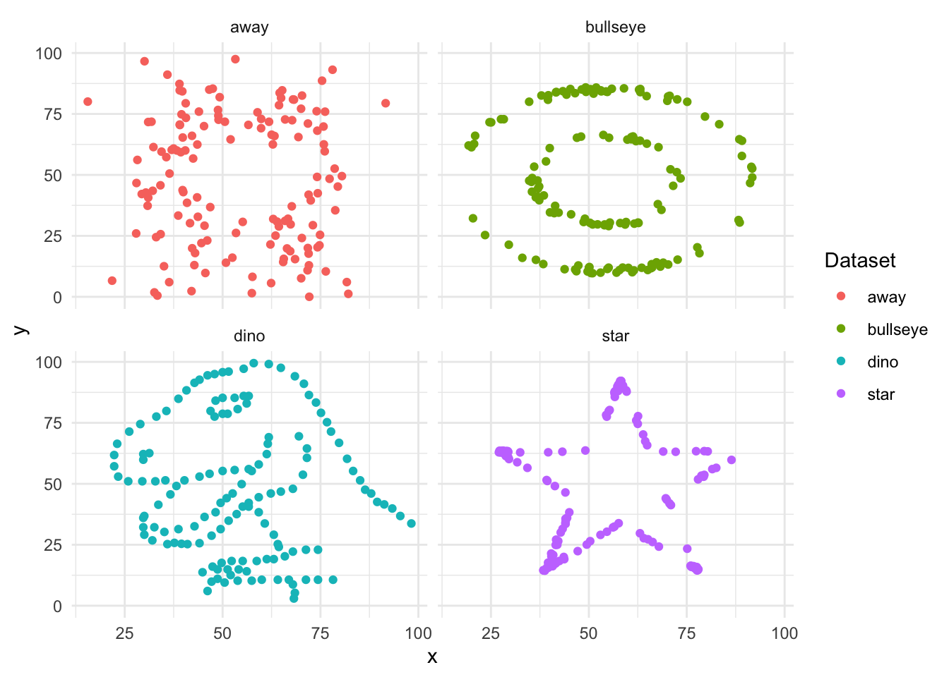
We get a similar lesson—always plot your data—from “Anscombe’s Quartet”, created by the twentieth century statistician Frank Anscombe. The key takeaway is that it is important to plot the actual data and not rely solely on summary statistics.
head(anscombe) x1 x2 x3 x4 y1 y2 y3 y4
1 10 10 10 8 8.04 9.14 7.46 6.58
2 8 8 8 8 6.95 8.14 6.77 5.76
3 13 13 13 8 7.58 8.74 12.74 7.71
4 9 9 9 8 8.81 8.77 7.11 8.84
5 11 11 11 8 8.33 9.26 7.81 8.47
6 14 14 14 8 9.96 8.10 8.84 7.04Anscombe’s Quartet consists of eleven observations for four different datasets, with x and y values for each observation. We need to manipulate this dataset with pivot_longer() to get it into the “tidy” format discussed in Online Appendix A.
# From: https://www.njtierney.com/post/2020/06/01/tidy-anscombe/
# And the pivot_longer() vignette.

tidy_anscombe <-
  anscombe |>
  pivot_longer(
    everything(),
    names_to = c(".value", "set"),
    names_pattern = "(.)(.)"
  )
We can first create summary statistics (Table 5.2) and then plot the data (Figure 5.2). This again illustrates the importance of graphing the actual data, rather than relying on summary statistics.
tidy_anscombe |>
  summarise(
    across(c(x, y), list(mean = mean, sd = sd)),
    .by = set
    ) |>
  kable(
    col.names = c("Dataset", "x mean", "x sd", "y mean", "y sd"),
    digits = 1, booktabs = TRUE
)| Dataset | x mean | x sd | y mean | y sd |
|---|---|---|---|---|
| 1 | 9 | 3.3 | 7.5 | 2 |
| 2 | 9 | 3.3 | 7.5 | 2 |
| 3 | 9 | 3.3 | 7.5 | 2 |
| 4 | 9 | 3.3 | 7.5 | 2 |
tidy_anscombe |>
  ggplot(aes(x = x, y = y, colour = set)) +
  geom_point() +
  geom_smooth(method = lm, se = FALSE) +
  theme_minimal() +
  facet_wrap(vars(set), nrow = 2, ncol = 2) +
  labs(colour = "Dataset") +
  theme(legend.position = "bottom")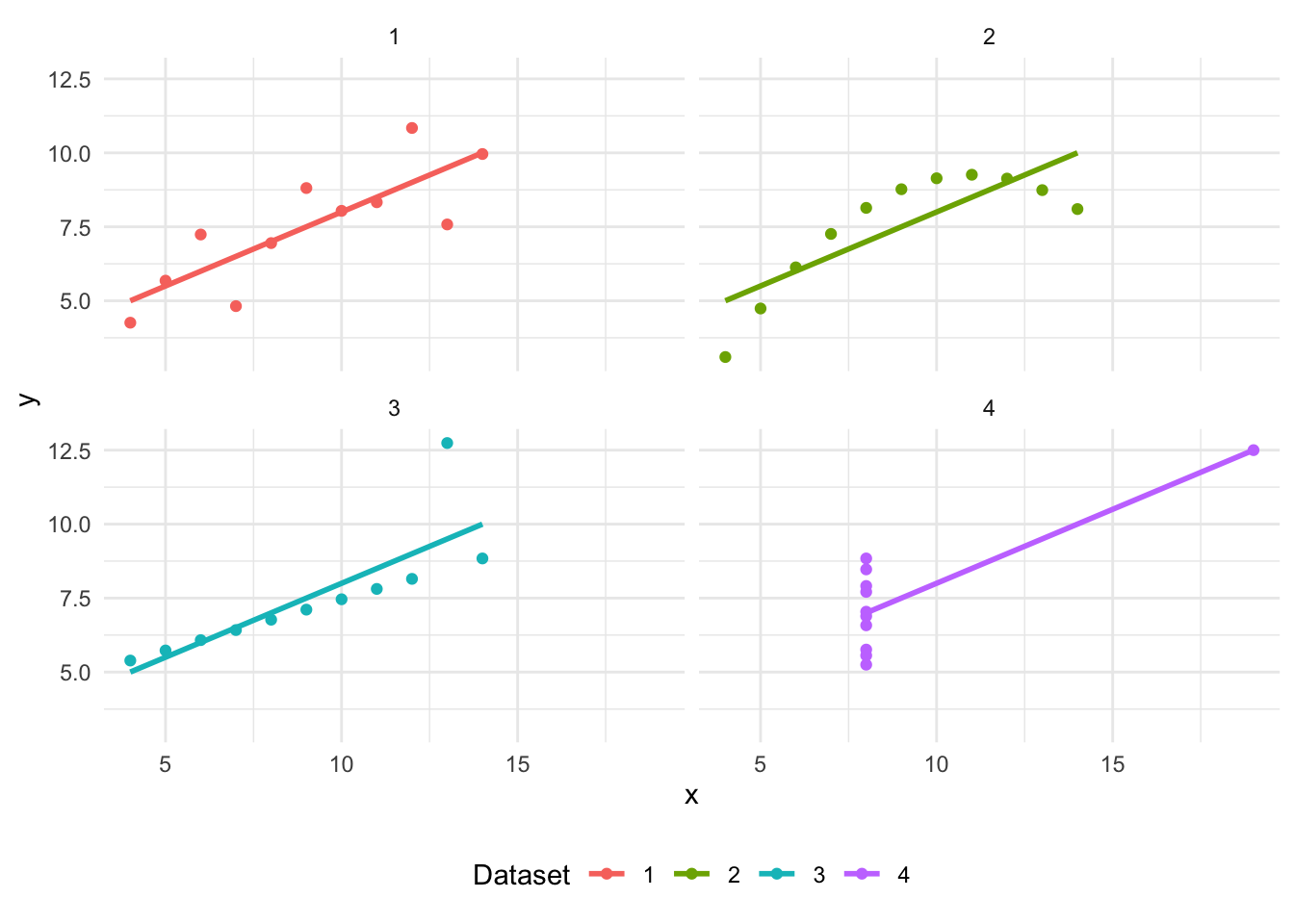
5.2.1 Bar charts
We typically use a bar chart when we have a categorical variable that we want to focus on. We saw an example of this in Chapter 2 when we constructed a graph of the number of occupied beds. The geometric object—a “geom”—that we primarily use is geom_bar(), but there are many variants to cater for specific situations. To illustrate the use of bar charts, we use a dataset from the 1997-2001 British Election Panel Study that was put together by Fox and Andersen (2006) and made available with BEPS, after installing and loading carData.
beps <-
  BEPS |>
  as_tibble() |>
  clean_names() |>
  select(age, vote, gender, political_knowledge)
The dataset consists of which party the respondent supports, along with various demographic, economic, and political variables. In particular, we have the age of the respondent. We begin by creating age-groups from the ages, and making a bar chart showing the frequency of each age-group using geom_bar() (Figure 5.3 (a)).
beps <-
  beps |>
  mutate(
    age_group =
      case_when(
        age < 35 ~ "<35",
        age < 50 ~ "35-49",
        age < 65 ~ "50-64",
        age < 80 ~ "65-79",
        age < 100 ~ "80-99"
      ),
    age_group =
      factor(age_group, levels = c("<35", "35-49", "50-64", "65-79", "80-99"))
  )
beps |>
ggplot(mapping = aes(x = age_group)) +
geom_bar() +
theme_minimal() +
labs(x = "Age group", y = "Number of observations")
beps |>
count(age_group) |>
ggplot(mapping = aes(x = age_group, y = n)) +
geom_col() +
theme_minimal() +
labs(x = "Age group", y = "Number of observations")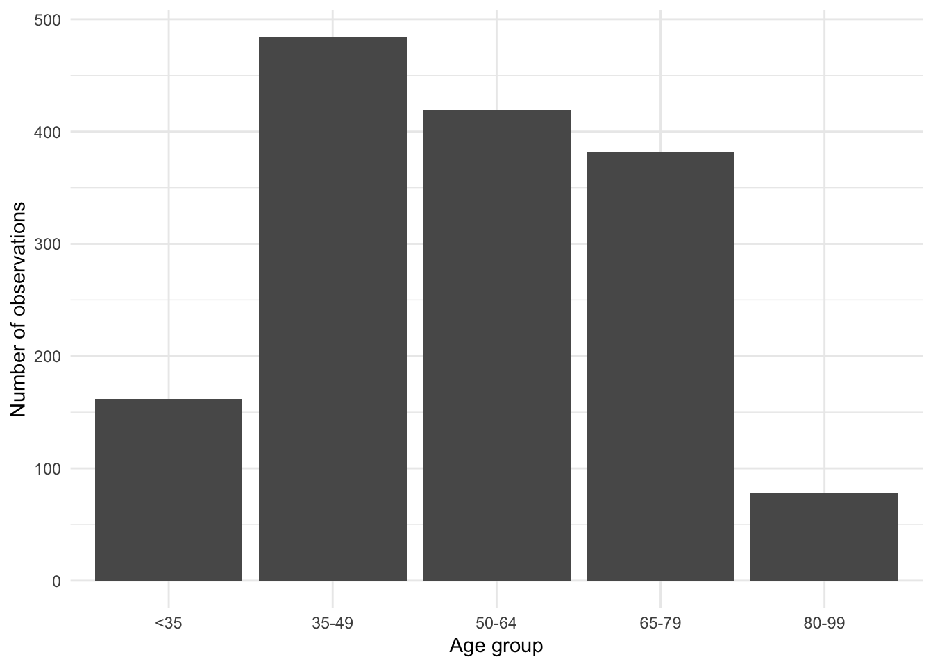
geom_bar()

count() and geom_col()
The default axis label used by ggplot2 is the name of the relevant variable, so it is often useful to add more detail. We do this using labs() by specifying a variable and a name. In the case of Figure 5.3 (a) we have specified labels for the x-axis and y-axis.
By default, geom_bar() creates a count of the number of times each age-group appears in the dataset. It does this because the default statistical transformation—a “stat”—for geom_bar() is “count”, which saves us from having to create that statistic ourselves. But if we had already constructed a count (for instance, with beps |> count(age_group)), then we could specify a variable for the y-axis and then use geom_col() (Figure 5.3 (b)).
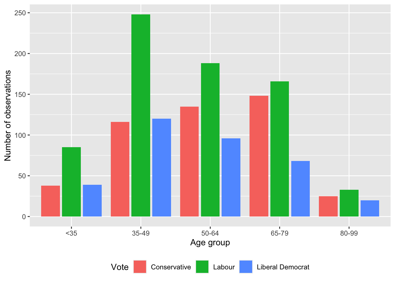
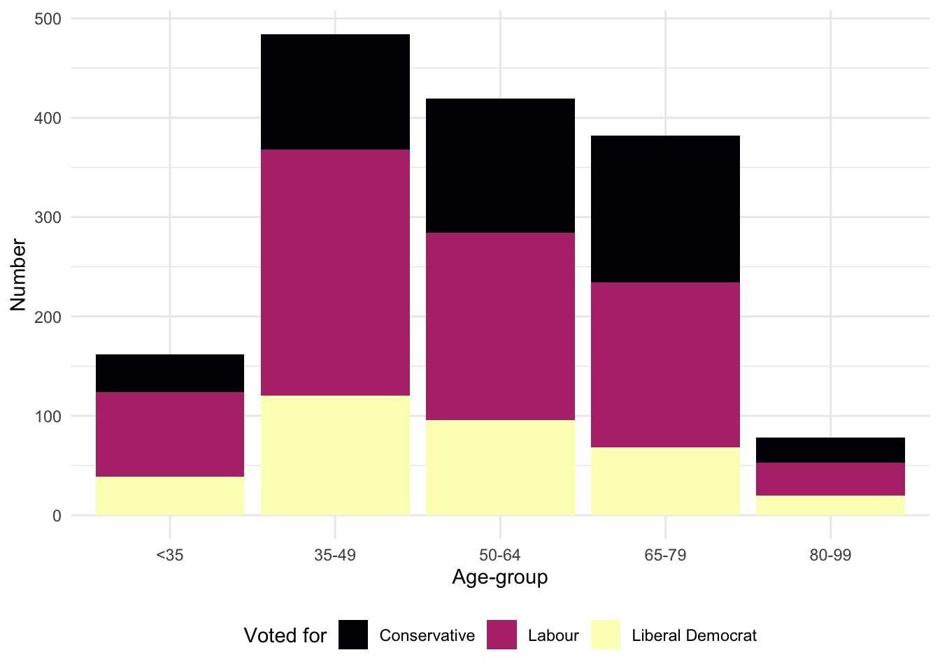
We may also like to consider various groupings of the data to get a different insight. For instance, we can use color to look at which party the respondent supports, by age-group (Figure 5.4 (a)).
beps |>
  ggplot(mapping = aes(x = age_group, fill = vote)) +
  geom_bar() +
  labs(x = "Age group", y = "Number of observations", fill = "Vote") +
  theme(legend.position = "bottom")

beps |>
  ggplot(mapping = aes(x = age_group, fill = vote)) +
  geom_bar(position = "dodge2") +
  labs(x = "Age group", y = "Number of observations", fill = "Vote") +
  theme(legend.position = "bottom")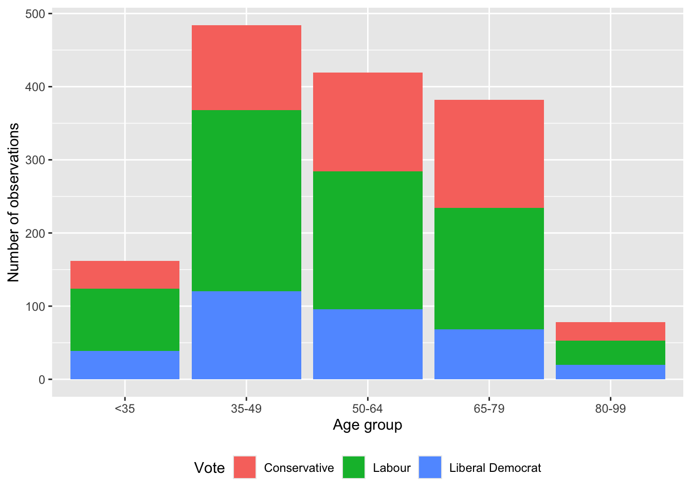
geom_bar()
geom_bar() with dodge2
By default, these different groups are stacked, but they can be placed side by side with position = "dodge2" (Figure 5.4 (b)). (Using “dodge2” rather than “dodge” adds a little space between the bars.)
5.2.1.1 Themes
At this point, we may like to address the general look of the graph. There are various themes that are built into ggplot2. These include: theme_bw(), theme_classic(), theme_dark(), and theme_minimal(). A full list is available in the ggplot2 cheat sheet. We can use these themes by adding them as a layer (Figure 5.5). We could also install more themes from other packages, including ggthemes (Arnold 2021), and hrbrthemes (Rudis 2020). We could even build our own!
theme_bw <-
  beps |>
  ggplot(mapping = aes(x = age_group)) +
  geom_bar(position = "dodge") +
  theme_bw()

theme_classic <-
  beps |>
  ggplot(mapping = aes(x = age_group)) +
  geom_bar(position = "dodge") +
  theme_classic()

theme_dark <-
  beps |>
  ggplot(mapping = aes(x = age_group)) +
  geom_bar(position = "dodge") +
  theme_dark()

theme_minimal <-
  beps |>
  ggplot(mapping = aes(x = age_group)) +
  geom_bar(position = "dodge") +
  theme_minimal()

(theme_bw + theme_classic) / (theme_dark + theme_minimal)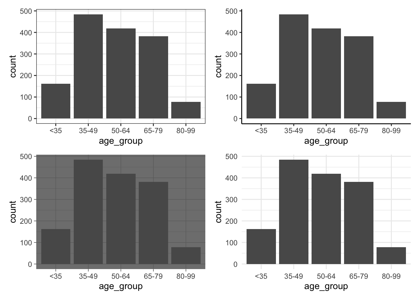
patchwork
In Figure 5.5 we use patchwork to bring together multiple graphs. To do this, after installing and loading the package, we assign the graph to a variable. We then use “+” to signal which should be next to each other, “/” to signal which should be on top, and use brackets to indicate precedence
5.2.1.2 Facets
We use facets to show variation, based on one or more variables (Wilkinson 2005, 219). Facets are especially useful when we have already used color to highlight variation in some other variable. For instance, we may be interested to explain vote, by age and gender (Figure 5.6). We rotate the x-axis with guides(x = guide_axis(angle = 90)) to avoid overlapping. We also change the position of the legend with theme(legend.position = "bottom").
beps |>
  ggplot(mapping = aes(x = age_group, fill = gender)) +
  geom_bar() +
  theme_minimal() +
  labs(
    x = "Age-group of respondent",
    y = "Number of respondents",
    fill = "Gender"
  ) +
  facet_wrap(vars(vote)) +
  guides(x = guide_axis(angle = 90)) +
  theme(legend.position = "bottom")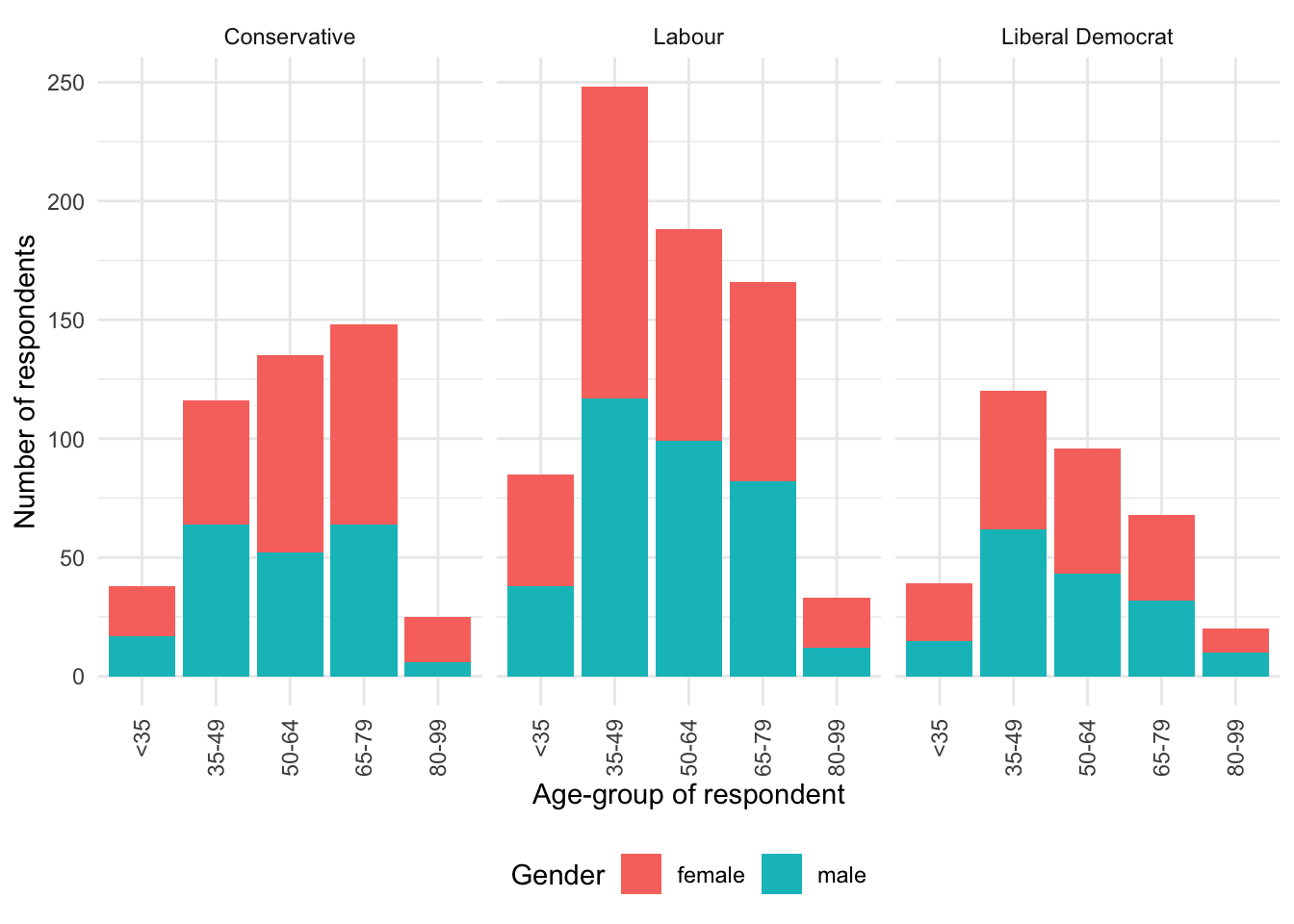
We could change facet_wrap() to wrap vertically instead of horizontally with dir = "v". Alternatively, we could specify a few rows, say nrow = 2, or a number of columns, say ncol = 2.
By default, both facets will have the same x-axis and y-axis. We could enable both facets to have different scales with scales = "free", or just the x-axis with scales = "free_x", or just the y-axis with scales = "free_y" (Figure 5.7).
beps |>
  ggplot(mapping = aes(x = age_group, fill = gender)) +
  geom_bar() +
  theme_minimal() +
  labs(
    x = "Age-group of respondent",
    y = "Number of respondents",
    fill = "Gender"
  ) +
  facet_wrap(vars(vote), scales = "free") +
  guides(x = guide_axis(angle = 90)) +
  theme(legend.position = "bottom")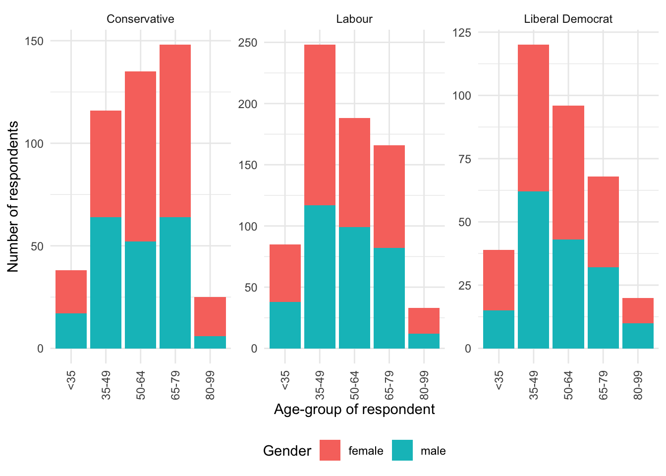
Finally, we can change the labels of the facets using labeller() (Figure 5.8).
new_labels <-
  c("0" = "No knowledge", "1" = "Low knowledge",
    "2" = "Moderate knowledge", "3" = "High knowledge")

beps |>
  ggplot(mapping = aes(x = age_group, fill = vote)) +
  geom_bar() +
  theme_minimal() +
  labs(
    x = "Age-group of respondent",
    y = "Number of respondents",
    fill = "Voted for"
  ) +
  facet_wrap(
    vars(political_knowledge),
    scales = "free",
    labeller = labeller(political_knowledge = new_labels)
  ) +
  guides(x = guide_axis(angle = 90)) +
  theme(legend.position = "bottom")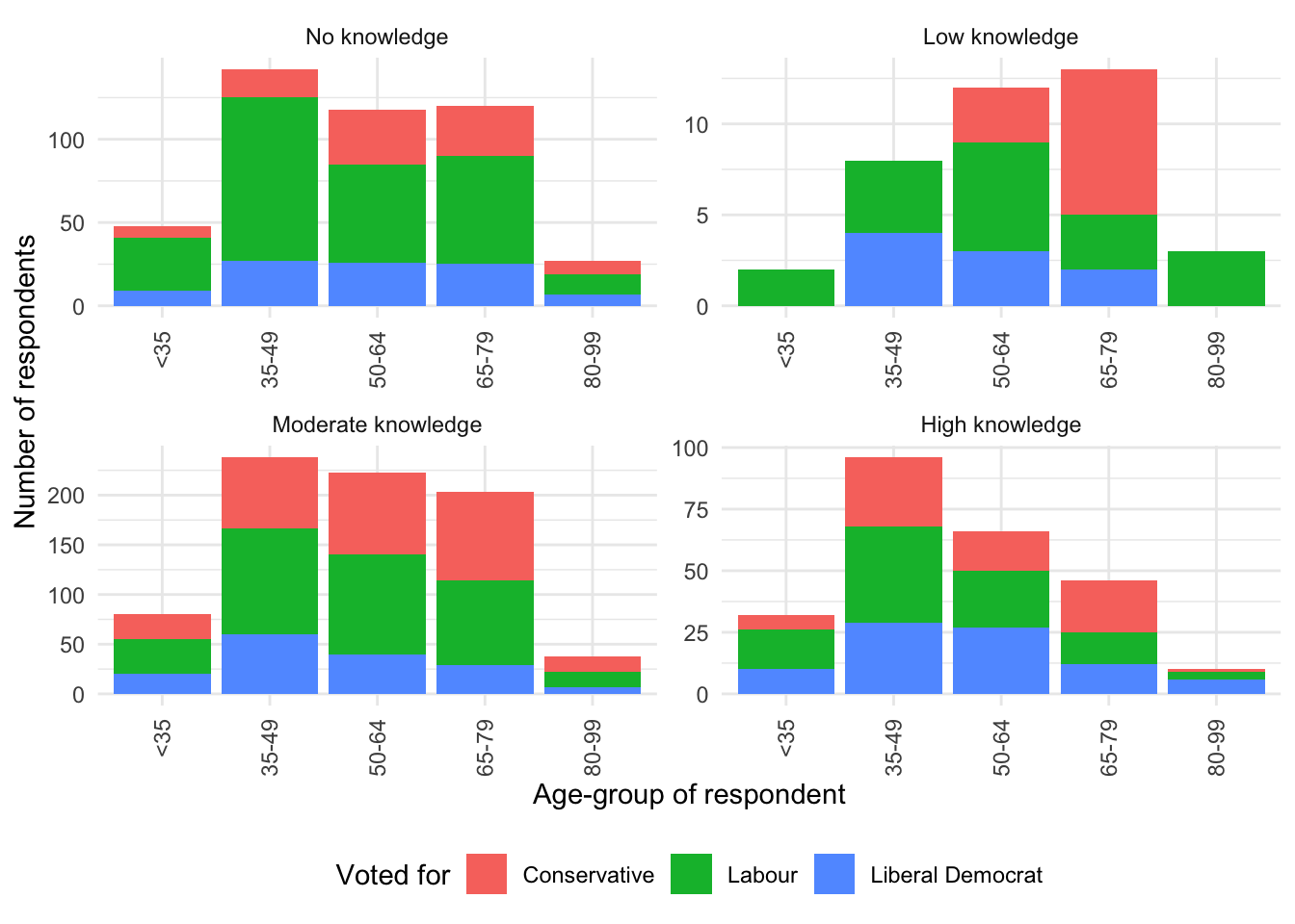
We now have three ways to combine multiple graphs: sub-figures, facets, and patchwork. They are useful in different circumstances:
- sub-figures—which we covered in Chapter 3—for when we are considering different variables;
- facets for when we are considering a categorical variable; and
patchworkfor when we are interested in bringing together entirely different graphs.
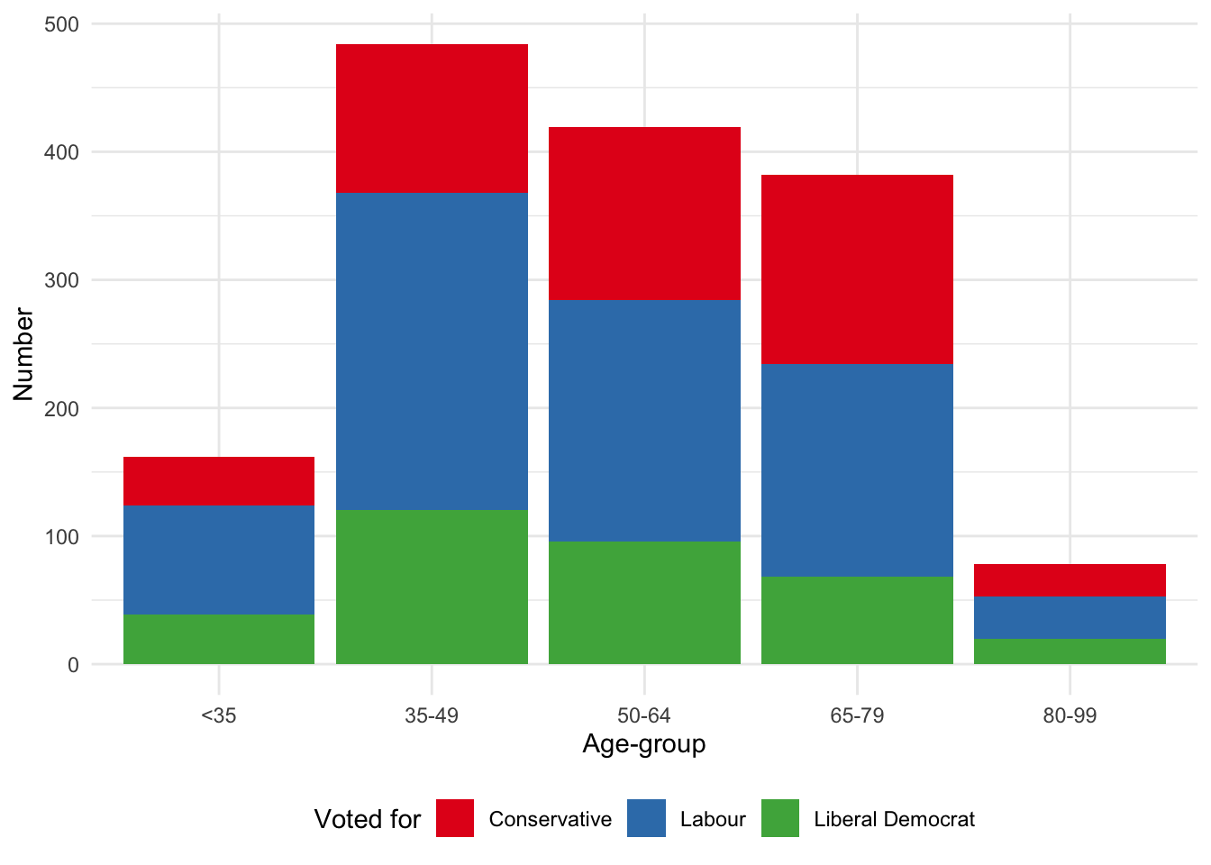
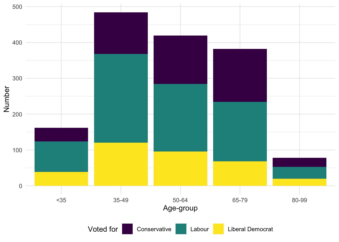
5.2.1.3 Colors
We now turn to the colors used in the graph. There are a variety of different ways to change the colors. The many palettes available from RColorBrewer (Neuwirth 2022) can be specified using scale_fill_brewer(). In the case of viridis (Garnier et al. 2021) we can specify the palettes using scale_fill_viridis_d(). Additionally, viridis is particularly focused on color-blind palettes (Figure 5.9). Neither RColorBrewer nor viridis need to be explicitly installed or loaded because ggplot2, which is part of the tidyverse, takes care of that for us.
Shoulders of giants
The name of the “brewer” palette refers to Cindy Brewer (Miller 2014). After earning a PhD in Geography from Michigan State University in 1991, she joined San Diego State University as an assistant professor, moving to Pennsylvania State University in 1994, where she was promoted to full professor in 2007. One of her best-known books is Designing Better Maps: A Guide for GIS Users (Brewer 2015). In 2019 she became only the ninth person to have been awarded the O. M. Miller Cartographic Medal since it was established in 1968.
# Panel (a)
beps |>
  ggplot(mapping = aes(x = age_group, fill = vote)) +
  geom_bar() +
  theme_minimal() +
  labs(x = "Age-group", y = "Number", fill = "Voted for") +
  theme(legend.position = "bottom") +
  scale_fill_brewer(palette = "Blues")

# Panel (b)
beps |>
  ggplot(mapping = aes(x = age_group, fill = vote)) +
  geom_bar() +
  theme_minimal() +
  labs(x = "Age-group", y = "Number", fill = "Voted for") +
  theme(legend.position = "bottom") +
  scale_fill_brewer(palette = "Set1")

# Panel (c)
beps |>
  ggplot(mapping = aes(x = age_group, fill = vote)) +
  geom_bar() +
  theme_minimal() +
  labs(x = "Age-group", y = "Number", fill = "Voted for") +
  theme(legend.position = "bottom") +
  scale_fill_viridis_d()

# Panel (d)
beps |>
  ggplot(mapping = aes(x = age_group, fill = vote)) +
  geom_bar() +
  theme_minimal() +
  labs(x = "Age-group", y = "Number", fill = "Voted for") +
  theme(legend.position = "bottom") +
  scale_fill_viridis_d(option = "magma")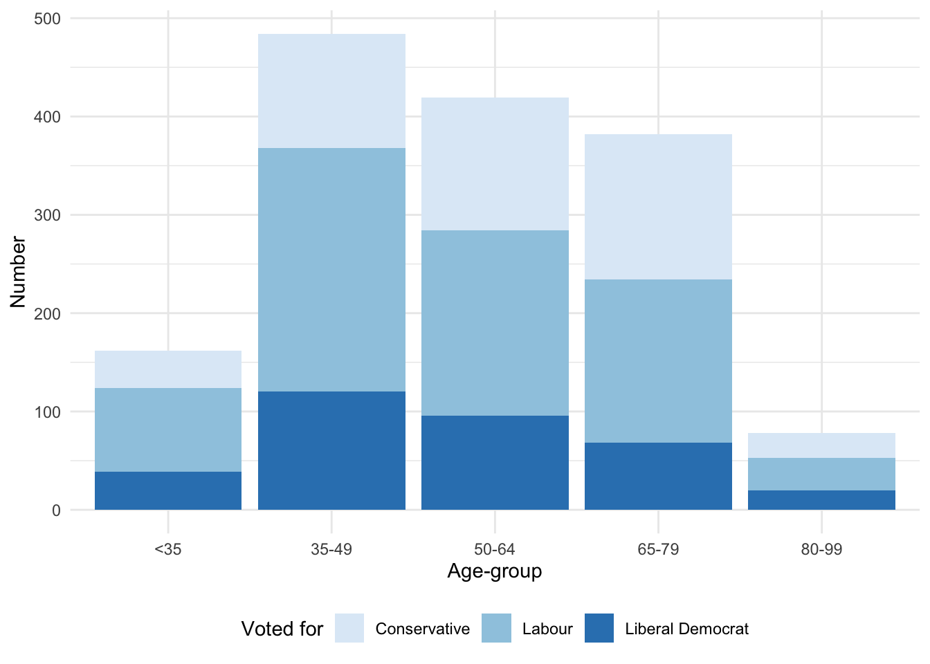
In addition to using pre-built palettes, we could build our own palette. That said, color is something to be considered with care. It should be used to increase the amount of information that is communicated (Cleveland [1985] 1994). Color should not be added to graphs unnecessarily—that is to say, it should play some role. Typically, that role is to distinguish different groups, which implies making the colors dissimilar. Color may also be appropriate if there is some relationship between the color and the variable. For instance, if making a graph of the price of mangoes and raspberries, then it could help the reader decode the information if the colors were yellow and red, respectively (Franconeri et al. 2021, 121).
5.2.2 Scatterplots
We are often interested in the relationship between two numeric or continuous variables. We can use scatterplots to show this. A scatterplot may not always be the best choice, but it is rarely a bad one (Weissgerber et al. 2015). Some consider it the most versatile and useful graph option (Friendly and Wainer 2021, 121). To illustrate scatterplots, we install and load WDI and then use that to download some economic indicators from the World Bank. In particular, we use WDIsearch() to find the unique key that we need to pass to WDI() to facilitate the download.
Oh, you think we have good data on that!
From OECD (2014, 15) Gross Domestic Product (GDP) “combines in a single figure, and with no double counting, all the output (or production) carried out by all the firms, non-profit institutions, government bodies and households in a given country during a given period, regardless of the type of goods and services produced, provided that the production takes place within the country’s economic territory.” The modern concept was developed by the twentieth century economist Simon Kuznets and is widely used and reported. There is a certain comfort in having a definitive and concrete single number to describe something as complicated as the economic activity of a country. It is useful and informative that we have such summary statistics. But as with any summary statistic, its strength is also its weakness. A single number necessarily loses information about constituent components, and disaggregated differences can be important (Moyer and Dunn 2020). It highlights short term economic progress over longer term improvements. And “the quantitative definiteness of the estimates makes it easy to forget their dependence upon imperfect data and the consequently wide margins of possible error to which both totals and components are liable” (Kuznets, Epstein, and Jenks 1941, xxvi). Summary measures of economic performance shows only one side of a country’s economy. While there are many strengths there are also well-known areas where GDP is weak.
WDIsearch("gdp growth")
WDIsearch("inflation")
WDIsearch("population, total")
WDIsearch("Unemployment, total")
world_bank_data <-
WDI(
indicator =
c("FP.CPI.TOTL.ZG", "NY.GDP.MKTP.KD.ZG", "SP.POP.TOTL","SL.UEM.TOTL.NE.ZS"),
country = c("AU", "ET", "IN", "US")
)We may like to change the variable names to be more meaningful, and only keep those that we need.
world_bank_data <-
  world_bank_data |>
  rename(
    inflation = FP.CPI.TOTL.ZG,
    gdp_growth = NY.GDP.MKTP.KD.ZG,
    population = SP.POP.TOTL,
    unem_rate = SL.UEM.TOTL.NE.ZS
  ) |>
  select(country, year, inflation, gdp_growth, population, unem_rate)

head(world_bank_data)
# A tibble: 6 × 6
country year inflation gdp_growth population unem_rate
<chr> <dbl> <dbl> <dbl> <dbl> <dbl>
1 Australia 1960 3.73 NA 10276477 NA
2 Australia 1961 2.29 2.48 10483000 NA
3 Australia 1962 -0.319 1.29 10742000 NA
4 Australia 1963 0.641 6.22 10950000 NA
5 Australia 1964 2.87 6.98 11167000 NA
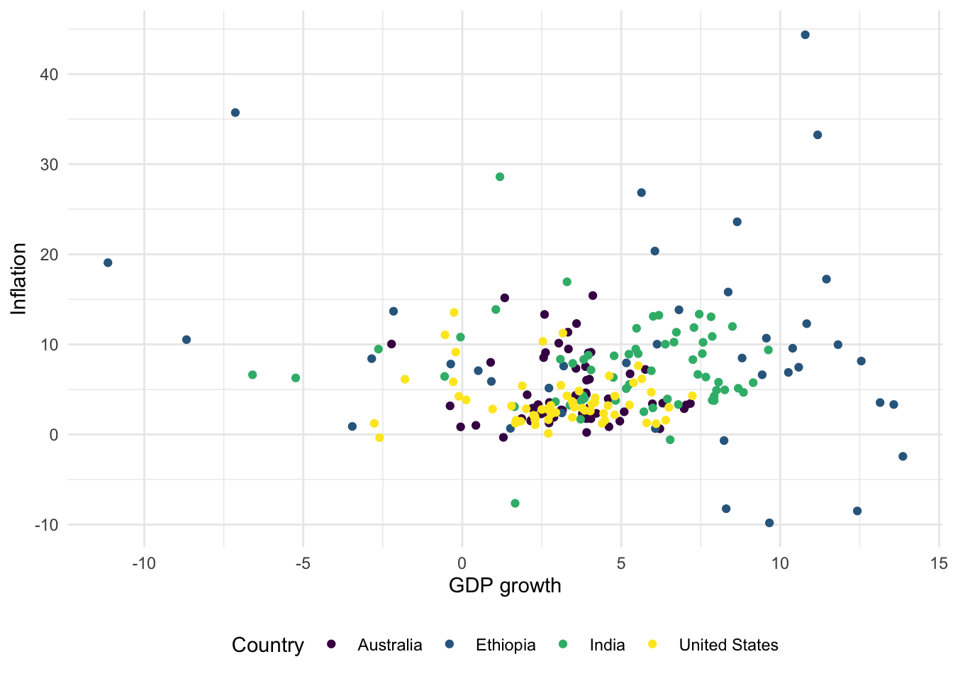
6 Australia 1965 3.41 5.98 11388000 NATo get started we can use geom_point() to make a scatterplot showing GDP growth and inflation, by country (Figure 5.10 (a)).
# Panel (a)
world_bank_data |>
  ggplot(mapping = aes(x = gdp_growth, y = inflation, color = country)) +
  geom_point()

# Panel (b)
world_bank_data |>
  ggplot(mapping = aes(x = gdp_growth, y = inflation, color = country)) +
  geom_point() +
  theme_minimal() +
  labs(x = "GDP growth", y = "Inflation", color = "Country")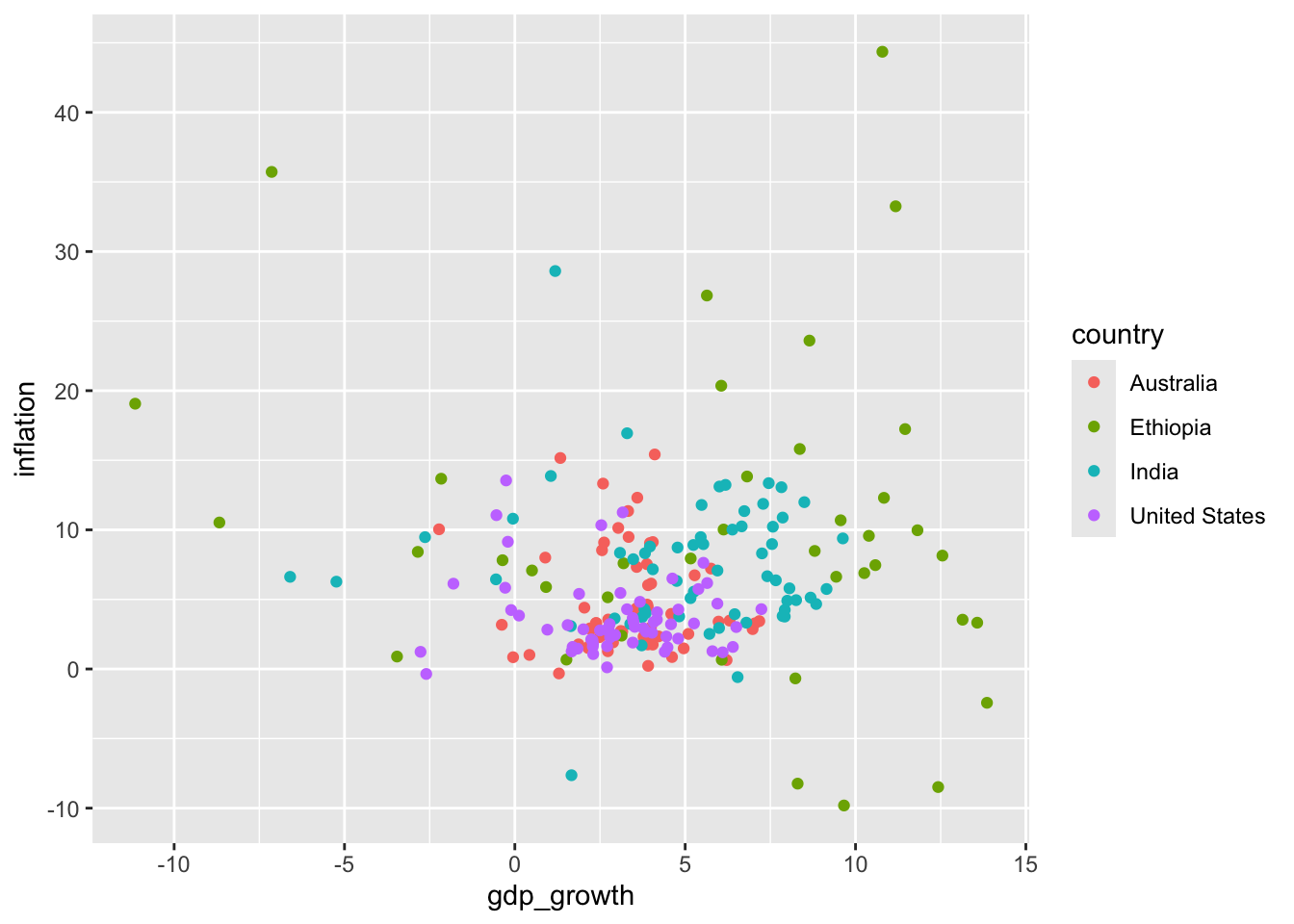

As with bar charts, we can change the theme, and update the labels (Figure 5.10 (b)).
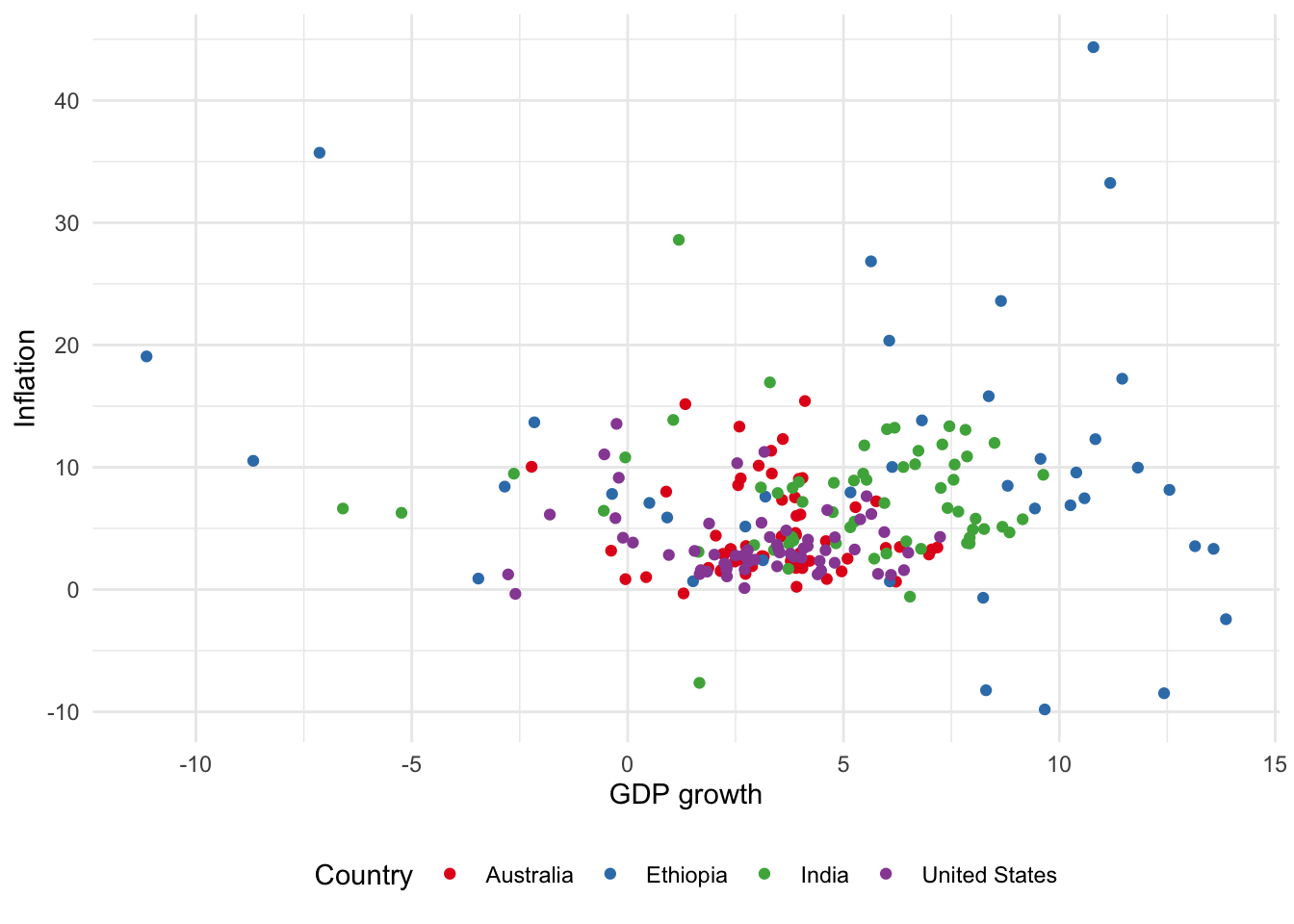
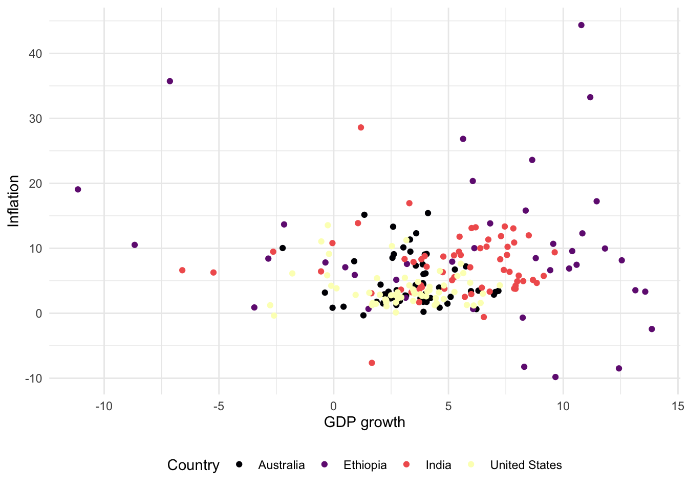
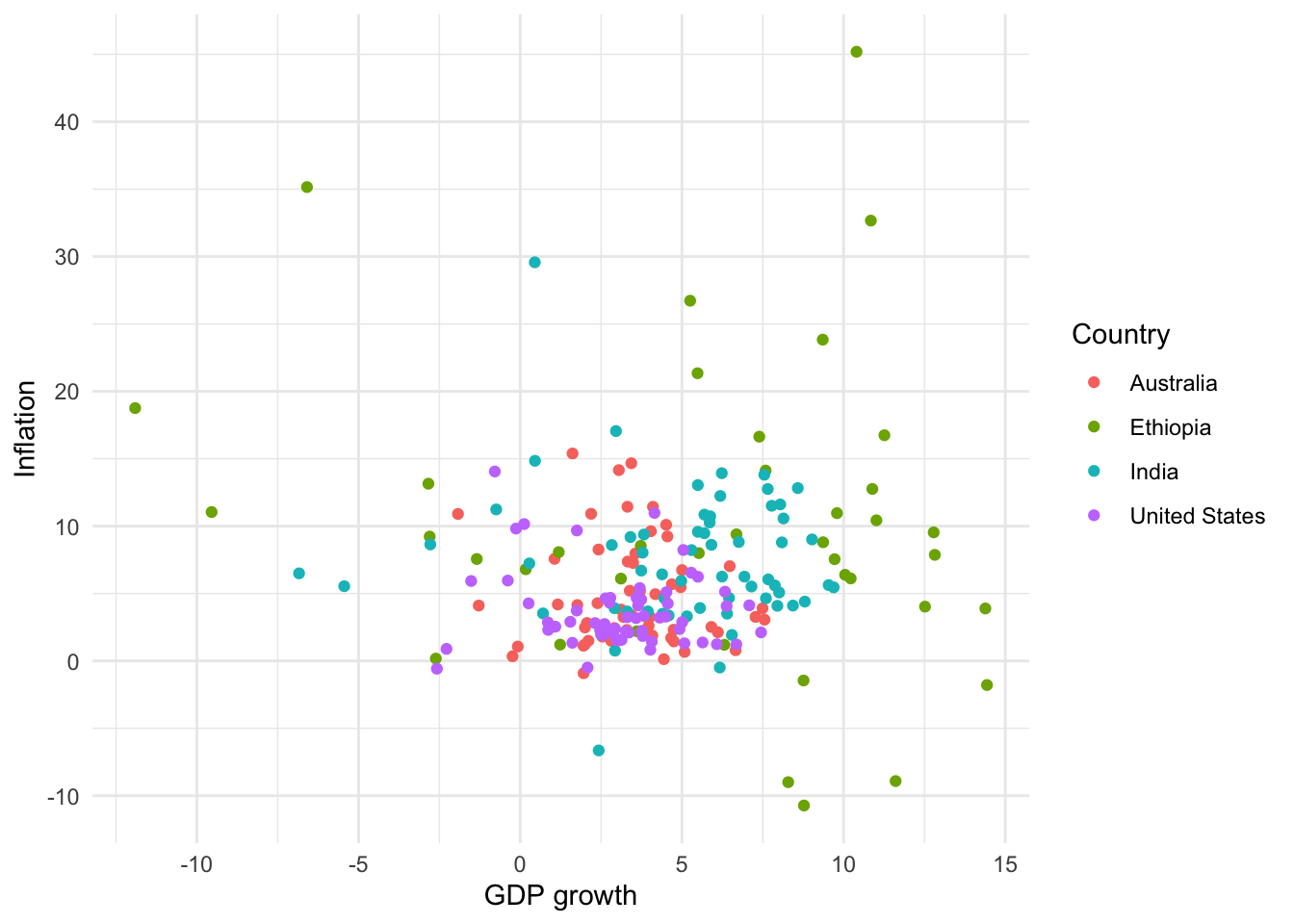
For scatterplots we use “color” instead of “fill”, as we did for bar charts, because they use dots rather than bars. This also then slightly affects how we change the palette (Figure 5.11). That said, with particular types of dots, for instance shape = 21, it is possible to have both fill and color aesthetics.
# Panel (a)
world_bank_data |>
  ggplot(aes(x = gdp_growth, y = inflation, color = country)) +
  geom_point() +
  theme_minimal() +
  labs(x = "GDP growth", y = "Inflation", color = "Country") +
  theme(legend.position = "bottom") +
  scale_color_brewer(palette = "Blues")

# Panel (b)
world_bank_data |>
  ggplot(aes(x = gdp_growth, y = inflation, color = country)) +
  geom_point() +
  theme_minimal() +
  labs(x = "GDP growth",  y = "Inflation", color = "Country") +
  theme(legend.position = "bottom") +
  scale_color_brewer(palette = "Set1")

# Panel (c)
world_bank_data |>
  ggplot(aes(x = gdp_growth, y = inflation, color = country)) +
  geom_point() +
  theme_minimal() +
  labs(x = "GDP growth",  y = "Inflation", color = "Country") +
  theme(legend.position = "bottom") +
  scale_colour_viridis_d()

# Panel (d)
world_bank_data |>
  ggplot(aes(x = gdp_growth, y = inflation, color = country)) +
  geom_point() +
  theme_minimal() +
  labs(x = "GDP growth",  y = "Inflation", color = "Country") +
  theme(legend.position = "bottom") +
  scale_colour_viridis_d(option = "magma")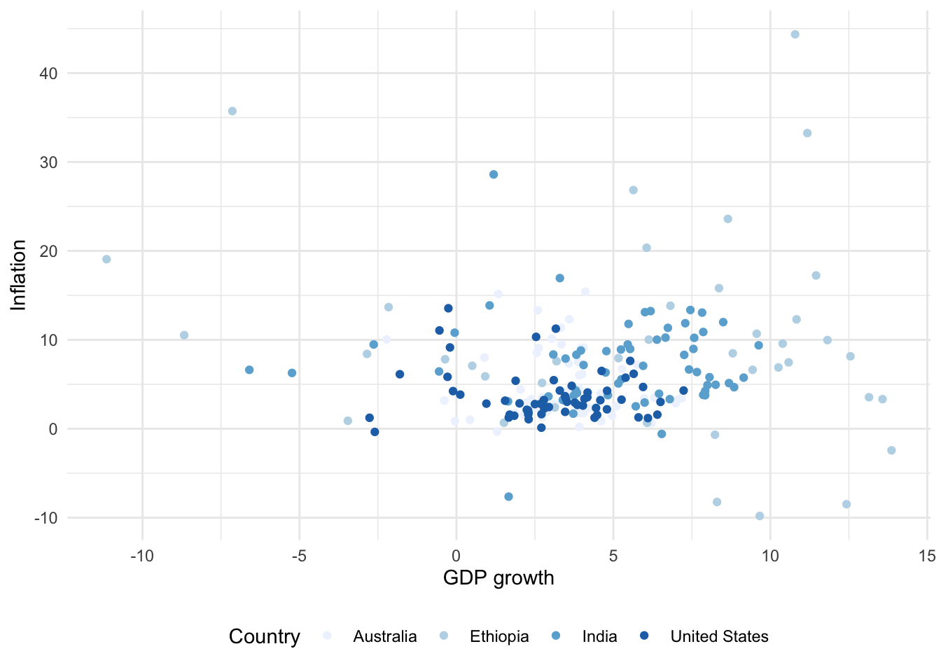
The points of a scatterplot sometimes overlap. We can address this situation in a variety of ways (Figure 5.12):
- Adding a degree of transparency to our dots with “alpha” (Figure 5.12 (a)). The value for “alpha” can vary between 0, which is fully transparent, and 1, which is completely opaque.
- Adding a small amount of noise, which slightly moves the points, using
geom_jitter()(Figure 5.12 (b)). By default, the movement is uniform in both directions, but we can specify which direction movement occurs with “width” or “height”. The decision between these two options turns on the degree to which accuracy matters, and the number of points: it is often useful to usegeom_jitter()when you want to highlight the relative density of points and not necessarily the exact value of individual points. When usinggeom_jitter()it is a good idea to set a seed, as introduced in Chapter 2, for reproducibility.
set.seed(853)

# Panel (a)
world_bank_data |>
  ggplot(aes(x = gdp_growth, y = inflation, color = country )) +
  geom_point(alpha = 0.5) +
  theme_minimal() +
  labs(x = "GDP growth", y = "Inflation", color = "Country")

# Panel (b)
world_bank_data |>
  ggplot(aes(x = gdp_growth, y = inflation, color = country)) +
  geom_jitter(width = 1, height = 1) +
  theme_minimal() +
  labs(x = "GDP growth", y = "Inflation", color = "Country")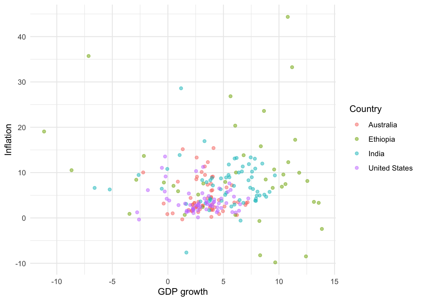
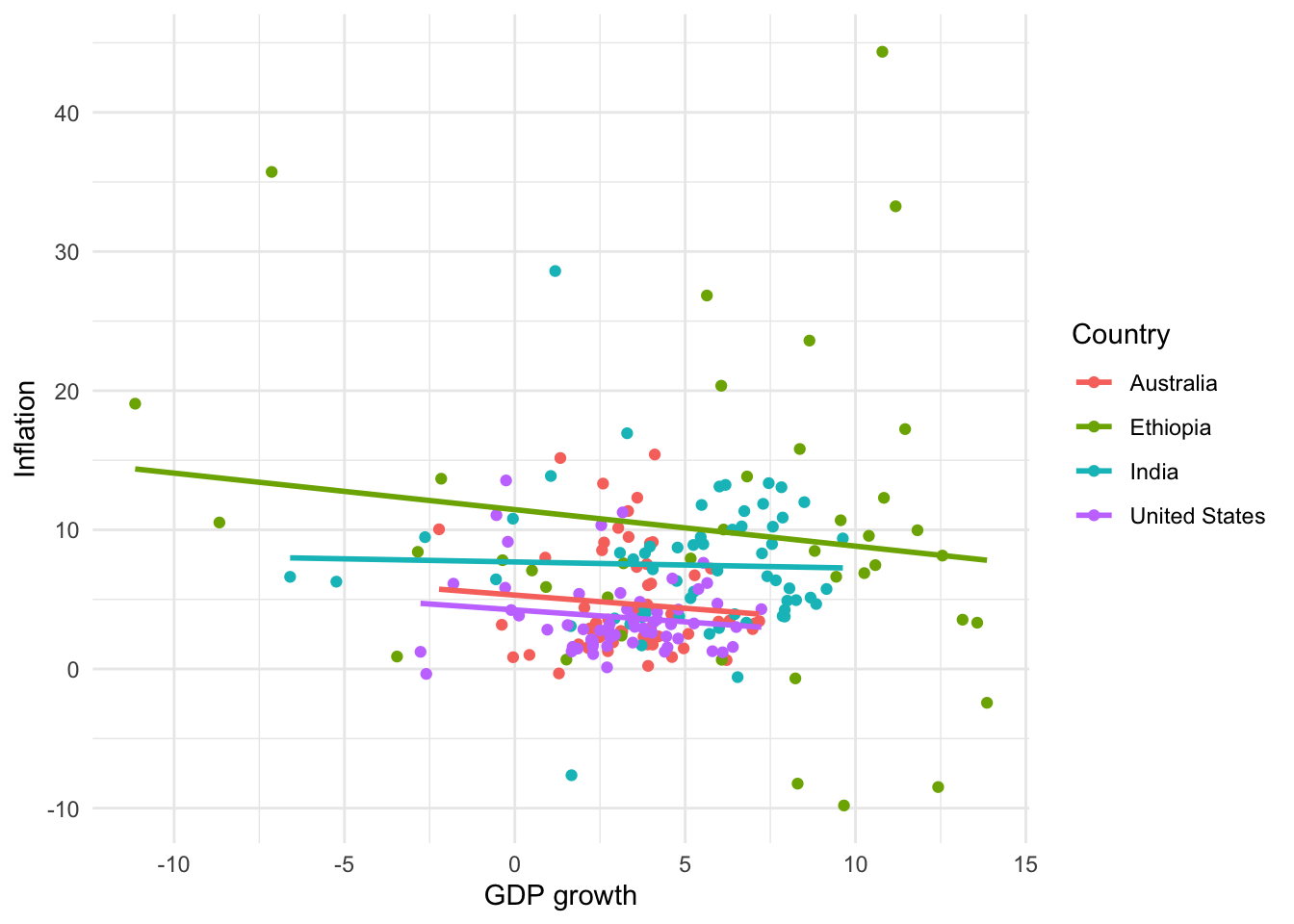
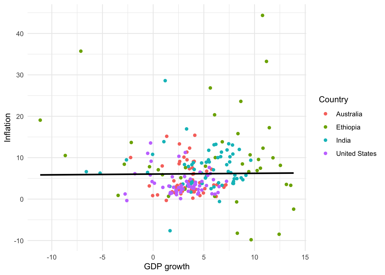
We often use scatterplots to illustrate a relationship between two continuous variables. It can be useful to add a “summary” line using geom_smooth() (Figure 5.13). We can specify the relationship using “method”, change the color with “color”, and add or remove standard errors with “se”. A commonly used “method” is lm, which computes and plots a simple linear regression line similar to using the lm() function. Using geom_smooth() adds a layer to the graph, and so it inherits aesthetics from ggplot(). For instance, that is why we have one line for each country in Figure 5.13 (a) and Figure 5.13 (b). We could overwrite that by specifying a particular color (Figure 5.13 (c)). There are situation where other types of fitted lines such as splines might be preferred.
# Panel (a)
world_bank_data |>
  ggplot(aes(x = gdp_growth, y = inflation, color = country)) +
  geom_jitter() +
  geom_smooth() +
  theme_minimal() +
  labs(x = "GDP growth", y = "Inflation", color = "Country")

# Panel (b)
world_bank_data |>
  ggplot(aes(x = gdp_growth, y = inflation, color = country)) +
  geom_jitter() +
  geom_smooth(method = lm, se = FALSE) +
  theme_minimal() +
  labs(x = "GDP growth", y = "Inflation", color = "Country")

# Panel (c)
world_bank_data |>
  ggplot(aes(x = gdp_growth, y = inflation, color = country)) +
  geom_jitter() +
  geom_smooth(method = lm, color = "black", se = FALSE) +
  theme_minimal() +
  labs(x = "GDP growth", y = "Inflation", color = "Country")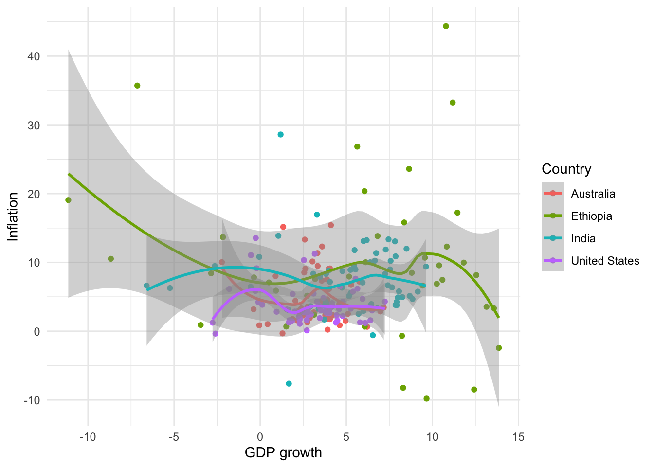
5.2.3 Line plots
We can use a line plot when we have variables that should be joined together, for instance, an economic time series. We will continue with the dataset from the World Bank and focus on GDP growth in the United States using geom_line() (Figure 5.14 (a)). The source of the data can be added to the graph using “caption” within labs().
# Panel (a)
world_bank_data |>
  filter(country == "United States") |>
  ggplot(mapping = aes(x = year, y = gdp_growth)) +
  geom_line() +
  theme_minimal() +
  labs(x = "Year", y = "GDP growth", caption = "Data source: World Bank.")

# Panel (b)
world_bank_data |>
  filter(country == "United States") |>
  ggplot(mapping = aes(x = year, y = gdp_growth)) +
  geom_step() +
  theme_minimal() +
  labs(x = "Year",y = "GDP growth", caption = "Data source: World Bank.")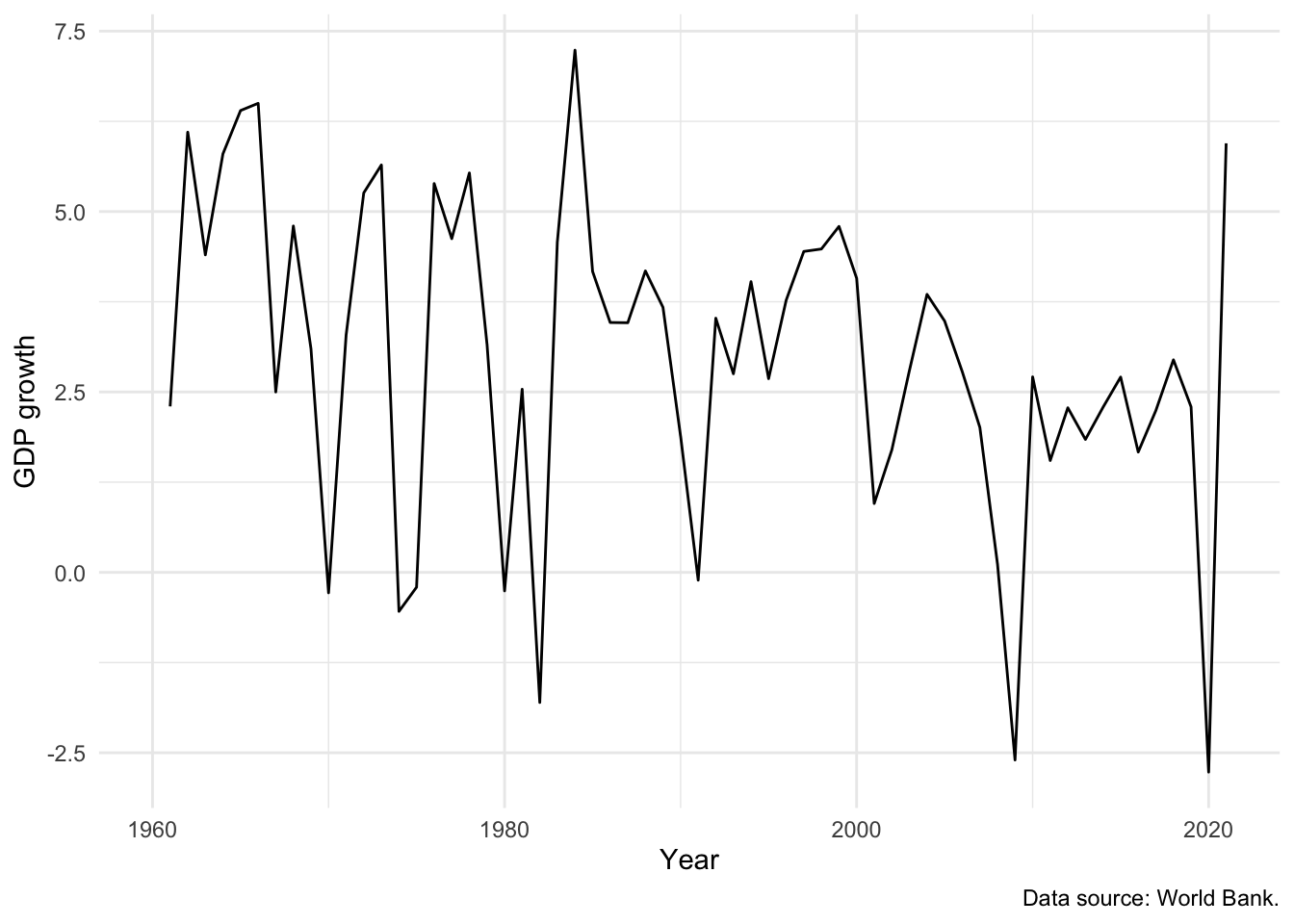
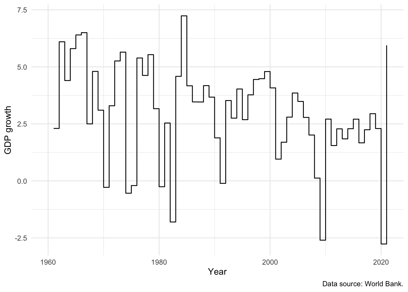
We can use geom_step(), a slight variant of geom_line(), to focus attention on the change from year to year (Figure 5.14 (b)).
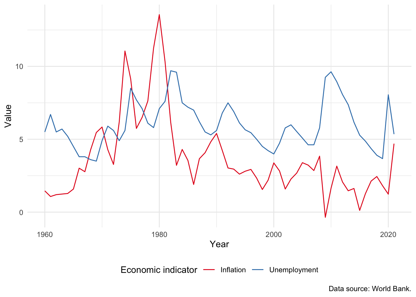
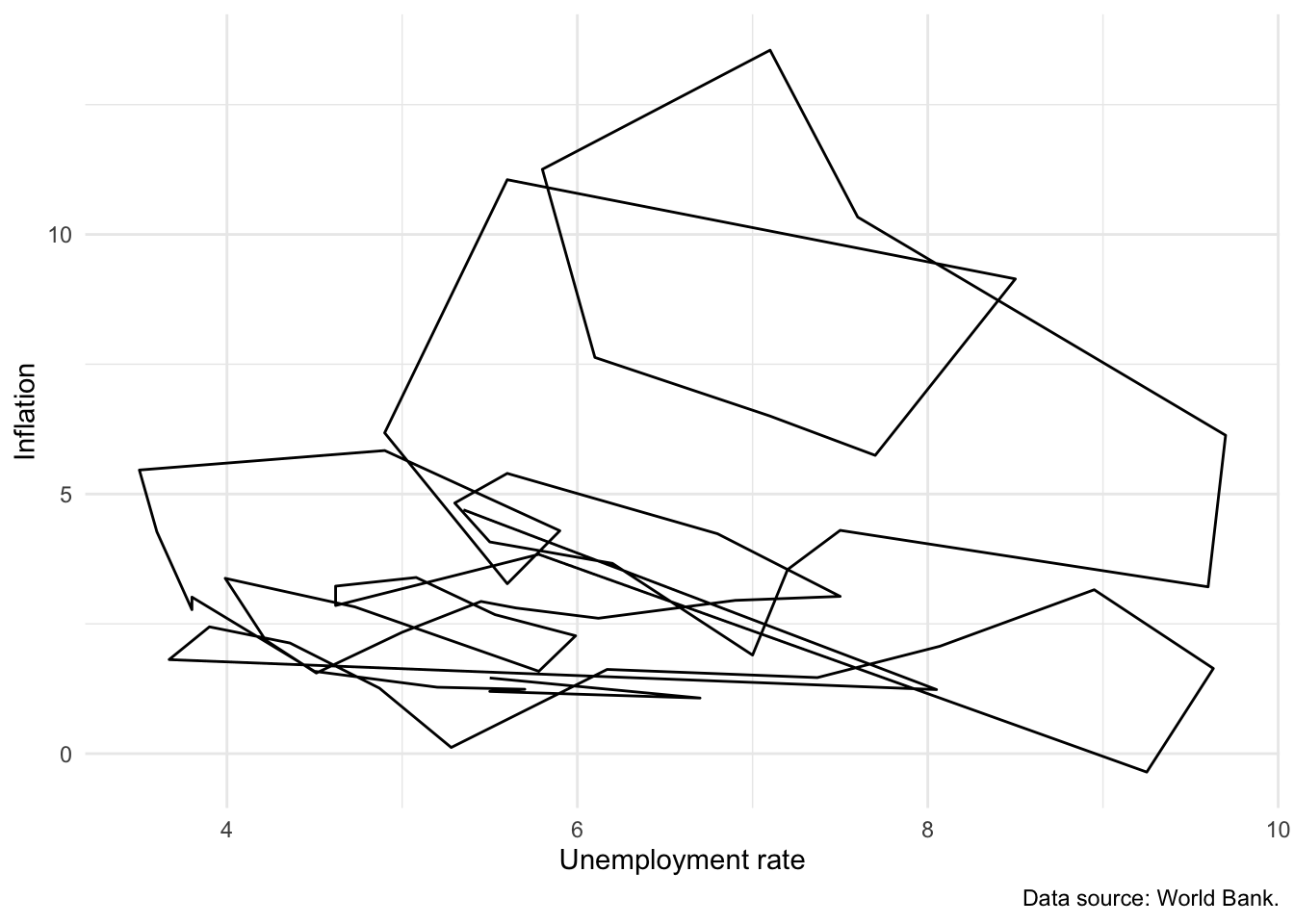
The Phillips curve is the name given to plot of the relationship between unemployment and inflation over time. An inverse relationship is sometimes found in the data, for instance in the United Kingdom between 1861 and 1957 (Phillips 1958). We have a variety of ways to investigate this relationship in our data, including:
- Adding a second line to our graph. For instance, we could add inflation (Figure 5.15 (a)). This requires us to use
pivot_longer(), which is discussed in Online Appendix A, to ensure that the data are in a tidy format. - Using
geom_path()to link values in the order they appear in the dataset. In Figure 5.15 (b) we show a Phillips curve for the United States between 1960 and 2020. Figure 5.15 (b) does not appear to show any clear relationship between unemployment and inflation.
world_bank_data |>
  filter(country == "United States") |>
  select(-population, -gdp_growth) |>
  pivot_longer(
    cols = c("inflation", "unem_rate"),
    names_to = "series",
    values_to = "value"
  ) |>
  ggplot(mapping = aes(x = year, y = value, color = series)) +
  geom_line() +
  theme_minimal() +
  labs(
    x = "Year", y = "Value", color = "Economic indicator",
    caption = "Data source: World Bank."
  ) +
  scale_color_brewer(palette = "Set1", labels = c("Inflation", "Unemployment")) +
  theme(legend.position = "bottom")

world_bank_data |>
  filter(country == "United States") |>
  ggplot(mapping = aes(x = unem_rate, y = inflation)) +
  geom_path() +
  theme_minimal() +
  labs(
    x = "Unemployment rate", y = "Inflation",
    caption = "Data source: World Bank."
  )
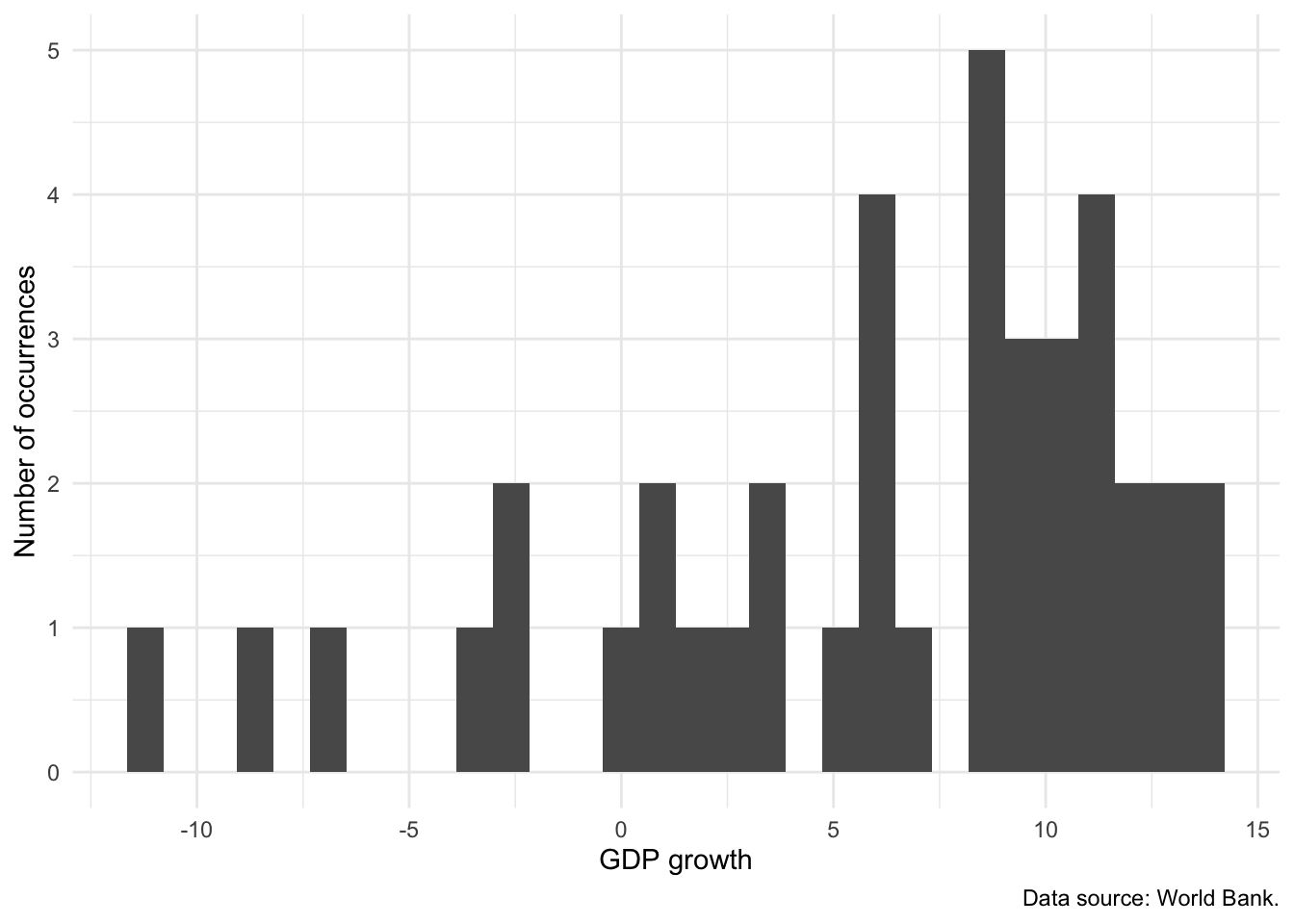
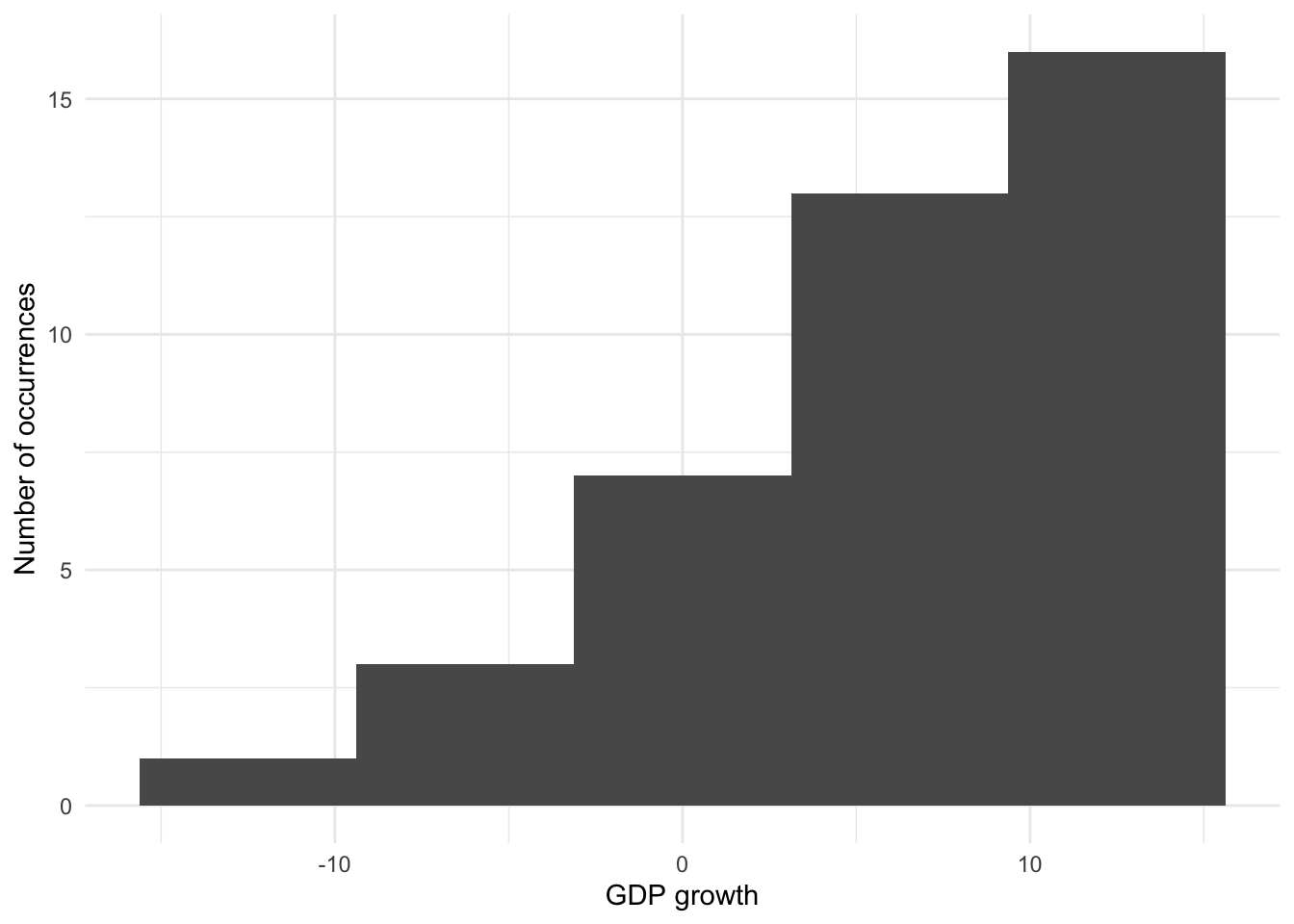
5.2.4 Histograms
A histogram is useful to show the shape of the distribution of a continuous variable. The full range of the data values is split into intervals called “bins” and the histogram counts how many observations fall into which bin. In Figure 5.16 we examine the distribution of GDP in Ethiopia.
world_bank_data |>
  filter(country == "Ethiopia") |>
  ggplot(aes(x = gdp_growth)) +
  geom_histogram() +
  theme_minimal() +
  labs(
    x = "GDP growth",
    y = "Number of occurrences",
    caption = "Data source: World Bank."
  )
The key component that determines the shape of a histogram is the number of bins. This can be specified in one of two ways (Figure 5.17):
- specifying the number of “bins” to include; or
- specifying their “binwidth”.
# Panel (a)
world_bank_data |>
  filter(country == "Ethiopia") |>
  ggplot(aes(x = gdp_growth)) +
  geom_histogram(bins = 5) +
  theme_minimal() +
  labs(
    x = "GDP growth",
    y = "Number of occurrences"
  )

# Panel (b)
world_bank_data |>
  filter(country == "Ethiopia") |>
  ggplot(aes(x = gdp_growth)) +
  geom_histogram(bins = 20) +
  theme_minimal() +
  labs(
    x = "GDP growth",
    y = "Number of occurrences"
  )

# Panel (c)
world_bank_data |>
  filter(country == "Ethiopia") |>
  ggplot(aes(x = gdp_growth)) +
  geom_histogram(binwidth = 2) +
  theme_minimal() +
  labs(
    x = "GDP growth",
    y = "Number of occurrences"
  )

# Panel (d)
world_bank_data |>
  filter(country == "Ethiopia") |>
  ggplot(aes(x = gdp_growth)) +
  geom_histogram(binwidth = 5) +
  theme_minimal() +
  labs(
    x = "GDP growth",
    y = "Number of occurrences"
  )
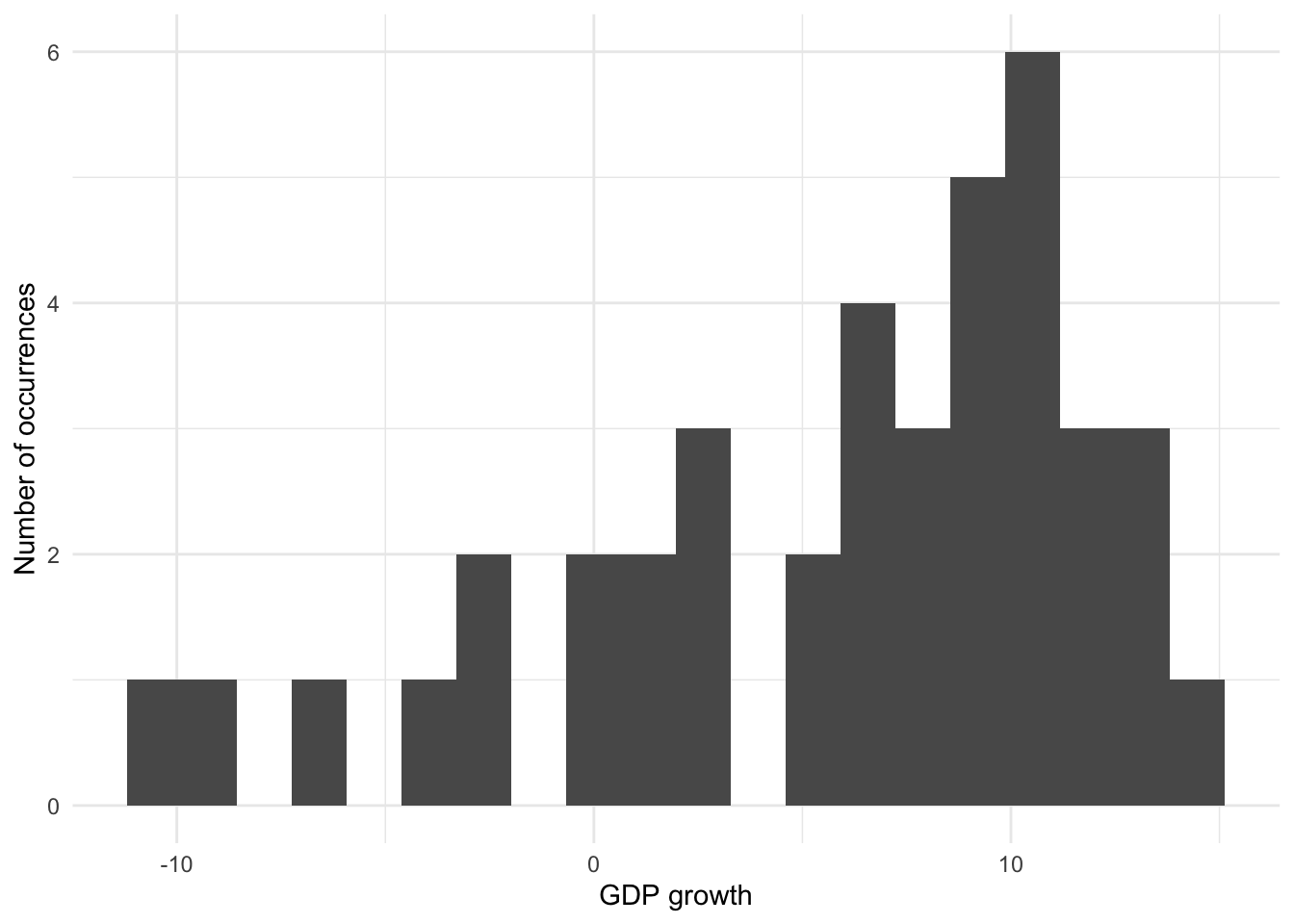
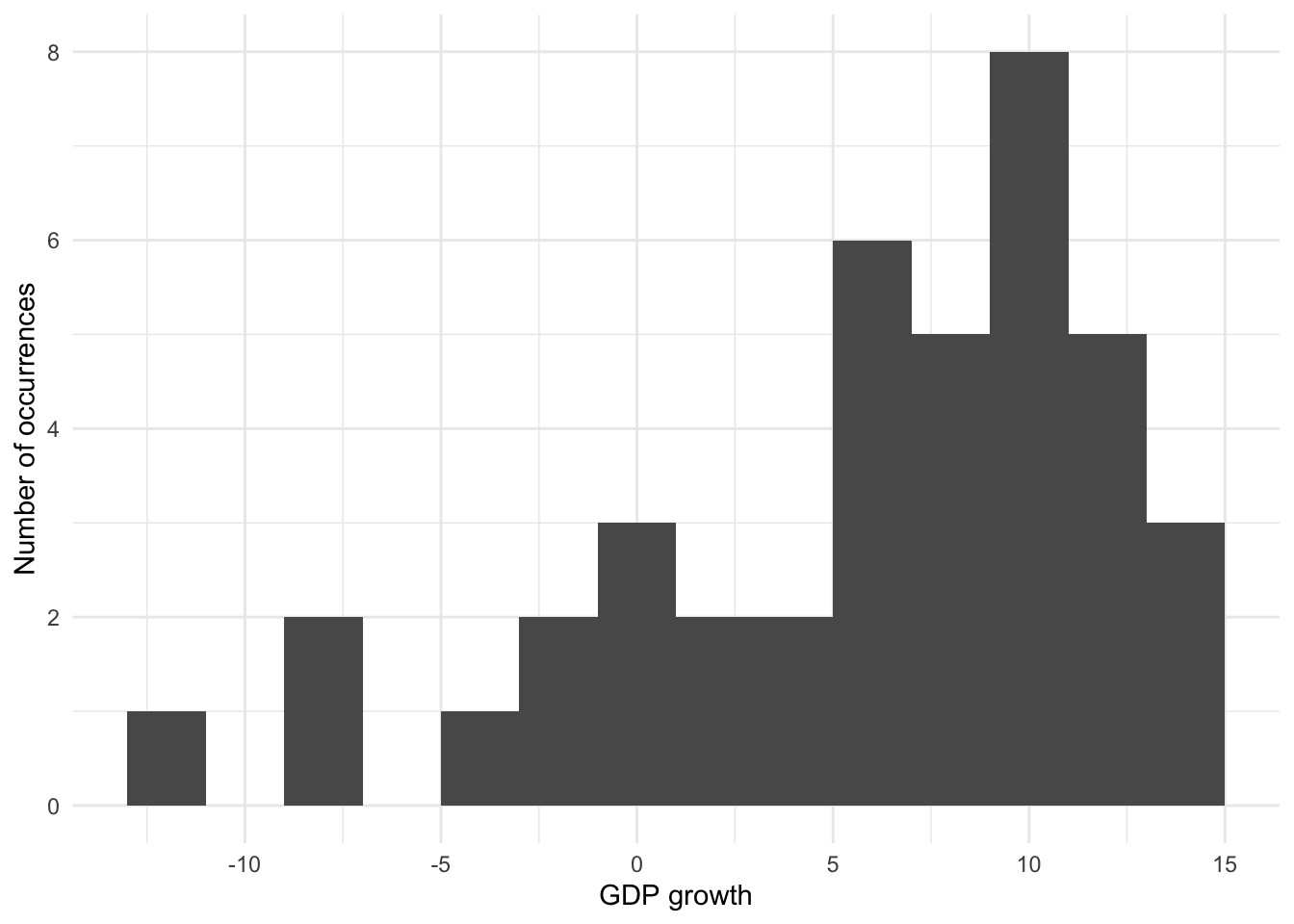
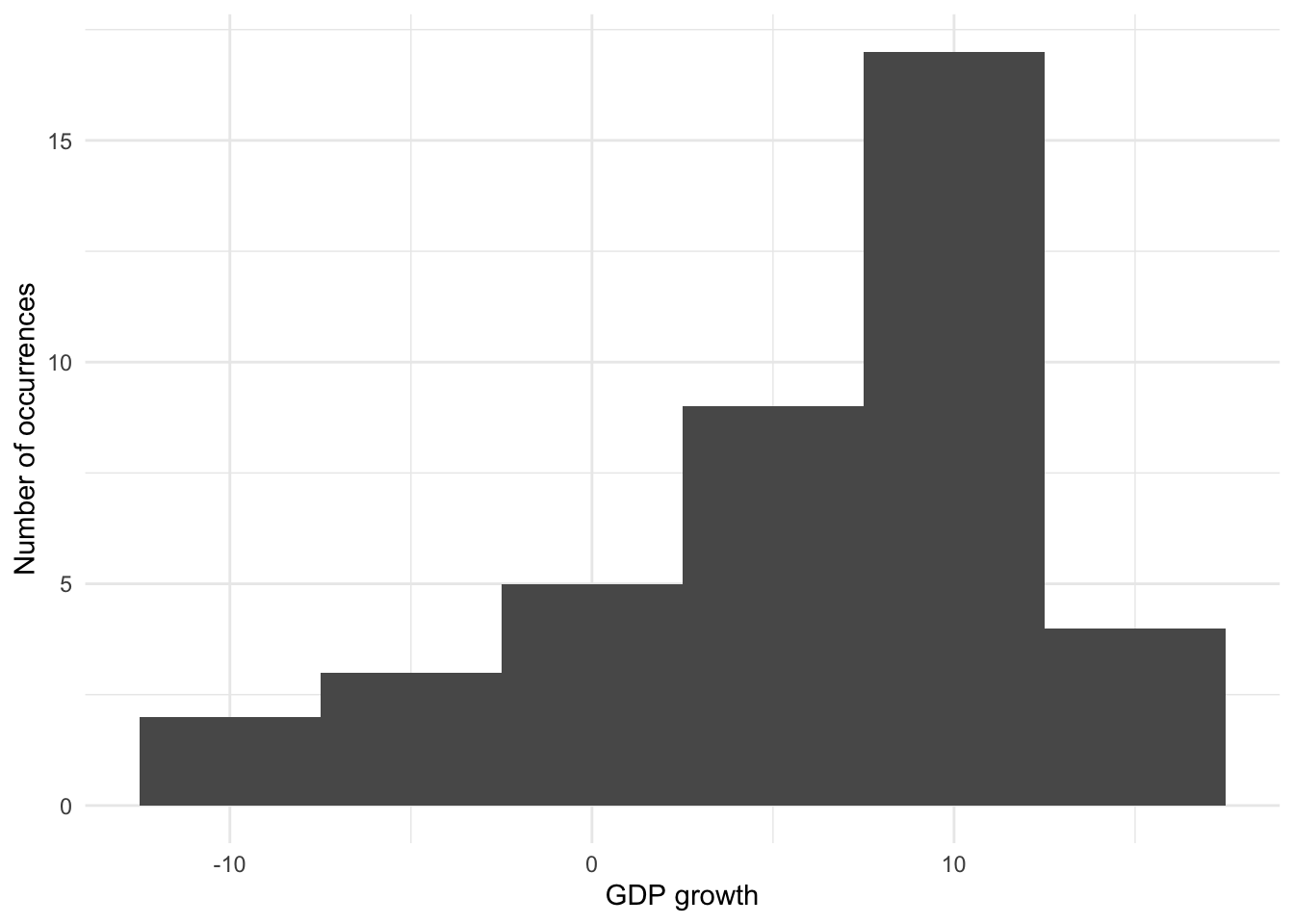
Histograms can be thought of as locally averaging data, and the number of bins affects how much of this occurs. When there are only two bins then there is considerable smoothing, but we lose a lot of accuracy. Too few bins results in more bias, while too many bins results in more variance (Wasserman 2005, 303). Our decision as to the number of bins, or their width, is concerned with trying to balance bias and variance. This will depend on a variety of concerns including the subject matter and the goal (Cleveland [1985] 1994, 135). This is one of the reasons that Denby and Mallows (2009) consider histograms to be especially valuable as exploratory tools.
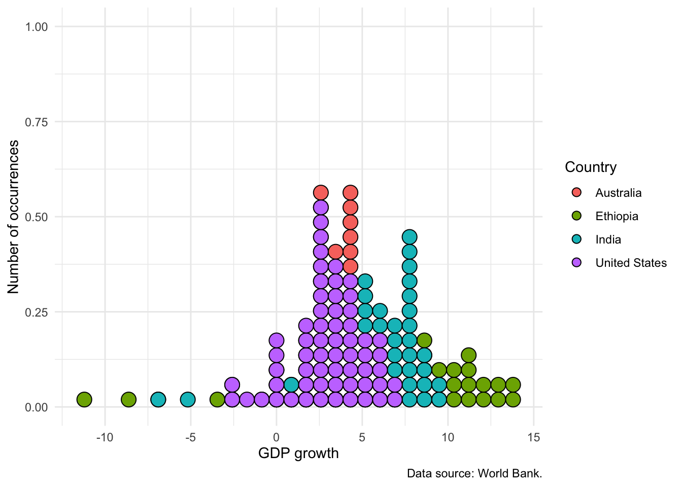
Finally, while we can use “fill” to distinguish between different types of observations, it can get quite messy. It is usually better to:
- trace the outline of the distribution with
geom_freqpoly()(Figure 5.18 (a)) - build stack of dots with
geom_dotplot()(Figure 5.18 (b)); or - add transparency, especially if the differences are more stark (Figure 5.18 (c)).
# Panel (a)
world_bank_data |>
  ggplot(aes(x = gdp_growth, color = country)) +
  geom_freqpoly() +
  theme_minimal() +
  labs(
    x = "GDP growth", y = "Number of occurrences",
    color = "Country",
    caption = "Data source: World Bank."
  ) +
  scale_color_brewer(palette = "Set1")

# Panel (b)
world_bank_data |>
  ggplot(aes(x = gdp_growth, group = country, fill = country)) +
  geom_dotplot(method = "histodot") +
  theme_minimal() +
  labs(
    x = "GDP growth", y = "Number of occurrences",
    fill = "Country",
    caption = "Data source: World Bank."
  ) +
  scale_color_brewer(palette = "Set1")

# Panel (c)
world_bank_data |>
  filter(country %in% c("India", "United States")) |>
  ggplot(mapping = aes(x = gdp_growth, fill = country)) +
  geom_histogram(alpha = 0.5, position = "identity") +
  theme_minimal() +
  labs(
    x = "GDP growth", y = "Number of occurrences",
    fill = "Country",
    caption = "Data source: World Bank."
  ) +
  scale_color_brewer(palette = "Set1")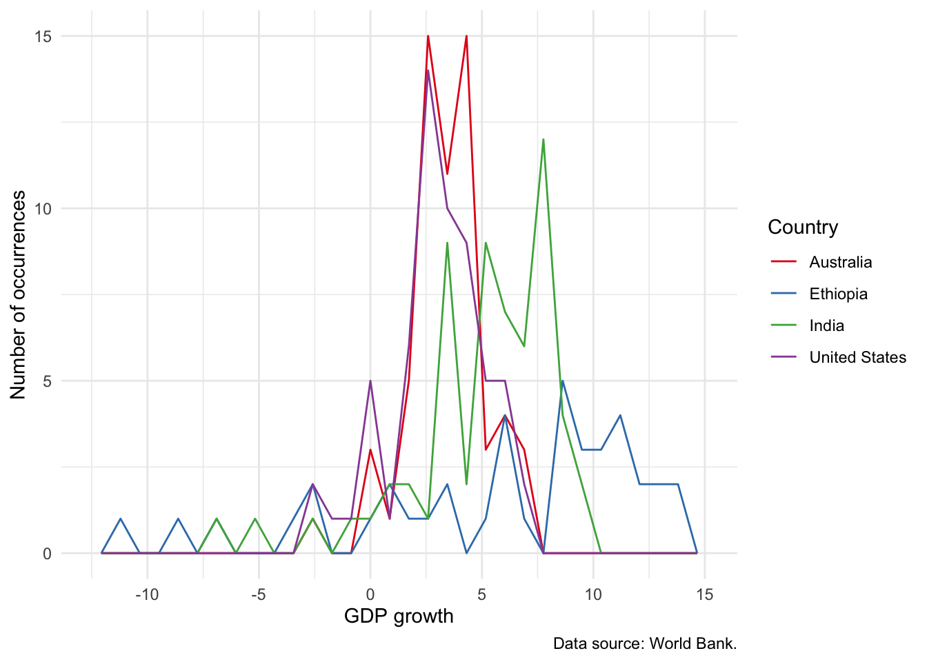
An interesting alternative to a histogram is the empirical cumulative distribution function (ECDF). The choice between this and a histogram is tends to be audience-specific. It may not appropriate for less-sophisticated audiences, but if the audience is quantitatively comfortable, then it can be a great choice because it does less smoothing than a histogram. We can build an ECDF with stat_ecdf(). For instance, Figure 5.19 shows an ECDF equivalent to Figure 5.16.
world_bank_data |>
  ggplot(mapping = aes(x = gdp_growth, color = country)) +
  stat_ecdf(geom = "point") +
  theme_minimal() +
  labs(
    x = "GDP growth", y = "Proportion", color = "Country",
    caption = "Data source: World Bank."
  ) +
  theme(legend.position = "bottom")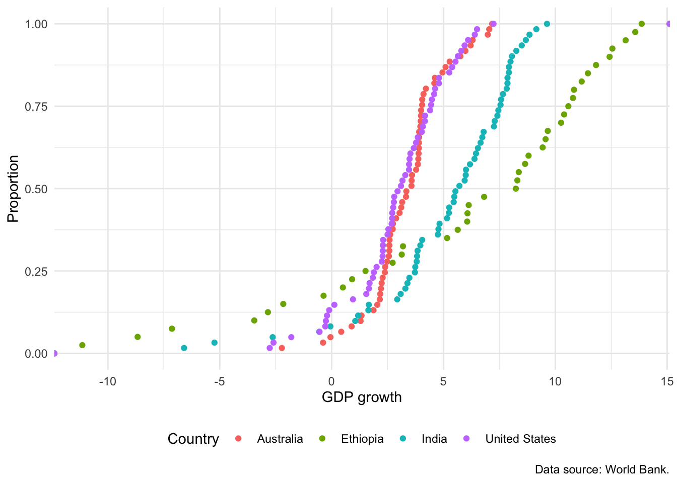
5.2.5 Boxplots
A boxplot typically shows five aspects: 1) the median, 2) the 25th, and 3) 75th percentiles. The fourth and fifth elements differ depending on specifics. One option is the minimum and maximum values. Another option is to determine the difference between the 75th and 25th percentiles, which is the interquartile range (IQR). The fourth and fifth elements are then the extreme observations within \(1.5\times\mbox{IQR}\) from the 25th and 75th percentiles. That latter approach is used, by default, in geom_boxplot from ggplot2. Spear (1952, 166) introduced the notion of a chart that focused on the range and various summary statistics including the median and the range, while Tukey (1977) focused on which summary statistics and popularized it (Wickham and Stryjewski 2011).
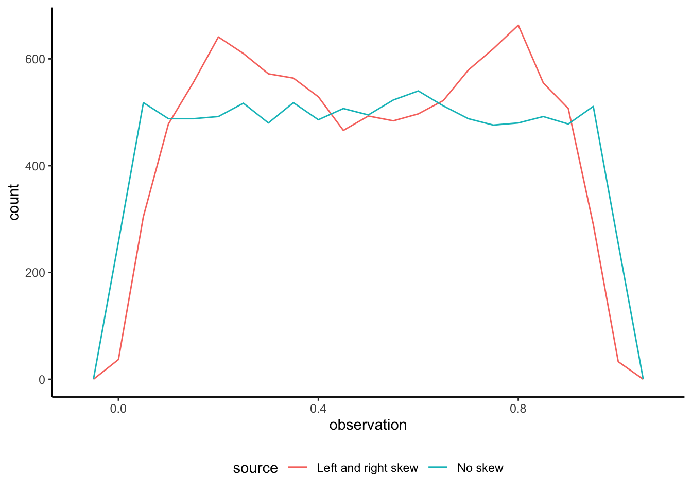
One reason for using graphs is that they help us understand and embrace how complex our data are, rather than trying to hide and smooth it away (Armstrong 2022). One appropriate use case for boxplots is to compare the summary statistics of many variables at once, such as in Bethlehem et al. (2022). But boxplots alone are rarely the best choice because they hide the distribution of data, rather than show it. The same boxplot can apply to very different distributions. To see this, consider some simulated data from the beta distribution of two types. The first contains draws from two beta distributions: one that is right skewed and another that is left skewed. The second contains draws from a beta distribution with no skew, noting that \(\mbox{Beta}(1, 1)\) is equivalent to \(\mbox{Uniform}(0, 1)\).
set.seed(853)

number_of_draws <- 10000

both_left_and_right_skew <-
  c(
    rbeta(number_of_draws / 2, 5, 2),
    rbeta(number_of_draws / 2, 2, 5)
  )

no_skew <-
  rbeta(number_of_draws, 1, 1)

beta_distributions <-
  tibble(
    observation = c(both_left_and_right_skew, no_skew),
    source = c(
      rep("Left and right skew", number_of_draws),
      rep("No skew", number_of_draws)
    )
  )
We can first compare the boxplots of the two series (Figure 5.20 (a)). But if we plot the actual data then we can see how different they are (Figure 5.20 (b)).
beta_distributions |>
  ggplot(aes(x = source, y = observation)) +
  geom_boxplot() +
  theme_classic()

beta_distributions |>
  ggplot(aes(x = observation, color = source)) +
  geom_freqpoly(binwidth = 0.05) +
  theme_classic() +
  theme(legend.position = "bottom")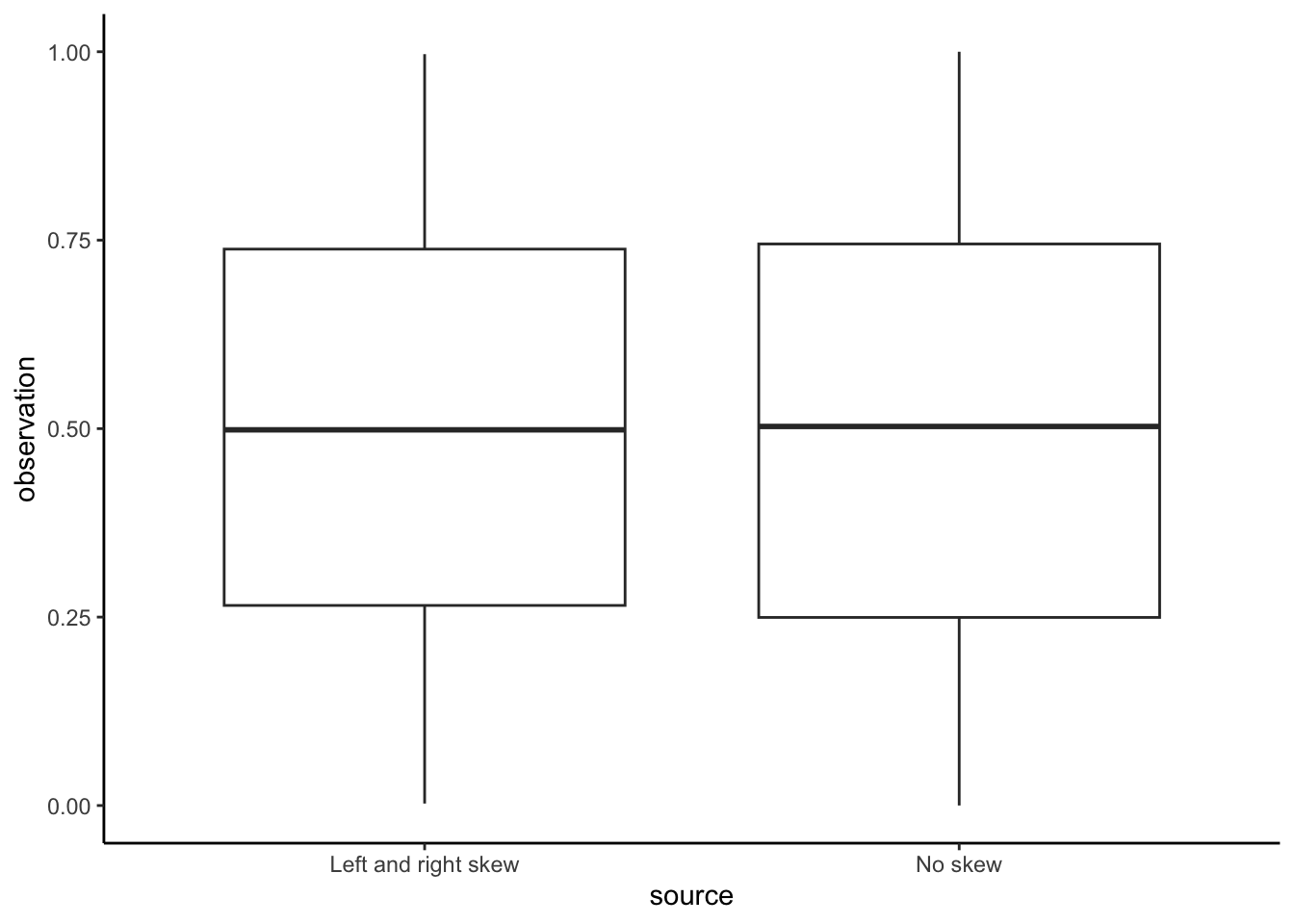
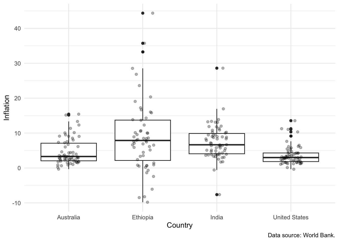
One way forward, if a boxplot is to be used, is to include the actual data as a layer on top of the boxplot. For instance, in Figure 5.21 we show the distribution of inflation across the four countries. The reason that this works well is that it shows the actual observations, as well as the summary statistics.
world_bank_data |>
  ggplot(mapping = aes(x = country, y = inflation)) +
  geom_boxplot() +
  geom_jitter(alpha = 0.3, width = 0.15, height = 0) +
  theme_minimal() +
  labs(
    x = "Country",
    y = "Inflation",
    caption = "Data source: World Bank."
  )
5.3 Tables
Tables are an important part of telling a compelling story. Tables can communicate less information than a graph, but they do so at a high fidelity. They are especially useful to highlight a few specific values (Andersen and Armstrong 2021). In this book, we primarily use tables in three ways:
- To show an extract of the dataset.
- To communicate summary statistics.
- To display regression results.
5.3.1 Showing part of a dataset
We illustrate showing part of a dataset using kable() from knitr. We use the World Bank dataset that we downloaded earlier and focus on inflation, GDP growth, and population as unemployment data are not available for every year for every country.
world_bank_data <-
  world_bank_data |>
  select(-unem_rate)
To begin, after installing and loading knitr, we can display the first ten rows with the default kable() settings.
world_bank_data |>
  slice(1:10) |>
kable()| country | year | inflation | gdp_growth | population |
|---|---|---|---|---|
| Australia | 1960 | 3.7288136 | NA | 10276477 |
| Australia | 1961 | 2.2875817 | 2.482656 | 10483000 |
| Australia | 1962 | -0.3194888 | 1.294611 | 10742000 |
| Australia | 1963 | 0.6410256 | 6.216107 | 10950000 |
| Australia | 1964 | 2.8662420 | 6.980061 | 11167000 |
| Australia | 1965 | 3.4055728 | 5.980438 | 11388000 |
| Australia | 1966 | 3.2934132 | 2.379040 | 11651000 |
| Australia | 1967 | 3.4782609 | 6.304945 | 11799000 |
| Australia | 1968 | 2.5210084 | 5.094034 | 12009000 |
| Australia | 1969 | 3.2786885 | 7.045584 | 12263000 |
To be able to cross-reference a table in the text, we need to add a table caption and label to the R chunk as shown in Section 3.2.6 of Chapter 3. We can also make the column names more informative with “col.names” and specify the number of digits to be displayed (Table 5.3).
```{r}
#| label: tbl-gdpfirst
#| message: false
#| tbl-cap: "A dataset of economic indicators for four countries"

world_bank_data |>
  slice(1:10) |>
  kable(
    col.names = c("Country", "Year", "Inflation", "GDP growth", "Population"),
    digits = 1
  )
```| Country | Year | Inflation | GDP growth | Population |
|---|---|---|---|---|
| Australia | 1960 | 3.7 | NA | 10276477 |
| Australia | 1961 | 2.3 | 2.5 | 10483000 |
| Australia | 1962 | -0.3 | 1.3 | 10742000 |
| Australia | 1963 | 0.6 | 6.2 | 10950000 |
| Australia | 1964 | 2.9 | 7.0 | 11167000 |
| Australia | 1965 | 3.4 | 6.0 | 11388000 |
| Australia | 1966 | 3.3 | 2.4 | 11651000 |
| Australia | 1967 | 3.5 | 6.3 | 11799000 |
| Australia | 1968 | 2.5 | 5.1 | 12009000 |
| Australia | 1969 | 3.3 | 7.0 | 12263000 |
5.3.2 Improving the formatting
When producing PDFs, the “booktabs” option makes a host of small changes to the default display and results in tables that look better (Table 5.4). (This should not have an effect for HTML output.) By default a small space will be added every five lines. We can additionally specify “linesep” to stop that.
world_bank_data |>
  slice(1:10) |>
  kable(
    col.names = c("Country", "Year", "Inflation", "GDP growth", "Population"),
    digits = 1,
    booktabs = TRUE,
    linesep = ""
)| Country | Year | Inflation | GDP growth | Population |
|---|---|---|---|---|
| Australia | 1960 | 3.7 | NA | 10276477 |
| Australia | 1961 | 2.3 | 2.5 | 10483000 |
| Australia | 1962 | -0.3 | 1.3 | 10742000 |
| Australia | 1963 | 0.6 | 6.2 | 10950000 |
| Australia | 1964 | 2.9 | 7.0 | 11167000 |
| Australia | 1965 | 3.4 | 6.0 | 11388000 |
| Australia | 1966 | 3.3 | 2.4 | 11651000 |
| Australia | 1967 | 3.5 | 6.3 | 11799000 |
| Australia | 1968 | 2.5 | 5.1 | 12009000 |
| Australia | 1969 | 3.3 | 7.0 | 12263000 |
We can specify the alignment of the columns using a character vector of “l” (left), “c” (center), and “r” (right) (Table 5.5). Additionally, we can change the formatting. For instance, we could specify groupings for numbers that are at least 1,000 using format.args = list(big.mark = ",").
world_bank_data |>
  slice(1:10) |>
  mutate(year = as.factor(year)) |>
  kable(
    col.names = c("Country", "Year", "Inflation", "GDP growth", "Population"),
    digits = 1,
    booktabs = TRUE,
    linesep = "",
    align = c("l", "l", "c", "c", "r", "r"),
    format.args = list(big.mark = ",")
)| Country | Year | Inflation | GDP growth | Population |
|---|---|---|---|---|
| Australia | 1960 | 3.7 | NA | 10,276,477 |
| Australia | 1961 | 2.3 | 2.5 | 10,483,000 |
| Australia | 1962 | -0.3 | 1.3 | 10,742,000 |
| Australia | 1963 | 0.6 | 6.2 | 10,950,000 |
| Australia | 1964 | 2.9 | 7.0 | 11,167,000 |
| Australia | 1965 | 3.4 | 6.0 | 11,388,000 |
| Australia | 1966 | 3.3 | 2.4 | 11,651,000 |
| Australia | 1967 | 3.5 | 6.3 | 11,799,000 |
| Australia | 1968 | 2.5 | 5.1 | 12,009,000 |
| Australia | 1969 | 3.3 | 7.0 | 12,263,000 |
5.3.3 Communicating summary statistics
After installing and loading modelsummary we can use datasummary_skim() to create tables of summary statistics from our dataset.
We can use this to get a table such as Table 5.6. That might be useful for exploratory data analysis, which we cover in Chapter 11. (Here we remove population to save space and do not include a histogram of each variable.)
world_bank_data |>
  select(-population) |>
datasummary_skim(histogram = FALSE)| Unique | Missing Pct. | Mean | SD | Min | Median | Max | |
|---|---|---|---|---|---|---|---|
| year | 62 | 0 | 1990.5 | 17.9 | 1960.0 | 1990.5 | 2021.0 |
| inflation | 243 | 2 | 6.1 | 6.5 | -9.8 | 4.3 | 44.4 |
| gdp_growth | 224 | 10 | 4.2 | 3.7 | -11.1 | 3.9 | 13.9 |
| country | N | % | |||||
| Australia | 62 | 25.0 | |||||
| Ethiopia | 62 | 25.0 | |||||
| India | 62 | 25.0 | |||||
| United States | 62 | 25.0 |
By default, datasummary_skim() summarizes the numeric variables, but we can ask for the categorical variables (Table 5.7). Additionally we can add cross-references in the same way as kable(), that is, include a “tbl-cap” entry and then cross-reference the name of the R chunk.
world_bank_data |>
datasummary_skim(type = "categorical")| country | N | % |
|---|---|---|
| Australia | 62 | 25.0 |
| Ethiopia | 62 | 25.0 |
| India | 62 | 25.0 |
| United States | 62 | 25.0 |
We can create a table that shows the correlation between variables using datasummary_correlation() (Table 5.8).
world_bank_data |>
datasummary_correlation()| year | inflation | gdp_growth | population | |
|---|---|---|---|---|
| year | 1 | . | . | . |
| inflation | .03 | 1 | . | . |
| gdp_growth | .11 | .01 | 1 | . |
| population | .25 | .06 | .16 | 1 |
We typically need a table of descriptive statistics that we could add to our paper (Table 5.9). This contrasts with Table 5.7 which would likely not be included in the main section of a paper, and is more to help us understand the data. We can add a note about the source of the data using notes.
datasummary_balance(
  formula = ~country,
  data = world_bank_data |>
    filter(country %in% c("Australia", "Ethiopia")),
  dinm = FALSE,
  notes = "Data source: World Bank."
)| Australia (N=62) | Ethiopia (N=62) | |||
|---|---|---|---|---|
| Mean | Std. Dev. | Mean | Std. Dev. | |
| Data source: World Bank. | ||||
| year | 1990.5 | 18.0 | 1990.5 | 18.0 |
| inflation | 4.7 | 3.8 | 9.1 | 10.6 |
| gdp_growth | 3.4 | 1.8 | 5.9 | 6.4 |
| population | 17351313.1 | 4407899.0 | 57185292.0 | 29328845.8 |
5.3.4 Display regression results
We can report regression results using modelsummary() from modelsummary. For instance, we could display the estimates from a few different models (Table 5.10).
first_model <- lm(
  formula = gdp_growth ~ inflation,
  data = world_bank_data
)

second_model <- lm(
  formula = gdp_growth ~ inflation + country,
  data = world_bank_data
)

third_model <- lm(
  formula = gdp_growth ~ inflation + country + population,
  data = world_bank_data
)

modelsummary(list(first_model, second_model, third_model))| (1) | (2) | (3) | |
|---|---|---|---|
| (Intercept) | 4.147 | 3.676 | 3.611 |
| (0.343) | (0.484) | (0.482) | |
| inflation | 0.006 | -0.068 | -0.065 |
| (0.039) | (0.040) | (0.039) | |
| countryEthiopia | 2.896 | 2.716 | |
| (0.740) | (0.740) | ||
| countryIndia | 1.916 | -0.730 | |
| (0.642) | (1.465) | ||
| countryUnited States | -0.436 | -1.145 | |
| (0.633) | (0.722) | ||
| population | 0.000 | ||
| (0.000) | |||
| Num.Obs. | 223 | 223 | 223 |
| R2 | 0.000 | 0.111 | 0.127 |
| R2 Adj. | -0.004 | 0.095 | 0.107 |
| AIC | 1217.7 | 1197.5 | 1195.4 |
| BIC | 1227.9 | 1217.9 | 1219.3 |
| Log.Lik. | -605.861 | -592.752 | -590.704 |
| F | 0.024 | 6.806 | |
| RMSE | 3.66 | 3.45 | 3.42 |
The number of significant digits can be adjusted with “fmt” (Table 5.11). To help establish credibility you should generally not add as many significant digits as possible (Howes 2022). Instead, you should think carefully about the data-generating process and adjust based on that.
modelsummary(
  list(first_model, second_model, third_model),
  fmt = 1
)| (1) | (2) | (3) | |
|---|---|---|---|
| (Intercept) | 4.1 | 3.7 | 3.6 |
| (0.3) | (0.5) | (0.5) | |
| inflation | 0.0 | -0.1 | -0.1 |
| (0.0) | (0.0) | (0.0) | |
| countryEthiopia | 2.9 | 2.7 | |
| (0.7) | (0.7) | ||
| countryIndia | 1.9 | -0.7 | |
| (0.6) | (1.5) | ||
| countryUnited States | -0.4 | -1.1 | |
| (0.6) | (0.7) | ||
| population | 0.0 | ||
| (0.0) | |||
| Num.Obs. | 223 | 223 | 223 |
| R2 | 0.000 | 0.111 | 0.127 |
| R2 Adj. | -0.004 | 0.095 | 0.107 |
| AIC | 1217.7 | 1197.5 | 1195.4 |
| BIC | 1227.9 | 1217.9 | 1219.3 |
| Log.Lik. | -605.861 | -592.752 | -590.704 |
| F | 0.024 | 6.806 | |
| RMSE | 3.66 | 3.45 | 3.42 |
5.4 Maps
In many ways maps can be thought of as another type of graph, where the x-axis is latitude, the y-axis is longitude, and there is some outline or background image. It is possible that they are the oldest and best understood type of chart (Karsten 1923, 1). We can generate a map in a straight-forward manner. That said, it is not to be taken lightly; things quickly get complicated!
The first step is to get some data. There is some geographic data built into ggplot2 that we can access with map_data(). There are additional variables in the world.cities dataset from maps.
france <- map_data(map = "france")

head(france)
long lat group order region subregion
1 2.557093 51.09752 1 1 Nord <NA>
2 2.579995 51.00298 1 2 Nord <NA>
3 2.609101 50.98545 1 3 Nord <NA>
4 2.630782 50.95073 1 4 Nord <NA>
5 2.625894 50.94116 1 5 Nord <NA>
6 2.597699 50.91967 1 6 Nord <NA>french_cities <-
world.cities |>
filter(country.etc == "France")
head(french_cities) name country.etc pop lat long capital
1 Abbeville France 26656 50.12 1.83 0
2 Acheres France 23219 48.97 2.06 0
3 Agde France 23477 43.33 3.46 0
4 Agen France 34742 44.20 0.62 0
5 Aire-sur-la-Lys France 10470 50.64 2.39 0
6 Aix-en-Provence France 148622 43.53 5.44 0Using that information you can create a map of France that shows the larger cities (Figure 5.22). Use geom_polygon() from ggplot2 to draw shapes by connecting points within groups. And coord_map() adjusts for the fact that we are making a 2D map to represent a world that is 3D.
ggplot() +
  geom_polygon(
    data = france,
    aes(x = long, y = lat, group = group),
    fill = "white",
    colour = "grey"
  ) +
  coord_map() +
  geom_point(
    aes(x = french_cities$long, y = french_cities$lat),
    alpha = 0.3,
    color = "black"
  ) +
  theme_minimal() +
  labs(x = "Longitude", y = "Latitude")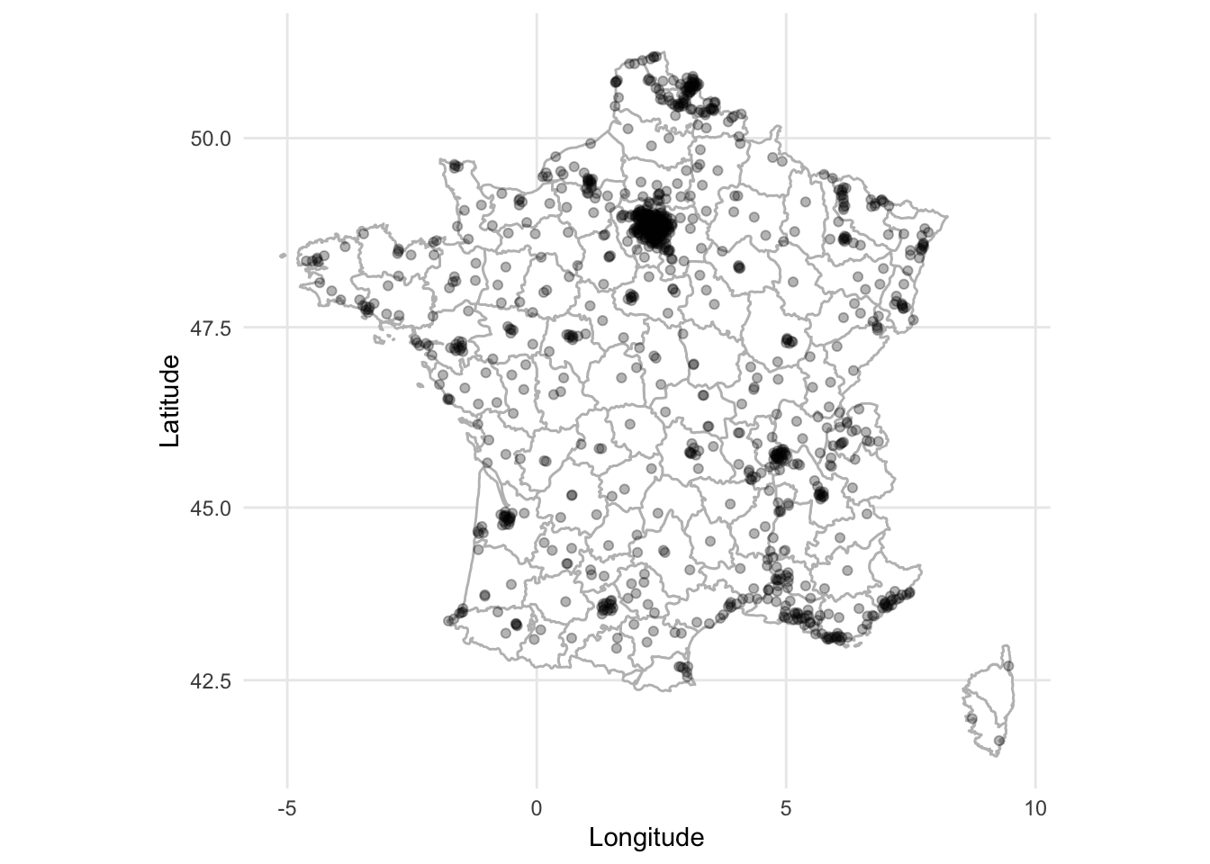
As is often the case with R, there are many ways to get started creating static maps. We have seen how they can be built using only ggplot2, but ggmap brings additional functionality.
There are two essential components to a map:
- a border or background image (sometimes called a tile); and
- something of interest within that border, or on top of that tile.
In ggmap, we use an open-source option for our tile, Stamen Maps. And we use plot points based on latitude and longitude.
5.4.1 Australian polling places
In Australia, people have to go to “booths” in order to vote. Because the booths have coordinates (latitude and longitude), we can plot them. One reason we may like to do that is to notice spatial voting patterns.
To get started we need to get a tile. We are going to use ggmap to get a tile from Stamen Maps, which builds on OpenStreetMap. The main argument to this function is to specify a bounding box. A bounding box is the coordinates of the edges that you are interested in. This requires two latitudes and two longitudes.
It can be useful to use Google Maps, or other mapping platform, to find the coordinate values that you need. In this case we have provided it with coordinates such that it will be centered around Australia’s capital Canberra.
bbox <- c(left = 148.95, bottom = -35.5, right = 149.3, top = -35.1)It is free, but we need to register in order to get a map. To do this go to https://client.stadiamaps.com/signup/ and create an account. Then create a new property, then “Add API Key”. Copy the key and run (replacing PUT-KEY-HERE with the key) register_stadiamaps(key = "PUT-KEY-HERE", write = TRUE). Then once you have defined the bounding box, the function get_stadiamap() will get the tiles in that area (Figure 5.23). The number of tiles that it needs depends on the zoom, and the type of tiles that it gets depends on the type of map. We have used “toner-lite”, which is black and white, but there are others including: “terrain”, “toner”, and “toner-lines”. We pass the tiles to ggmap() which will plot it. An internet connection is needed for this to work as get_stadiamap() downloads the tiles.
canberra_stamen_map <- get_stadiamap(bbox, zoom = 11, maptype = "stamen_toner_lite")

ggmap(canberra_stamen_map)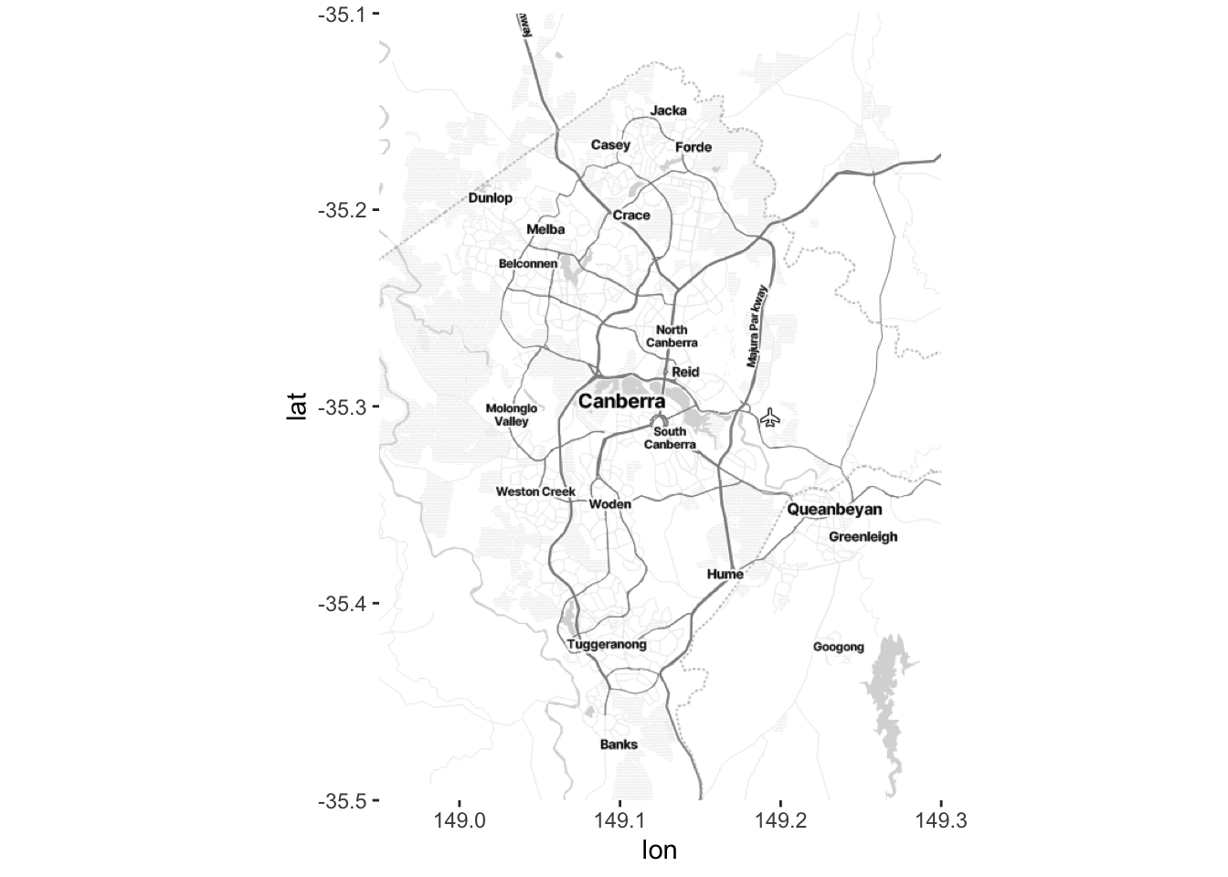
Once we have a map then we can use ggmap() to plot it. Now we want to get some data that we plot on top of our tiles. We will plot the location of the polling place based on its “division”. This is available from the Australian Electoral Commission (AEC).
booths <-
  read_csv(
    "https://results.aec.gov.au/24310/Website/Downloads/GeneralPollingPlacesDownload-24310.csv",
    skip = 1,
    guess_max = 10000
  )
This dataset is for the whole of Australia, but as we are only plotting the area around Canberra, we will filter the data to only booths with a geography close to Canberra.
booths_reduced <-
  booths |>
  filter(State == "ACT") |>
  select(PollingPlaceID, DivisionNm, Latitude, Longitude) |>
  filter(!is.na(Longitude)) |> # Remove rows without geography
  filter(Longitude < 165) # Remove Norfolk Island
Now we can use ggmap in the same way as before to plot our underlying tiles, and then build on that using geom_point() to add our points of interest.
ggmap(canberra_stamen_map, extent = "normal", maprange = FALSE) +
  geom_point(data = booths_reduced,
             aes(x = Longitude, y = Latitude, colour = DivisionNm),
             alpha = 0.7) +
  scale_color_brewer(name = "2019 Division", palette = "Set1") +
  coord_map(
    projection = "mercator",
    xlim = c(attr(map, "bb")$ll.lon, attr(map, "bb")$ur.lon),
    ylim = c(attr(map, "bb")$ll.lat, attr(map, "bb")$ur.lat)
  ) +
  labs(x = "Longitude",
       y = "Latitude") +
  theme_minimal() +
  theme(panel.grid.major = element_blank(),
        panel.grid.minor = element_blank())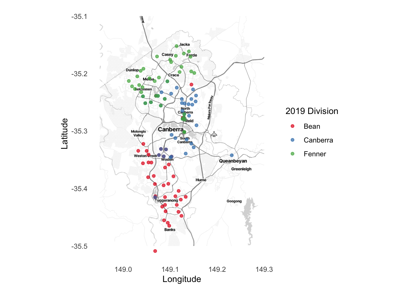
We may like to save the map so that we do not have to create it every time, and we can do that in the same way as any other graph, using ggsave().
ggsave("map.pdf", width = 20, height = 10, units = "cm")Finally, the reason that we used Stamen Maps and OpenStreetMap is because they are open source, but we could have also used Google Maps. This requires you to first register a credit card with Google, and specify a key, but with low usage the service should be free. Using Google Maps—by using get_googlemap() within ggmap—brings some advantages over get_stadiamap(). For instance it will attempt to find a place name rather than needing to specify a bounding box.
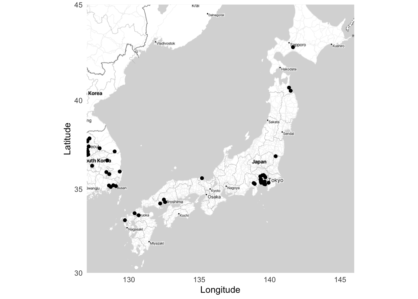
5.4.2 United States military bases
To see another example of a static map we will plot some United States military bases after installing and loading troopdata. We can access data about United States overseas military bases back to the start of the Cold War using get_basedata().
bases <- get_basedata()

head(bases)
# A tibble: 6 × 9
countryname ccode iso3c basename lat lon base lilypad fundedsite
<chr> <dbl> <chr> <chr> <dbl> <dbl> <dbl> <dbl> <dbl>
1 Afghanistan 700 AFG Bagram AB 34.9 69.3 1 0 0
2 Afghanistan 700 AFG Kandahar Airfield 31.5 65.8 1 0 0
3 Afghanistan 700 AFG Mazar-e-Sharif 36.7 67.2 1 0 0
4 Afghanistan 700 AFG Gardez 33.6 69.2 1 0 0
5 Afghanistan 700 AFG Kabul 34.5 69.2 1 0 0
6 Afghanistan 700 AFG Herat 34.3 62.2 1 0 0We will look at the locations of United States military bases in Germany, Japan, and Australia. The troopdata dataset already has the latitude and longitude of each base, and we will use that as our item of interest. The first step is to define a bounding box for each country.
# Use: https://data.humdata.org/dataset/bounding-boxes-for-countries
bbox_germany <- c(left = 5.867, bottom = 45.967, right = 15.033, top = 55.133)

bbox_japan <- c(left = 127, bottom = 30, right = 146, top = 45)

bbox_australia <- c(left = 112.467, bottom = -45, right = 155, top = -9.133)
Then we need to get the tiles using get_stadiamap() from ggmap.
german_stamen_map <- get_stadiamap(bbox_germany, zoom = 6, maptype = "stamen_toner_lite")
japan_stamen_map <- get_stadiamap(bbox_japan, zoom = 6, maptype = "stamen_toner_lite")
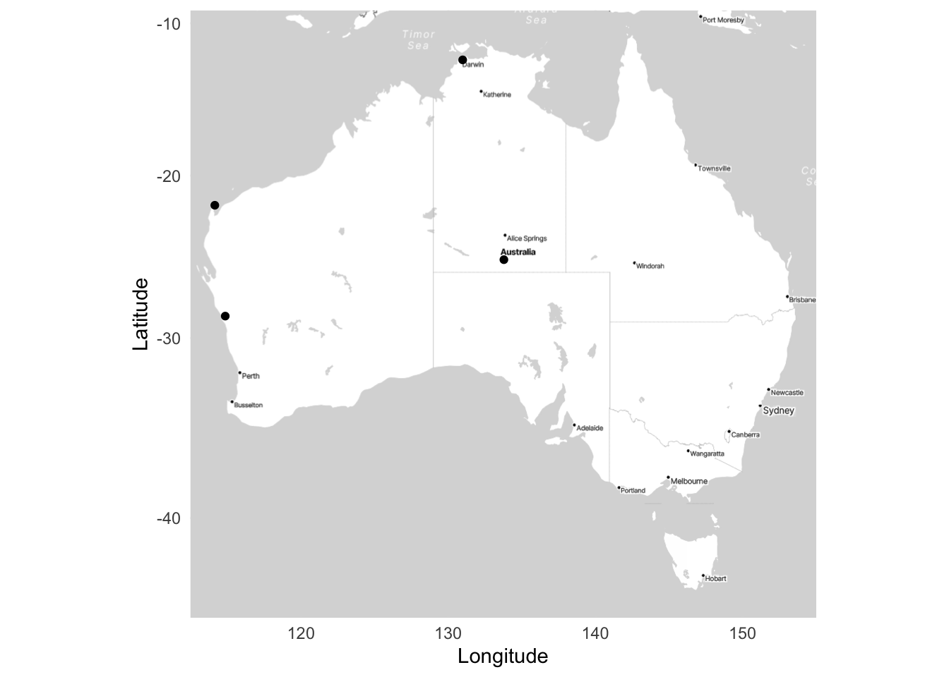
aus_stamen_map <- get_stadiamap(bbox_australia, zoom = 5, maptype = "stamen_toner_lite")And finally, we can bring it all together with maps showing United States military bases in Germany (Figure 5.25 (a)), Japan (Figure 5.25 (b)), and Australia (Figure 5.25 (c)).
ggmap(german_stamen_map) +
  geom_point(data = bases, aes(x = lon, y = lat)) +
  labs(x = "Longitude",
       y = "Latitude") +
  theme_minimal()

ggmap(japan_stamen_map) +
  geom_point(data = bases, aes(x = lon, y = lat)) +
  labs(x = "Longitude",
       y = "Latitude") +
  theme_minimal()

ggmap(aus_stamen_map) +
  geom_point(data = bases, aes(x = lon, y = lat)) +
  labs(x = "Longitude",
       y = "Latitude") +
  theme_minimal()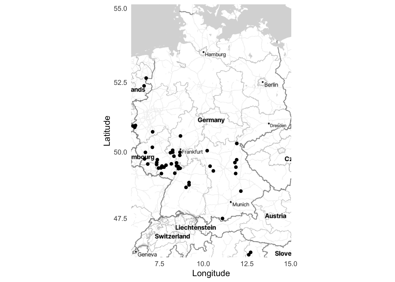
5.4.3 Geocoding
So far we have assumed that we already have geocoded data. This means that we have latitude and longitude coordinates for each place. But sometimes we only have place names, such as “Sydney, Australia”, “Toronto, Canada”, “Accra, Ghana”, and “Guayaquil, Ecuador”. Before we can plot them, we need to get the latitude and longitude coordinates for each case. The process of going from names to coordinates is called geocoding.
Oh, you think we have good data on that!
While you almost surely know where you live, it can be surprisingly difficult to specifically define the boundaries of many places. And this is made especially difficult when different levels of government have different definitions. Bronner (2021) illustrates this in the case of Atlanta, Georgia, where there are (at least) three official different definitions:
- the metropolitan statistical area;
- the urbanized area; and
- the census place.
Which definition is used can have a substantial effect on the analysis, or even the data that are available, even though they are all “Atlanta”.
There are a range of options to geocode data in R, but tidygeocoder is especially useful. We first need a dataframe of locations.
place_names <-
  tibble(
    city = c("Sydney", "Toronto", "Accra", "Guayaquil"),
    country = c("Australia", "Canada", "Ghana", "Ecuador")
  )

place_names
# A tibble: 4 × 2
city country
<chr> <chr>
1 Sydney Australia
2 Toronto Canada
3 Accra Ghana
4 Guayaquil Ecuador place_names <-
geo(
city = place_names$city,
country = place_names$country,
method = "osm"
)
place_names# A tibble: 4 × 4
city country lat long
<chr> <chr> <dbl> <dbl>
1 Sydney Australia -33.9 151.
2 Toronto Canada 43.7 -79.4
3 Accra Ghana 5.56 -0.201
4 Guayaquil Ecuador -2.29 -80.1 And we can now plot and label these cities (Figure 5.26).
world <- map_data(map = "world")

ggplot() +
  geom_polygon(
    data = world,
    aes(x = long, y = lat, group = group),
    fill = "white",
    colour = "grey"
  ) +
  geom_point(
    aes(x = place_names$long, y = place_names$lat),
    color = "black") +
  geom_text(
    aes(x = place_names$long, y = place_names$lat, label = place_names$city),
    nudge_y = -5) +
  theme_minimal() +
  labs(x = "Longitude",
       y = "Latitude")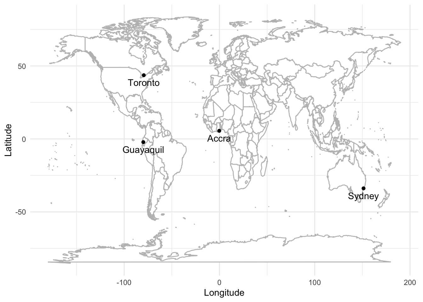
5.5 Concluding remarks
In this chapter we considered many ways of communicating data. We spent substantial time on graphs, because of their ability to convey a large amount of information in an efficient way. We then turned to tables because of how they can specifically convey information. Finally, we discussed maps, which allow us to display geographic information. The most important task is to show the observations to the full extent possible.
5.6 Exercises
Practice
- (Plan) Consider the following scenario: Three friends—Edward, Hugo, and Lucy—each measure the height of 20 of their friends. Each of the three use a slightly different approach to measurement and so make slightly different errors. Please sketch what that dataset could look like and then sketch a graph that you could build to show all observations.
- (Simulate) Please further consider the scenario described and simulate the situation with every variable independent of each other. Please include three tests based on the simulated data.
- (Acquire) Please specify a source of actual data about human height that you are interested in.
- (Explore) Build a graph and table using the simulated data.
- (Communicate) Please write some text to accompany the graph and table, as if they reflected the actual situation. The exact details contained in the paragraphs do not have to be factual but they should be reasonable (i.e. you do not actually have to get the data nor create the graphs). Separate the code appropriately into
Rfiles and a Quarto doc. Submit a link to a GitHub repo with a README.
Quiz
- What is the primary reason for always plotting data (pick one)?
- To better understand our data.
- To ensure the data are normal.
- To check for missing values.
- From Wickham, Çetinkaya-Rundel, and Grolemund ([2016] 2023), which of the following best describes tidy data (pick one)?
- Each variable is in its own column, and each observation in its own row.
- All data in a single row.
- Multiple values per cell.
- Data are stored in one cell.
- From Healy (2018), what does
ggplot()require as its first argument (pick one)?- A dataframe.
- A geom function.
- A legend.
- An aesthetic mapping.
- From Healy (2018), in
ggplot2, what does the+operator do (pick one)?- Saves the plot.
- Adds data to the plot.
- Combines layers of the plot.
- Removes elements from the plot.
- From Wickham, Çetinkaya-Rundel, and Grolemund ([2016] 2023), what is an “aesthetic” in the context of
ggplot2(pick one)?- The type of chart used.
- The axis labels.
- The color of the plot.
- How variables in the dataset are mapped to visual properties.
- From Wickham, Çetinkaya-Rundel, and Grolemund ([2016] 2023), in
ggplot2, what is a “geom” (pick one)?- A data transformation function.
- The geometrical object that a plot uses to represent data.
- A plot title.
- A statistical transformation.
- Which geom should be used to make a scatter plot (pick one)?
geom_dotplot()geom_bar()geom_smooth()geom_point()
- Which should be used to create bar charts (when you have already computed counts) (pick one)?
geom_line()geom_bar()geom_histogram()geom_col()
- Which
ggplot2geom would you use to create a histogram (pick one)?geom_col()geom_bar()geom_density()geom_histogram()
- Assume the
tidyverseanddatasauRusare installed and loaded. What would be the outcome of the following code (pick one)?- Two vertical lines.
- Three vertical lines.
- Four vertical lines.
- Five vertical lines.
datasaurus_dozen |>
  filter(dataset == "v_lines") |>
  ggplot(aes(x=x, y=y)) +
geom_point()- From Wickham, Çetinkaya-Rundel, and Grolemund ([2016] 2023), what happens when you map a variable to the
coloraesthetic inggplot2(select all that apply)?- The points get different colors based on the variable.
- A legend is automatically created.
- The size of points changes based on the variable.
- From Healy (2018), what is the difference between
colorandfillaesthetics inggplot2(pick one)?- Both terms are used interchangeably.
colorapplies to points and lines, whilefillapplies to area elements.colorcontrols font color, whilefillcontrols plot title.colorapplies to the background, whilefillapplies to text.
- How do you add some transparency to the points when using
geom_point()(pick one)?- By setting
alphato a value between 0 and 1. - By removing
geom_point()from the plot. - By using
color = NULLinaes()
- By setting
- What does
labs()do inggplot2(pick one)?- Changes the background color of the plot.
- Adds labels like legend and axis labels.
- Adds a line of best fit.
- Modifies the plot layout.
- In the code below, what should be added to
labs()to change the text of the legend (pick one)?scale = "Voted for"legend = "Voted for"color = "Voted for"fill = "Voted for"
beps |>
  ggplot(mapping = aes(x = age, fill = vote)) +
  geom_bar() +
  theme_minimal() +
labs(x = "Age of respondent", y = "Number of respondents")- Based on the help file for
scale_colour_brewer()which palette diverges (pick one)?- “GnBu”
- “Set1”
- “Accent”
- “RdBu”
- Which theme does not have solid lines along the x and y axes (pick one)?
theme_minimal()theme_classic()theme_bw()
- Which argument to
positionshould be added togeom_bar()to make the bars be next to each other rather than on top of each other (pick one)?position = "adjacent"position = "side_by_side"position = "closest"position = "dodge2"
beps |>
  ggplot(mapping = aes(x = age, fill = vote)) +
geom_bar()- Based on Vanderplas, Cook, and Hofmann (2020), which cognitive principle should be considered when creating graphs (pick one)?
- Proximity.
- Volume estimation.
- Relative motion.
- Axial positioning.
- Based on Vanderplas, Cook, and Hofmann (2020), color can be used to (pick one)?
- Improve chart design aesthetics.
- Encode categorical and continuous variables and group plot elements.
- Identify magnitude.
- Which of these would result in the largest number of bins (pick one)?
geom_histogram(binwidth = 2)geom_histogram(binwidth = 5)
- Suppose there is a dataset that contains the heights of 100 birds, each from one of three different species. If we are interested in understanding the distribution of these heights, then in a paragraph or two, please explain which type of graph should be used and why.
- Would this code
data |> ggplot(aes(x = col_one)) |> geom_point()work if we assume the libraries are loaded and the dataset and columns exist (pick one)?- No.
- Yes.
- In
ggplot2, what is the purpose of using facets in a plot (pick one)?- To adjust the transparency of the points.
- To add labels to data points.
- To create multiple plots split by the values of one or more variables.
- To change the color scheme of the plot.
- When creating a bar chart with
ggplot2, which aesthetic is typically mapped to a categorical variable to fill bars with different colors (pick one)?fillxysize
- What is the effect of adding
position = "dodge"orposition = "dodge2"to ageom_bar()inggplot2(pick one)?- It adds transparency to the bars.
- It places the bars side by side for each group.
- It stacks the bars on top of each other.
- It changes the bar colors to grayscale.
- In the context of
ggplot2, what is the primary difference betweengeom_point()andgeom_jitter()(pick one)?geom_jitter()adds random noise to points to reduce overplotting.geom_jitter()is used for continuous data,geom_point()for categorical data.geom_point()adds transparency,geom_jitter()does not.geom_point()plots points,geom_jitter()plots lines.
- Which
ggplot2geom would you use to add a line of best fit to a scatterplot (pick one)?geom_histogram()geom_smooth()geom_bar()geom_line()
- What argument would you use in geom_smooth() to specify a linear model without standard errors (pick one)?
fit = lm, show_se = FALSEtype = "linear", ci = FALSEmodel = linear, error = FALSEmethod = lm, se = FALSE
- What does adjusting the number of bins, or changing the binwidth, affect for a histogram (pick one)?
- The labels on the x-axis.
- The size of the data points.
- The colors used in the plot.
- How smooth the distribution will appear.
- What is one disadvantage of using boxplots (pick one)?
- They cannot show outliers.
- They take too long to compute.
- They hide the underlying distribution of the data.
- They are too colorful.
- How can you deal with that disadvantage (pick one)?
- Remove the whiskers from the boxplot.
- Add colors for each category.
- Overlay the actual data points using
geom_jitter(). - Increase the box width.
- What does
stat_ecdf()compute (pick one)?- A cumulative distribution function.
- A scatterplot with error bars.
- A boxplot.
- A histogram.
- Which function from
modelsummarycould we use to create a table of descriptive statistics (pick one)?datasummary_balance()datasummary_skim()datasummary_descriptive()datasummary_crosstab()
- What is geocoding (pick one)?
- Converting latitude and longitude into place names.
- Drawing map boundaries.
- Picking a map projection.
- Converting place names into latitude and longitude.
Activity
Please create a graph using ggplot2 and a map using ggmap and add explanatory text to accompany both. Be sure to include cross-references and captions, etc. Each of these should take about a page.
Then, with regard the graph you created, please reflect on Vanderplas, Cook, and Hofmann (2020). Add a few paragraphs about the different options that you considered to make the graph more effective.
And finally, with regard to the map that you created, please reflect on the following quote from Heather Krause, founder of We All Count: “maps only show people who aren’t invisible to the makers” as well as Chapter 3 from D’Ignazio and Klein (2020) and add a few paragraphs related to this.
Submit a link to a high-quality GitHub repo.
Paper
At about this point the Mawson Paper from Online Appendix E would be appropriate.